Skip to content
Pimp my Type
  • Free Type Check
  • Articles
  • Font Friday
  • Speaking
  • YouTube

Tag accessibility

The word Readability in very low contrast in a glass like shape showing cracks, while Oliver is looking at it shocked.
Typography

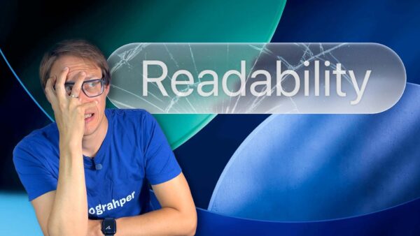
Apple’s Liquid Glass Shatters Typography

Roast my Site! Live Web Accessibility Audit with Expert Mina Nabinger
Talk4

Web Accessibility for Designers with Mina Nabinger

Open Dyslexic: Why these fonts fail
Typography5

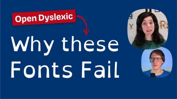
Dyslexia friendly fonts: Are they any good?

Designing Accessible Fonts Talk with type designer Eleni Beveratou
Talk2

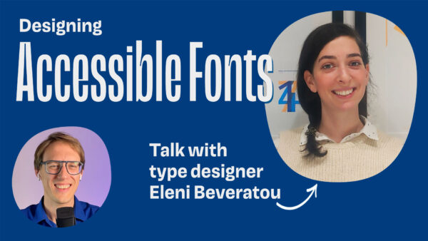
Fonts for Accessibility with Eleni Beveratou

Both buttons fail
Typography11

Fix Color Contrast – Web Accessibility for Text & UI Design

Oliver Schöndorfer

Smarter Typography, Stronger UX

Hey, I'm Oliver Schöndorfer – typography consultant, speaker, and UI designer from Austria. Let's chat about how to boost your UX with better typography. I love sharing insights in my enthusiastic, entertaining style – whether at a workshop, conference, or on a podcast. Drop me a line!

  • E-mail
  • YouTube
  • LinkedIn
  • Instagram
Oliver Schöndorfer, © 2018–2025 | Imprint | Privacy

¶ I love type, but typos seem to love me! If you find one, send it over so I can fix it. The typefaces Piazzolla and Magnet that are used on this site were neither stretched, faux-bolded nor harmed in any other way. Please be good to type.