
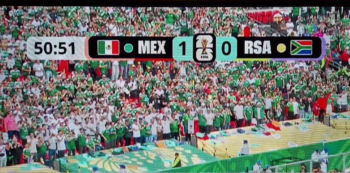
It’s World Cup – and I didn’t really care … until I saw the typeface on TV 😳. Isn’t this a bit hard to read?! This made me go into a rabbit hole that forced me to watch a game (or at least parts of it). So let’s find out what the issue with the FIFA World Cup 2026 font is and what it can learn us for UI design!
The typefaces used for FIFA 2026
All started with Piret, who sent me a message on LinkedIn, asking me what I think about the typeface on the scoreboard. And then I did some research, analyzed their website, social media, even the metadata of their fonts!
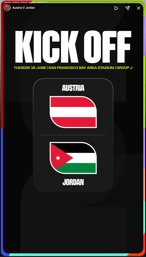
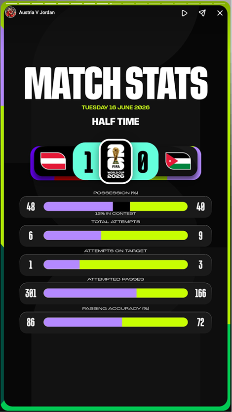
FIFA uses a custom-made typeface for the 2026 world cup, called FWC26, made by Pangram Pangram, as Mat Desjardins said in this interview. behind it is not known. It’s a striking, vivid display typeface, available in various weights and widths. FIFA uses it mostly in all caps, Ultra Condensed, Black. That’s nice for a headline in their striking social media post, conveying a bold, dynamic and athletic spirit. But it is it appropriate for smaller sizes? Or on low resolution screens? No.
Analyzing the FIFA scoreboard
Now let’s go back to the thing that started all of this, the scoreboard in the top left corner. Compared to FIFA’s social media and promotional graphics, here it is not only the FWC26 font. It is paired with Noto Sans used for the timer and the scores. Obviously someone found out that it would have been too challenging on a TV screen.
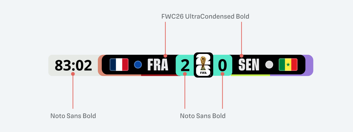
But they still kept the bold and striking typeface for the country abbreviations. This is problematic because:
- Letters are very tight and squarish, the inner shapes tend to disappear.
- This makes them harder to distinguish
- Tricodes for countries are not always that obvious (I learned that RSA stands for South Africa)
- Flags next to it help, but not everyone knows them either
- Plus, this will be seen on a variety of screens and resolutions, so it should be as legible as possible
How could this look differently?
If FIFA had used their custom typeface FWC26 for all the information (like they do on social media) this would have been much worse. I simulated it below, and it’s especially hard when you look at the score. The slashed zero could easily be mistaken for an eight. This typeface is simply inappropriate for information design.
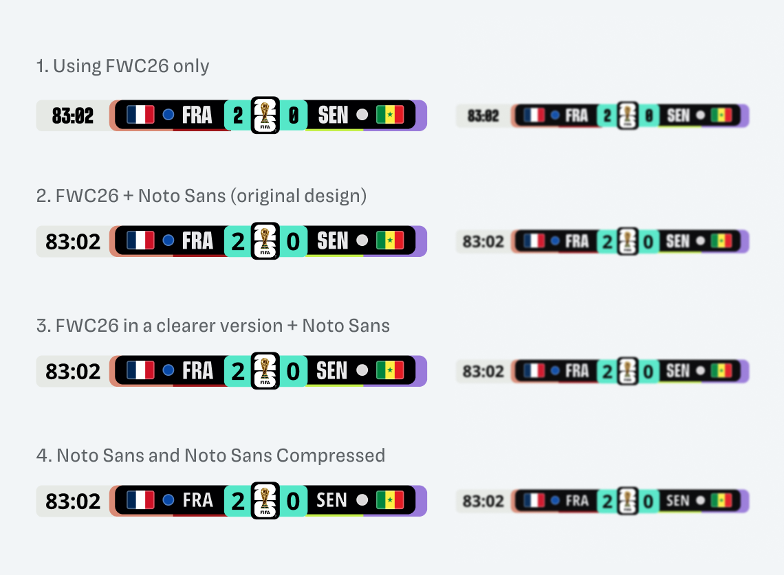
Looking at the original design in version two makes it clear why they picked the Noto Sans typeface for numbers. But they still could have used a wider, and less bold version of their custom font to make it more legible without losing character. I simulated this in version three. By far, version four, that is only uses Noto Sans is most legible. They could have picked this one. But I also understand that they wanted to keep a hint of the typographic branding in there.
What can we learn for UI design?
If you pick a font that is very condensed and black and small it’s a perfect recipe for making things harder to read. It’s not that I don’t like the FIFA typeface, I think it’s a good choice for branding, but there should be a companion version for smaller sizes.
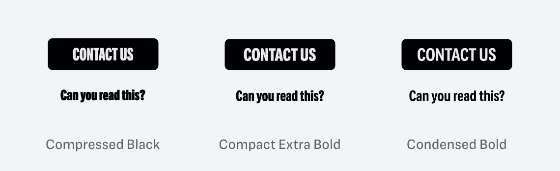
A typeface can also be too contrasting for its size. Which of these examples above do you find most readable? I bet it’s not the one on the left, using the Compressed Black style. So picking slightly wider and not too bold fonts can be very helpful for your design components.
Update about the type designer, June 26, 2026: I attributed the type design of FWC26 originally to Alistair McCready from the New Zealand based foundry Monolith. When editing my video, I double-checked and could not verify it. McCready designed the custom typeface FIFA Sans, which I found out from the web font’s metadata.
July 8th – thanks to Peter for pointing me to an interview where it is mentioned that Pangram Pangram is behind the design of FWC26.
Update about Noto Sans, June 29, 2026: In earlier graphics and the the video, I mixed up Noto Sans with Open Sans. But it’s not that problematic, since Open Sans is based on Noto Sans and the numerals are identical.
Any more typography fouls that I should know about? Let me know, as I’m preparing a video about it. Until then enjoy the World Cup if you watch. I’ll only watch it to complain about the type 😉.
Thanks Oliver, love this! I hope you’re going to look at the typography on the jerseys next! Slightly connected – you probably already know this foundry here?
https://sportsfonts.com/
Cheers!
Jerseys is usually the place where legibility and readability go to die 😂. I know Christoph Koeberlin, the man behind it, but I did not know that he created a specific branch for this! Love it! And so necessary given the horrible examples out there.
Over the last several months my vision started getting blurry. In simple terms, the thin capsule behind the artificial lens becomes cloudy over time, (posterior capsule opacification, which the ophthalmologist described it a “waxed paper behind the lens”) and the YAG laser makes a small opening in it so light can pass through clearly again. I can see fine again, but before the laser procedure, I had a very hard time reading descriptions on Netflix. Forget expert panels or reading comprehension tests to ascertain readability and legibility. The best test for readability and legibility is by those whose reading is less than 20/20. Your examples blurred to simulate lower resolution screens also serve to illustrate what it may look like to those with less than perfect vision. You don’t know what visual acuity is until you lose it, and if you’re lucky enough to regain it as I dd.
Yours for better typography, Steve
Thanks for sharing that, Steve! Good to know that the blurry vision simulation is close to what you experienced and happy to hear that you could regain visual acuity again!
Oliver, this proves time and again that your job won’t be replaced by AI any time soon. We will need critical thinking and a discerning eye forever. Typefaces are everywhere, since they’re a form of omnipresent, written verbal communication. Now, run Forest, run!
Haha, thanks Jana. Happy that AI won’t replace me here 😉.
In top right graphic, it is also hard to tell the team kit colors as just a tiny band of color to the side of the flag and if team wearing white it blends with the white in the timer part of graphic.
That’s true, this could also turn into a problematic edge case.
Your updates are in the future? July 26 and 29, 2026? ☺️
Haha, I’m from the fuuuuuture! Thanks, Mia, fixed it!
Where did you find the official font? I really need it for a recreation of the scoreboard. Really nice post btw!
Thanks, Chris! Simply Google FWC26 font. You will find it 😉.
Excellent Content!!!
Which font do you use for the headline, I searched but couldn’t get it.
You mean the headlines in my blog? It’s Magnet Headline by Inga Plönnings from Frere Jones Type 😊.
Thankx a lot!!
I noticed the same readability problem when watching the broadcast: the score graphics looked cramped at a distance. Good point about testing type on a TV-sized screen, not only on a design monitor, and carrying that lesson to UI work.