Recently I had the honor to speak at the wonderful pitercss_conf in St. Petersburg, Russia. My talk was about Web Typography and also covered the proper use of punctuation marks, like quotes and dashes. I wanted to make it as useful as possible, for the mostly Russian participants, so I researched the local typographic conventions and keyboard shortcuts you can now find in this article.
Please bear in mind that I can neither speak, nor write Russian. I researched this for my talk very precisely and checked the results with local typographers. But everyone can make mistakes, so if you find an error, please point it out in the comments and I will correct it.
Quotation marks in Russian typography
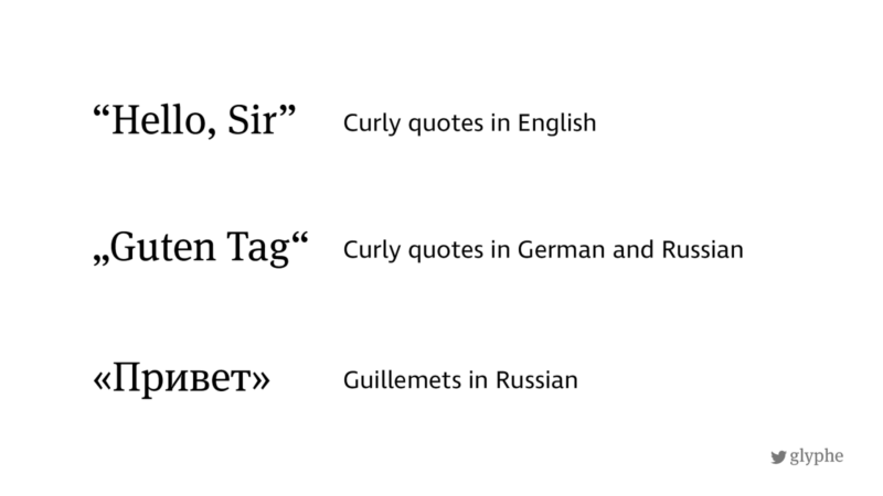
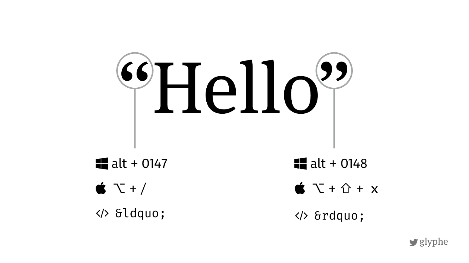
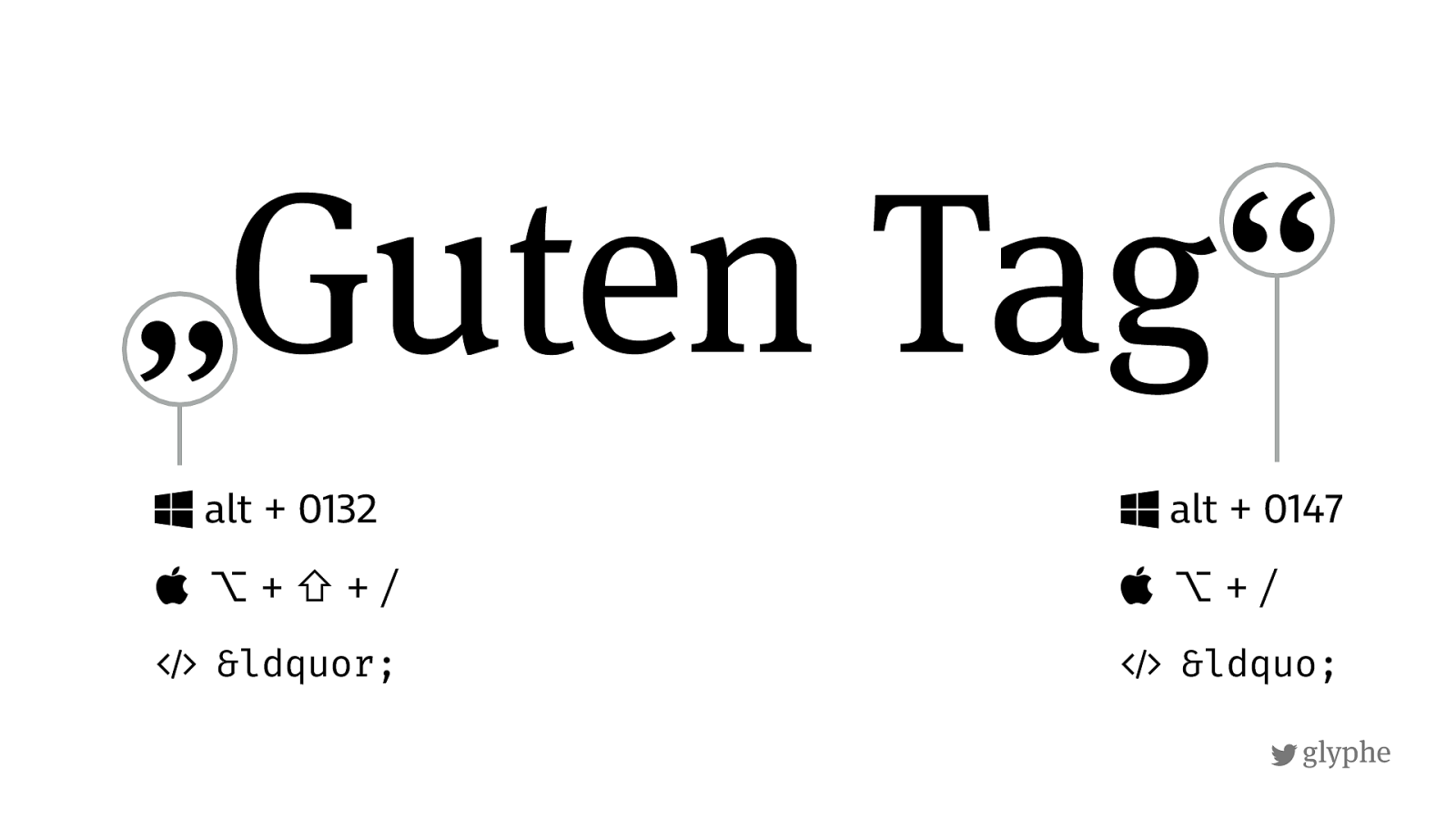
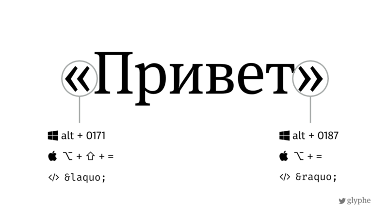
The typographer’s choice for quotation marks in Russian are the French «Guillemets». For nested quotes, it will be these „curly quotes“ (opening on the baseline and closing on top, in German these are the primary ones). The following images show you the shortcuts for Russian keyboards, find those for English and German keyboards on Typefacts.
One interesting thing I found out about the Russian language is, that when direct speech starts on a new paragraph, dashes are used instead of quotation marks. Which brings us to the next point.
Dashes in Russian typography
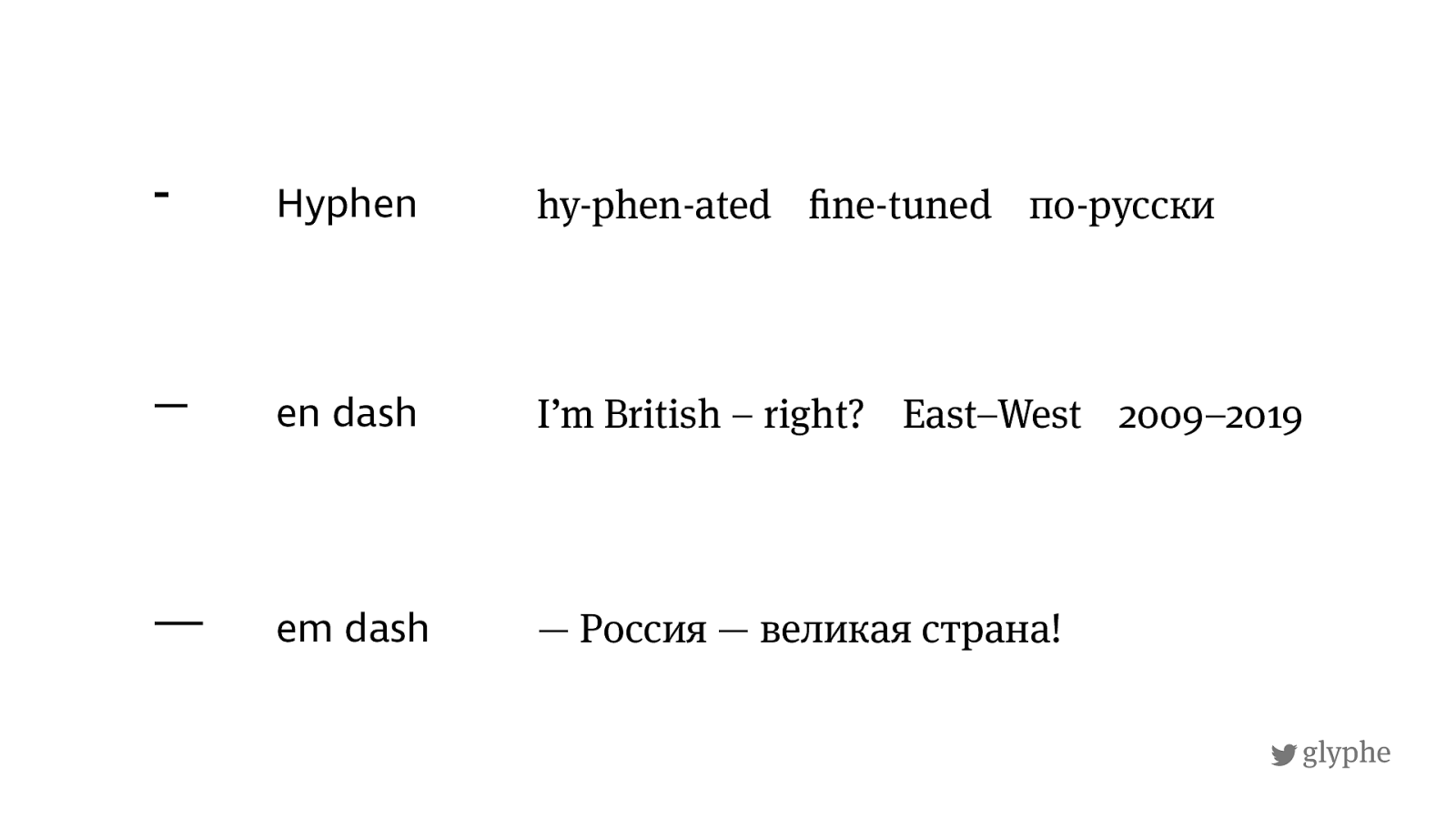
There are three kinds of dashes used in Russian typography:
- The short hyphen – for combining and hyphenating words
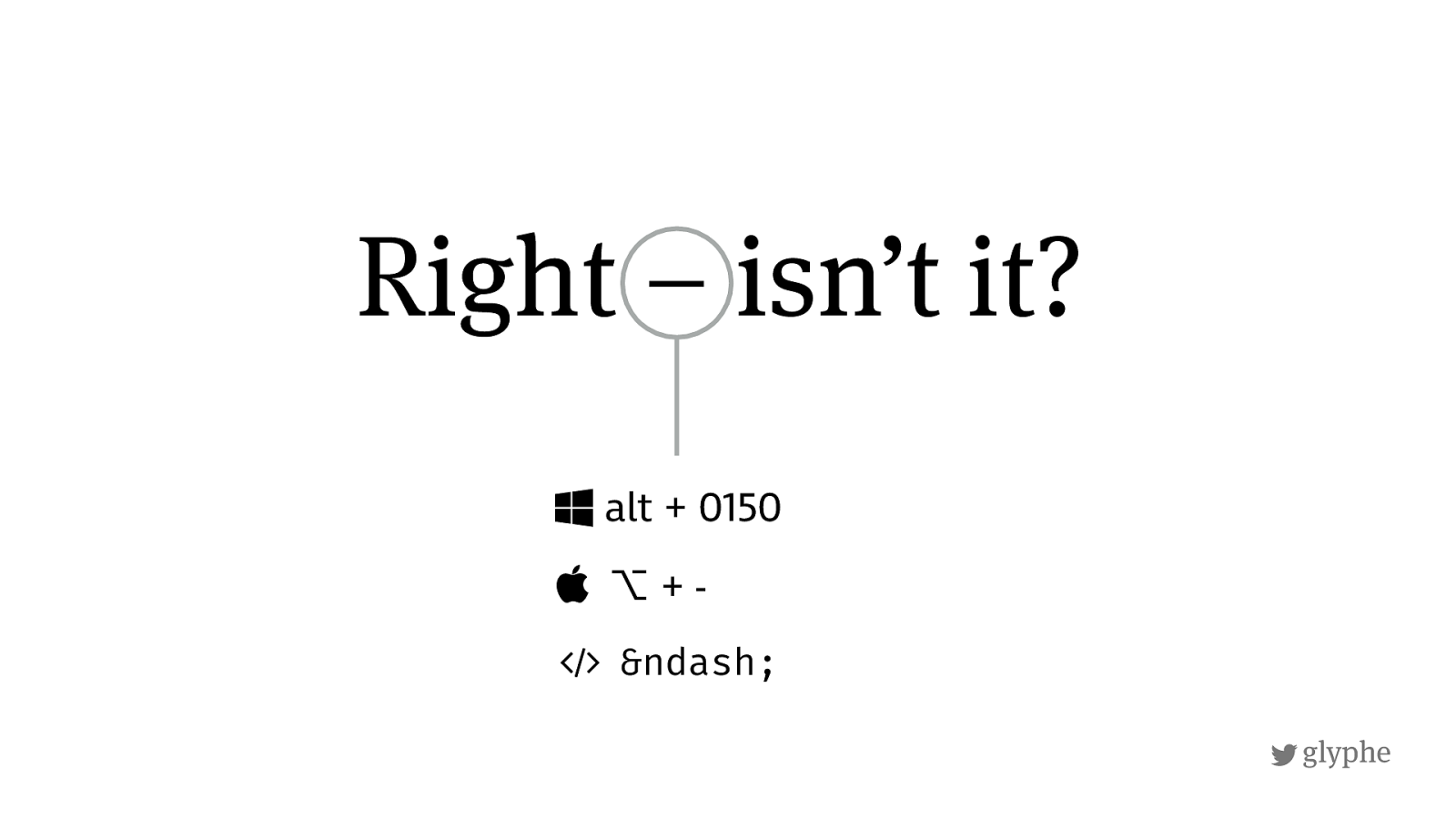
- The longer en dash – which is rarely used in Russian typography except for ranges of numbers (like 2008–2010)
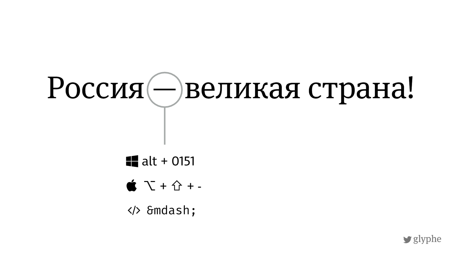
- The very long em dash — which is the dash used in Russian with spaces before and after.
Even though I could not read it, I saw the em dash a lot in Russian. Besides the use for starting quotes and marking an abrupt change of thought in a sentence, it is also replacing the word “to be“. Being used to the shorter en dash in German and Britsh typography, the long em dash looks very disruptive to me, but I guess it’s just what you are familiar with. Please also pay attention to the spaces around the em dash. This might be pretty irritating to people used to American writing style where there are no spaces added to an em dash. And yes, also Russian typography there is a fourth dash – it’s the minus, but you would not need that expect in you text except for mathematics.
Resources
If you want to dig more into it, here I have some resources for you:
- My talk “You Can Save Web Typography” for pitcss_conf in June 2018: Download pdf slides or browse on noti.st
- An excellent explanation of the different dashes by the Russian Designer Artemy Lebedev, also covering the minus (in Russian, I read it with the browser translation)
- A talk about Russian typography by Roman Prudnikov: Russian Video on YouTube and Slides

Hello. I’m not a Russian, but a long, long, long time ago I used to learn that language. I’m sure there is not a letter “e” with accent over it in cyrillic alphabet (at least in the Russian alphabet). You might find it in some language learning books to indicate where the accent is, but there are not letters with accents like in French or Italian. You might find a letter “ё” (pronounce “yo”), but still that’s not an accent sign.
Hey Błażej, thanks a lot for your valuable feedback! I googled “привет” and could not find the accent on the é either. Fixed the graphic.
The accent is not an accent, but a mark used to indicate the natural stress in the word. This is intended to assist foreigners in proper pronunciation and is not a feature of the language.
I see … thanks for the elaboration, John!
You still have one example of «приве́т», in the first, smaller example. (I was unable to type it on a Russian keyboard, so I tried to copy & paste in an example from wiktionary, where they do include those accent marks.)
Thank you, just fixed it 😊