Jan sent in his tech blog for typographic review. In this article and video I cover how to handle monospace alike type choice by pimping the headings, the paragraph’s line height and spacing.
TL;DW For headings in monospace and monospace alike fonts reduce the letter and word spacing. Only use a few different font sizes. Longer lines need more line height, and relate your margins to the line height.
Three things about monospaced fonts
If you don’t want to dig into the details of this review, there are just three things you should know about when you use monospaced fonts for body text.
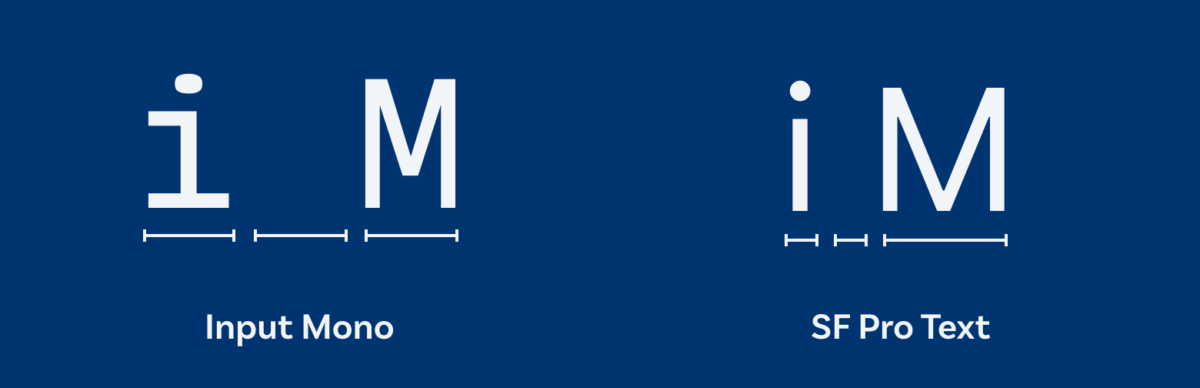
1. They need a lot of space since every character is the same width, compared to a classical proportional typeface, where every character has a different width. Letters like the i seem very light and an M become very dense. To compensate for that you could choose a narrower width or a proportional font that seems like a monospaced one (like Jan did in his design).
2. Different sizes seem unnatural with monospaced fonts. From typewriters and code editors we are used to seeing monospaced fonts in one size (you can see this in the example below). So try to set them in as little different font sizes as possible. If you use them in more than one size, continue to the final point.
3. Problematic word spaces in larger sizes let headings fall apart. The word spaces are about double the width of a regular proportional typeface. So reduce them in lager sizes (20 to 24 px upwards) and also lower the letter spacing to make the line of text more compact.
The design briefing
- The key audience are software developers.
- Their top 3 values are curiosity, sharing knowledge, the joy of tinkering with technology.
- The atmosphere of the blog should be technical, elegant, clear, focussed.
The current design
Jan already did a great job on the current design. The feeling his type choice evokes fits the atmosphere he wants to create. He uses the monospace alike typeface Input Sans. I write monspace alike, because it struck me after recording the video, that Input Sans and Input Serif actually are not monospaced (Input Mono is). But Input Sans and Serif are designed with the idea of a monospaced typeface. This means it has generous spacing, especially at the word space, large punctuation and easily distinguishable characters.
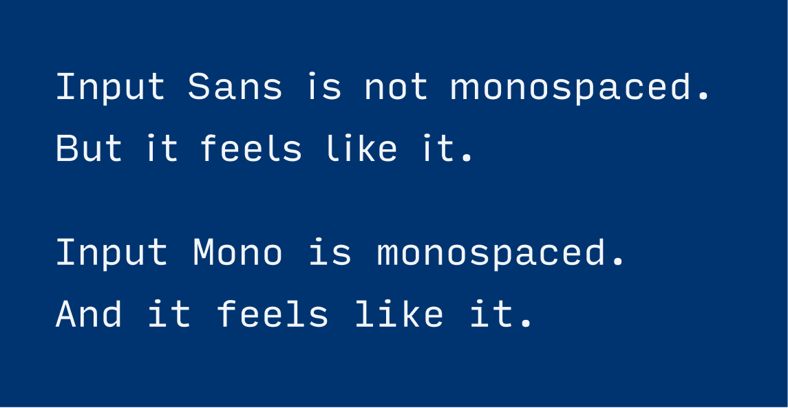
So choosing this proportional typeface that seems like a monospaced one is a smart move, Jan! A real monospaced font is less pleasant to read for longer text and needs a lot of space. Jan also picked the condensed style of Input to compensate for that.
I also appreciate that a lot of attention to typographic detail went into the web design as well. Like at the superscript “th” in the date, or the gorgeous footnotes on the left side of the text column.
Where I see some room for improvement are in the spacing and font size of the heading, and the line height to get out even more of this already very well done blog design.
Pimpin’ it
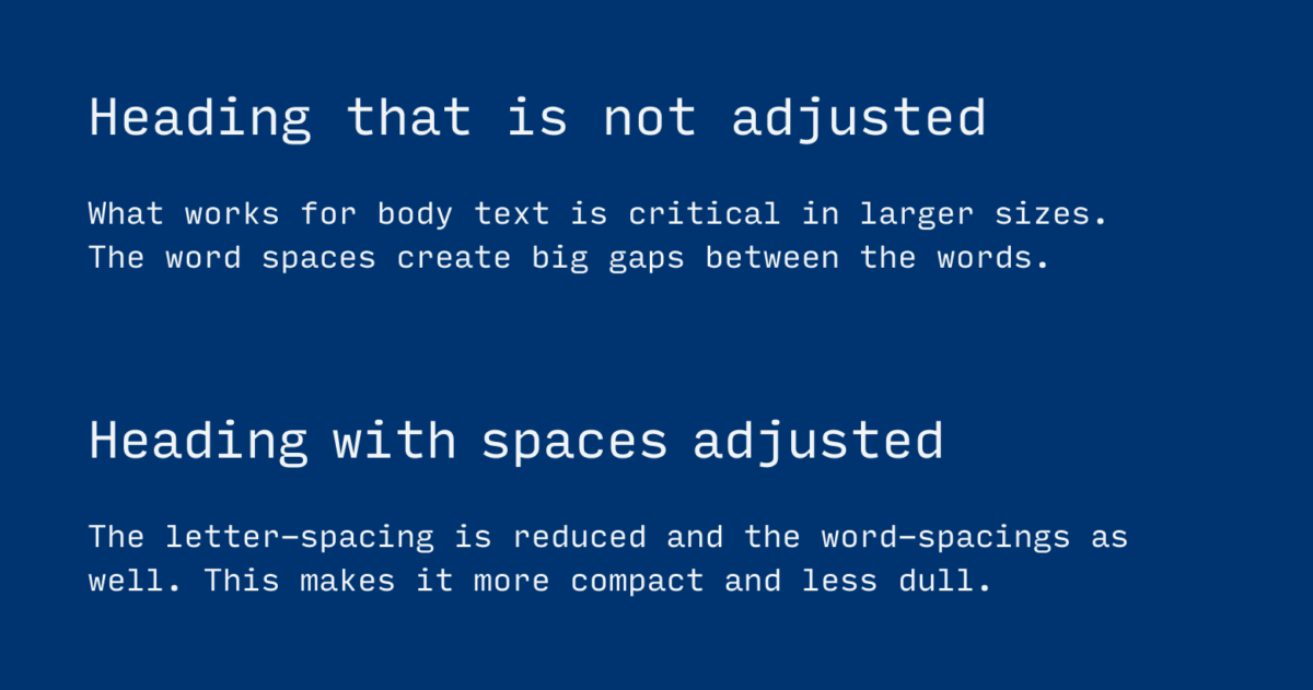
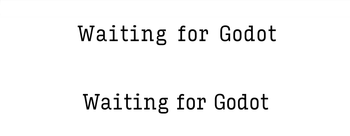
Reduce the letter spacing for large headings
Many fonts at display sizes (20 to 24 px and above) get a very loose spacing, and monospace and monospace alike fonts especially. The letter spacing should be reduced to make them appear more compact and connected. So I lowered the letter spacing even more than Jan already did from -0.032em to letter-spacing: -0.5em.
Reduce the word spacing for large headings
Especially monospaced fonts come with a relatively wide word space, compared to other fonts. When they are set in larger sizes this is problematic, since the words are not that closely connected anymore. To get them closer together I reduce the word spacing with word-spacings: -0.1em.
Use less different font sizes
The subheading is not set in the same size as the heading but larger than the body text. This creates a rather noisy impression. To harmonize it, I reduce the font-size to visually the same size as the body text (1.1rem).
Increase the line height for longer lines
The longer the lines, the larger you line height should be. The ideal line is about 60 to 80 characters long, and Jan’s lines are around 80 characters long. Originally the line height is set to line-height: 1.57;. It is quite low for that long lines of text. Setting it to a factor of 1.8 makes it lighter, easier to read and gives it a cleaner look.
Adjust the spacing in relation to the line-height
It’s a proven technique to use the line-height as a base size for your vertical spacing. This means factions or multiples of it could be the margins for your paragraphs or headings. Jan already considered that principle in his original design. But since I changed the line height I have to apply this in the reviewed version as well. Additionally, I move the heading a bit away from the body text, to let it appear more decided.
Clearly align the layout
It’s not so obvious if the design is left aligned, but it definitely is not centered. I suggest deciding on one approach and choose to center it.
Bonus tip
Scale up the whole text at a certain breakpoint to 120% or even larger. This will make it easier to read, when the blog is browsed full screen on a 27″ monitor which probably is positioned further away from the viewer.
The result
I think the pimped version gives it an even cleaner and more confident look. The heading is more of a unit and the body text with the increased line height is friendlier and easier to read. Happy to hear your thoughts in the comments blow! Here you can submit your design for a free Type Check.
Hello Oliver,
I find this episode of Pimp My Type very interesting. I put the before and after side by side, and I initially felt like the paragraphs in the before were more pleasing to my eye. Once I started trying to read, however, I definitely think the after version is easier to read.
Where I disagree with you, and you know I’m not a designer, but I am old and remember physically typesetting newsprint and magazines, is in the subheading. I think I agree with all your choices there except for the six words to three words in the two lines. I much prefer the original look with five then four. I wonder why you chose that. I know why my mind and eye prefer the five-four—I have a bit of CDO—which is just like OCD, except the letters are in alphabetical order.
Hey Dexter – I agree it seems more structured to have lesser words in one line, but as a system it works better with that visual relation to the size of the body text. Had to laugh at the OCD part 😉