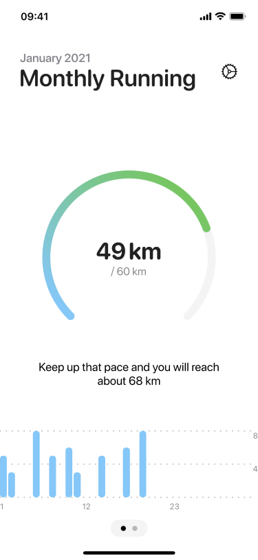
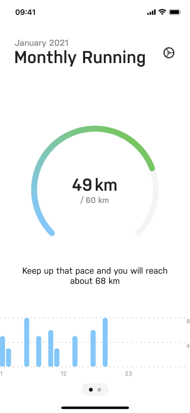
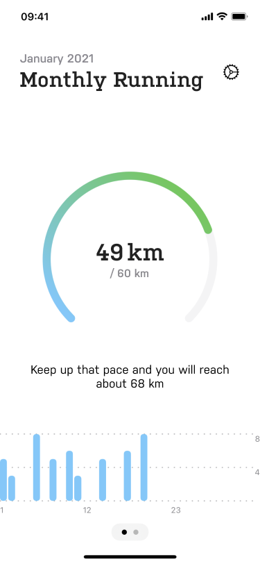
I asked you to send in your web or app designs for typographic review and – among others – Manfred did! He submitted his workout goals app Res and in this first episode of Pimp my Type Review I share some microtypographic improvements and ideas for alternative typefaces to make it more unique.
The Design Briefing
- The key audience are casual, sporty people.
- Their top 3 values are clean, engaging, and fun.
- The atmosphere of the app should be fun and competitive.
The Current Design
It is a clean and minimalistic design that fits its purpose and target audience. It uses the iOS default typefaces SF Pro and SF Rounded. This is neither wrong nor bad, since it lets your product easily integrate into the given platform. On the other hand there is some unused potential to make it stand out, especially with it’s reduced design.
Microtypographic Improvements
- Avoid too harsh contrasts by not using solid black on solid white. Go for a dark gray (like #222) to make it easier on the eyes.
- Bring the figures and the unit (49 km) closer together to get a more compact, united appearance.
- I use this website to copy whitespace characters.
- Use case-sensitive forms to align the forward slash vertically (/ 60 km)


Alternative typefaces
I use the monolinear, geometric sans-serif Nudista by Tomáš Brousil for a more edgy and less clean look. To make the typography even more distinct I combine it with the slab serif version Kulturista which creates a playful atmosphere. As a result it’s more playful and unique, especially in this very reduced user interface.


What do you think about my font selection and microtypographic adjustments? Leave it in the comments below! Here you can submit your web of app design for a free typographic review.
