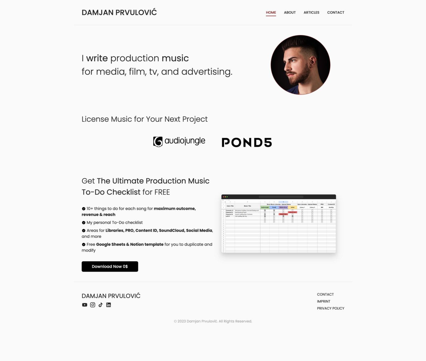
Composer Damjan submitted his site for typographic review. In this short, dramatic video 🥹 and article, I address the home page and give practical tips, so that it becomes clearer and more aligned.
What’s problematic
It lacks focus. What is most important? The name on the top left, the big heading, the photo, the logos of audiojungle and Pond5? All these elements compete against each other, not guiding the viewer’s eye.
It lacks alignment. Most things are left aligned, the logos of the audio platforms are centered tho. Also, the unordered list with the check marks seems cluttered.

My suggestions
Make bold text bold. The heading is set in font-weight: 300, but the words “write” and “music” are set in font-weight: 400. This is too little contrast to really stand out as being different. By setting the whole first line in font-weight: 700 it becomes more engaging and clearer.
Left align the logos, and make them and the text in that section smaller. Additionally, I suggest reducing the font size of the name on the top left. This all lets the title stand out more and create focus.
Tidy up that list. By increasing the size of the icon and pulling them out of the text, it is easier to skim. I made the heading of the list smaller, so it is the same size as the one above the logos. And bold text should be clearly bold again. Finally, when the font size of the list is increased, it will be more connected to the adjacent heading.
Before and After
After these improvements, the homepage of Damjan’s website creates a clearer, more focused and professional impression.
I had a lot of fun using Demjan’s music when editing the video, so thanks for providing it!
Do you want typographic feedback for your project? You can submit it here!
