
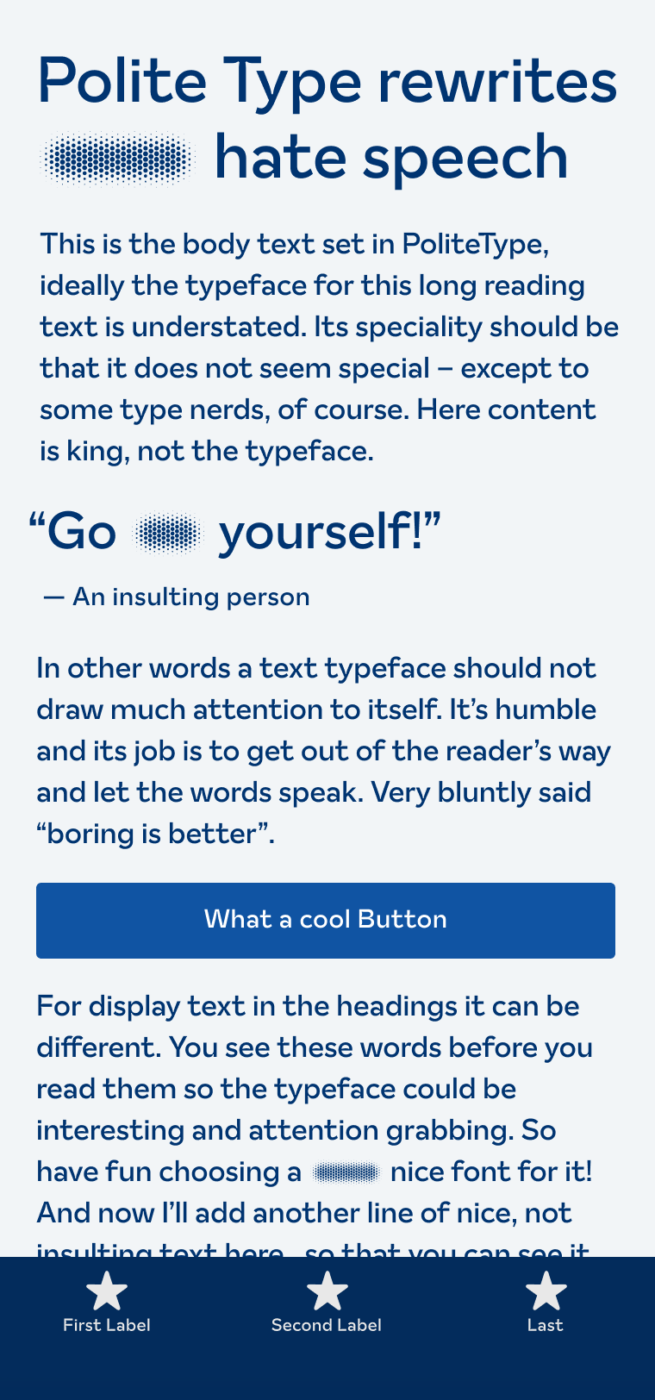
My thoughts on The Polite Type
The typeface I present to you this week is very different. Not necessarily due to its design, but because of the intention behind it and the and programming. The Polite Type is an open-source font that rewrites hurtful words, replacing them with more inclusive ones. It is meant to be used for educational purposes, maybe at schools or by parents, as a way to approach this issue and to create a safe space for discussion. Before I dig into the mechanics, let’s take a look at the design.
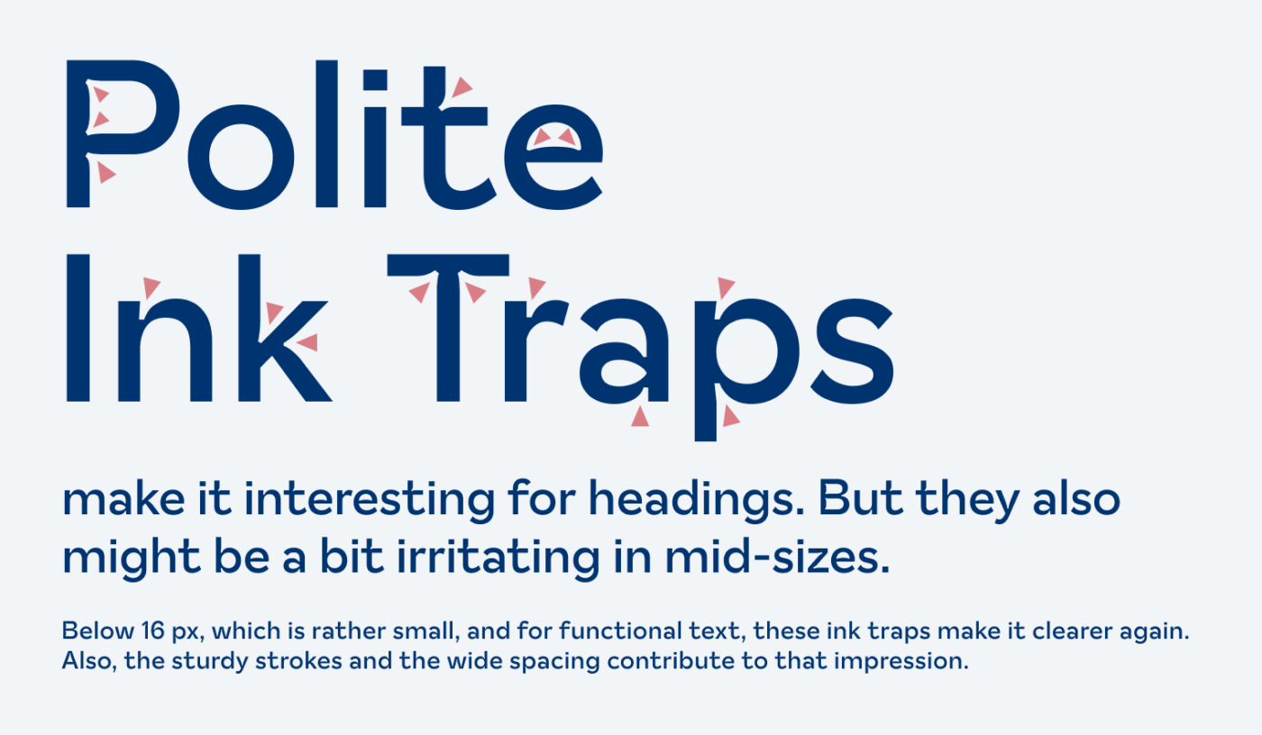
The Polite Type is a geometric sans-serif (like the last one), but with a contemporary touch. This is due to the fashionable ink traps, sturdy strokes and large x-height. The overemphasized ink traps make it interesting for headings, and easier to read in smaller sizes. For the in-between-sizes, it’s a bit questionable (more fonts with stylistic ink traps).
The typeface uses a catalog of slurs and insults and rewrites them or blurs them out. The people behind the project claim, that the library of words deemed hurtful has been put together in collaboration with people from different origins, religions, world views and sexual orientations. And they also invite people to participate and translate the project to different languages.
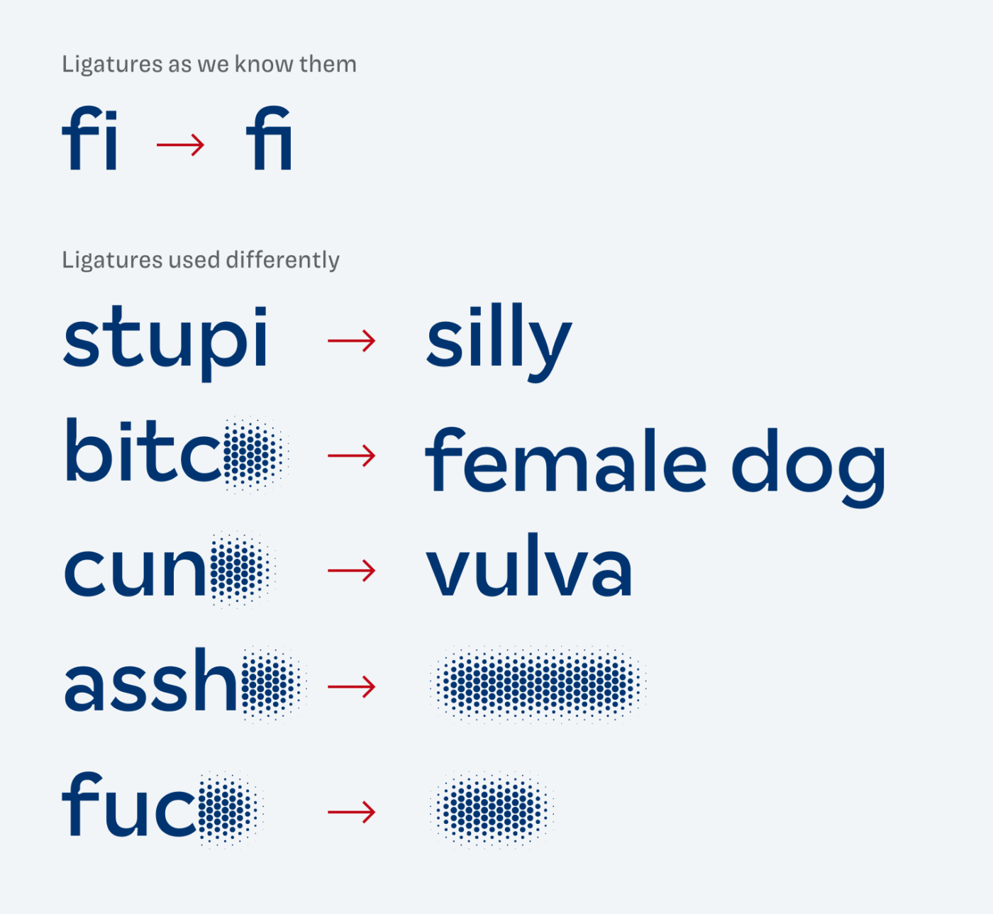
The technology behind this is nothing new. The Polite Type uses the OpenType ligature feature differently. You might be familiar with it from the common fi ligature example (see above). This font is the first one I see using this in regard to the content. So when you turn ligatures off, the replacement won’t work.

Of course, The Polite Type can not solve the causes of hate speech. But I think it is a fascinating way to educate in certain situations and encourage people to reconsider what they are writing. An interesting use case could be a comment section or a messenger service. Regarding the design, it definitely would work in those applications.
What do you think? Is The Polite Type something for an upcoming project, or do you have a font recommendation? Tell me in the comments below!
The font is interesting from a technical standpoint. For me, I don’t care for its aesthetics. As for the design philosophy, it seems ironic that any kind of art, but especially font design, would propagate the idea that censorship can bring about change.
Interesting argument, Scott. In would rather not see this as an art discipline rather than a software feature in an unexpected situation. Or at least interesting publicity for the topic of hate speech.