
My thoughts on MD IO
Here and there I’m drawn to monospace fonts. Not because I like to make a big deal about my coding font – I actually don’t really care that much, since I rarely write code. I like them for the technical, rational and sober feeling they create. And I really love one, when it come with a twist, with something that breaks out of that mechanical, dry appearance. This is why I picked MD IO by Mass-Driver.
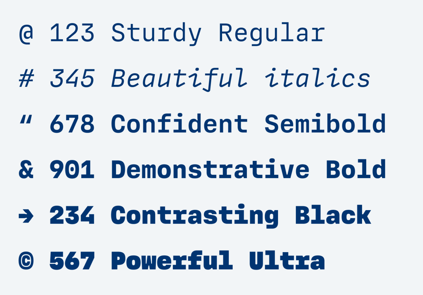
MD IO is still in progress but with a complete character set, and available on Future Fonts. It comes in 6 weights, and for now only in Regular Italic. And this style also stole my heart! It looks like bent wire, very linear and still engaging with the long serifs (and the preview of Bold Italic is very promising, too).
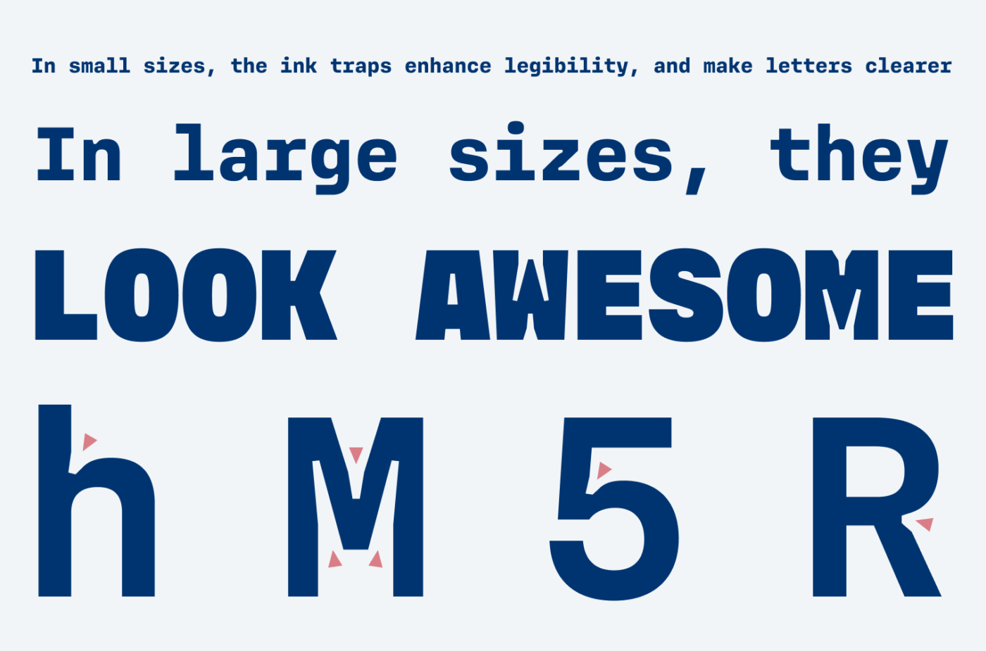
The ink traps are the part that give MD IO a warm, funky, even fuzzy feeling, by breaking the straight, and sober lines. In most cases they enhance legibility in small sizes, in some cases they are stylistic decisions. Read more about ink traps in my review of Right Grotesk.
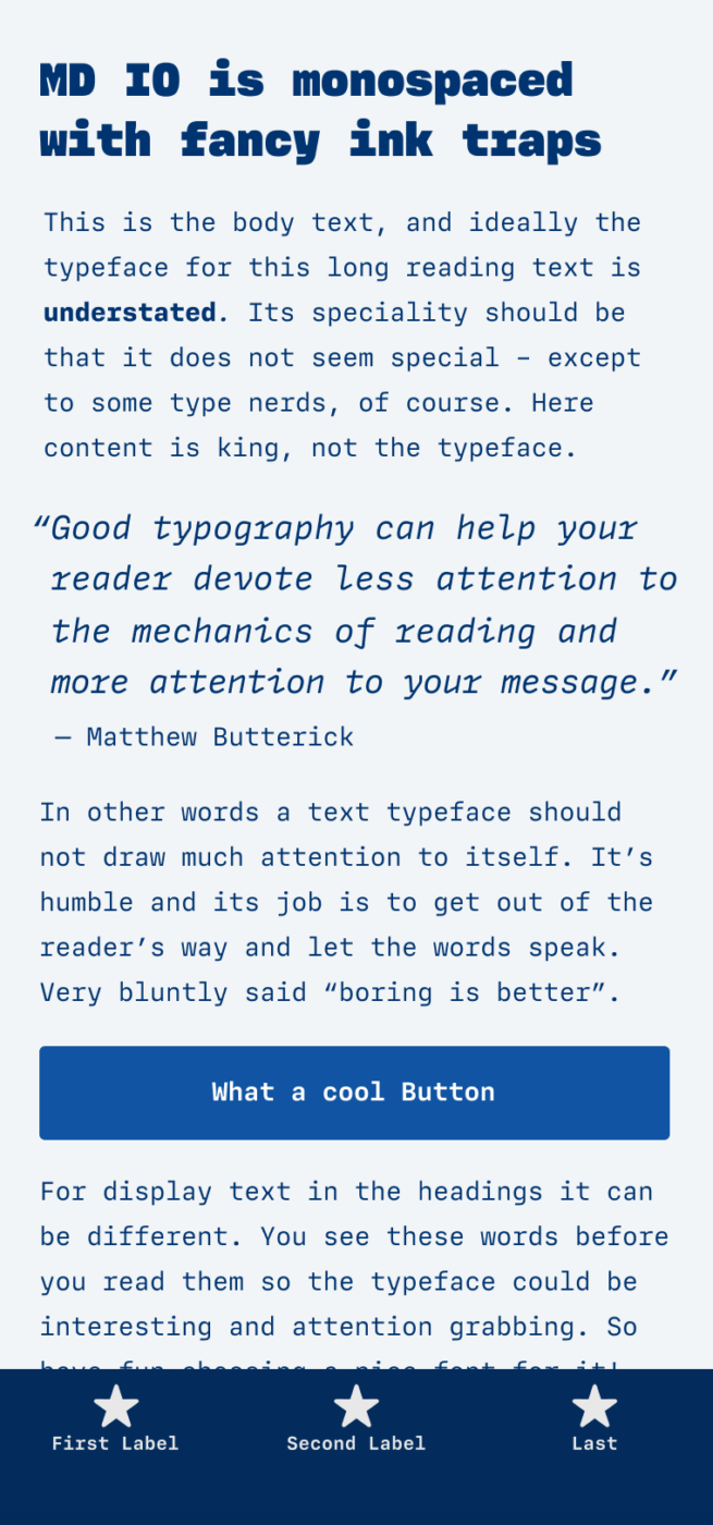
Overall, I could image it in a user interface, where the text does not get too long, or for a little running text. As always with monospaced fonts, they don’t work for display sizes, because the word space becomes too big (you can see this in the example above as well, the sentences almost fall apart). So setting it at larger sizes will only work for some characters or one word, maximum.
What do you think? Is MD IO something for an upcoming project? Tell me in the comments below!
Oliver,
I look forward to your emails each Friday like it is Christmas morning. Thanks for the information about ink traps. I didn’t know that term.
Linda
Oh, Linda! Thanks for sharing that with me! You are too kind 🤩!