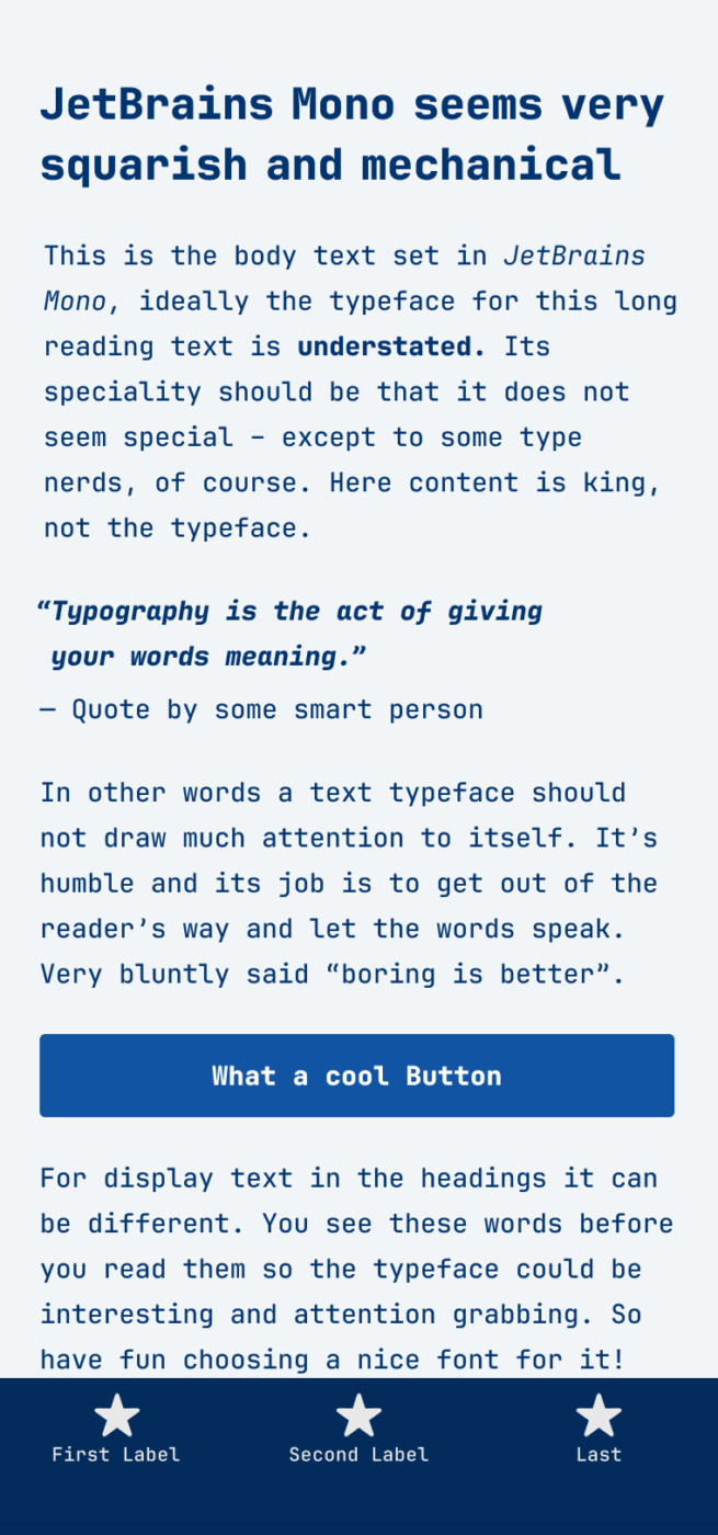
My thoughts on JetBrains Mono
This typeface is clearly tailored towards developers, providing them with highly distinctive, and tall letter shapes for coding. Traditionally monospace fonts were mainly used on typewriters. On early computers they were used due to their limited graphical processors. For coding and text editing monospaced fonts are still popular, since they make it easy to compare characters and see errors easier. Or it’s just something we are used to see in these applications.
The vibe JetBrains Mono creates is more technical with its squarish shapes. Since every character has the same width, monospaced fonts don’t create the compact word shapes like other fonts. This also limits their usage. Like every monospaced typeface, it works best set in one, maybe two sizes (one for body text, one for headings). However, they work for reading text, but I’d suggest not using them on very text heavy sites and definitely not in large sizes where they might fall apart.
What I like is, that JetBrains Mono has a true italic style. These means it’s not only an angled version of the upright, the shapes change (e.g. the upright two-story a turns into a one-story version). The beautiful landing page highlights this and other features. If you’re interested about the history of monospace fonts, check out Episode #37 of The Weekly Typographic Podcast (stating at minute 24).
Recommended Font Pairing
If you are looking for a similar typeface for body text, choose geometric Sora. For interesting headings, pick rational Belarius.
- Copy
- UI Text
Learn more about pairing typefaces using the Font Matrix.

