
My Uai Font Review
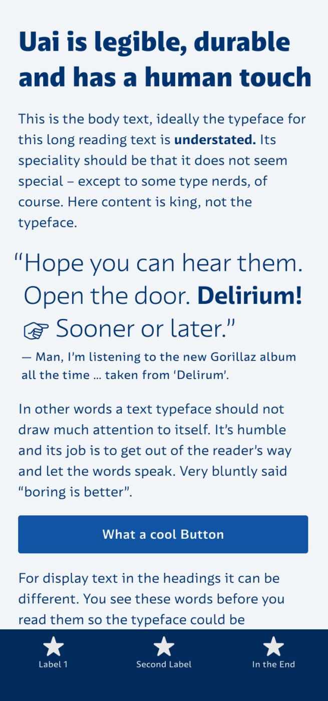
Typefaces specifically made for user interfaces often feel a bit techy, cold, and soulless. But not this one – Uai from the Brazilian Naipe Foundry is very functional but still has a human touch. Distinct letter shapes ensure ideal legibility, while its open forms – like the lowercase ‘e’ and ‘c’ – make it readable even at tiny sizes.
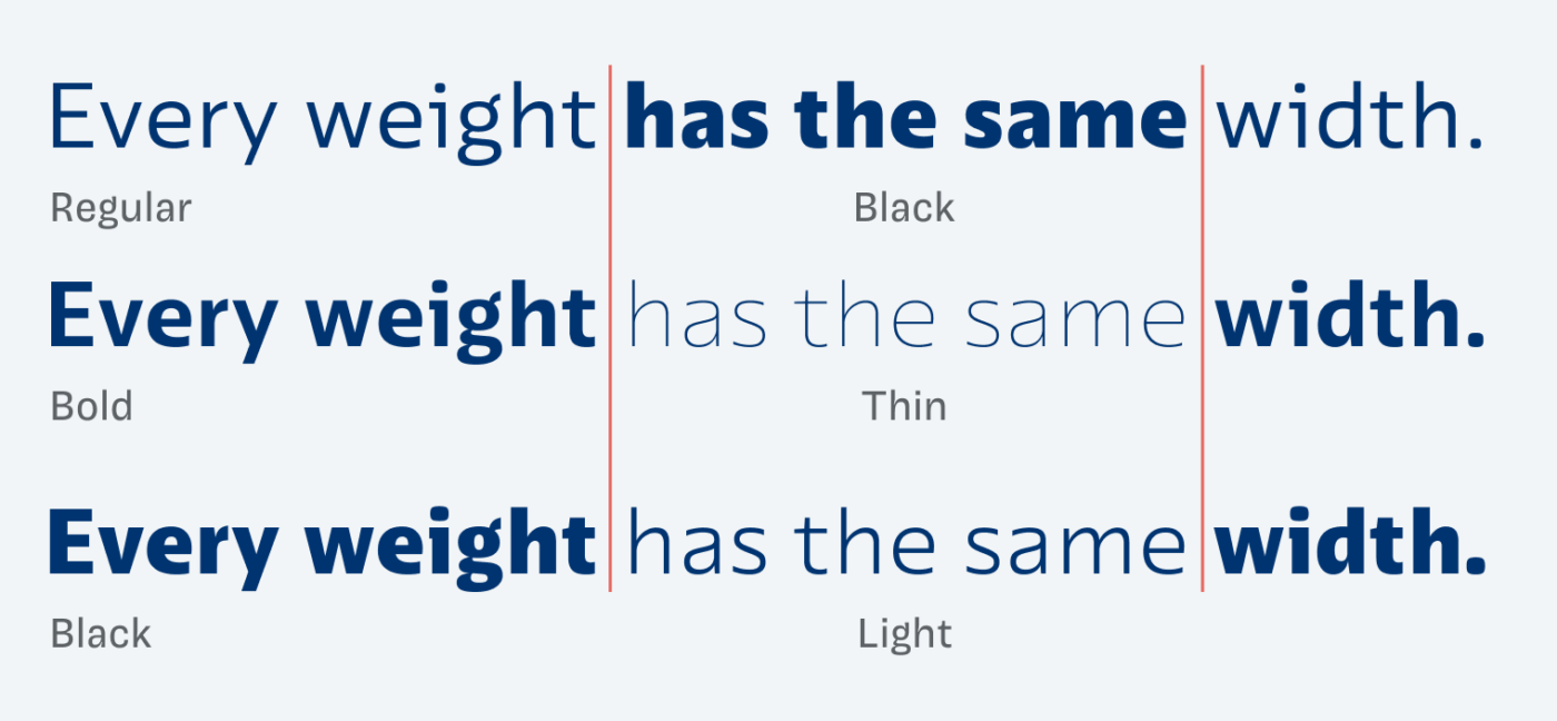
What I find most interesting is that Uai comes as a uniwidth or multiplexed design. This means it uses the same amount of space in every weight, from Thin to Black. As a result, you can change weights in hover states without a jumping effect or reflows. However, this also requires setting it a bit tighter in larger sizes and lighter weights – otherwise, it takes up a lot of space. Even though I feel that Uai works best at small sizes, it still looks interesting enough in headings.
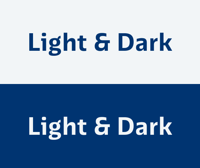
Another lovely detail is that there’s a distinct style for light text on dark backgrounds, called Uai Dark Mode. When using the same weight on a dark background, it appears thicker. This is because of the so-called Irradiation Illusion. Uai Dark Mode compensates for that by making the weight slightly lighter. This way it appears optically even next to the positive text. Not many fonts have this.
Uai also comes with some stylistic alternates and many other cool features, like perfect vertical alignment in buttons – Graças a Deus! – which makes it really fun to explore the mini site.
Font Pairings with Uai
Uai is a dynamic, linear, sans-serif typeface. Here are some interesting font pairing for body text or headings.


Learn more about pairing typefaces using the Font Matrix.
Is your UI waiting for Uai? Tell me your thoughts in the comments below!
Wow! $250 for a font that’s an edge case for display AND text with no italics?
So ugly 😣 little “p” looks stupid and “a” lazy, oh Gosh, I can’t 😩