My thoughts on Supermarker
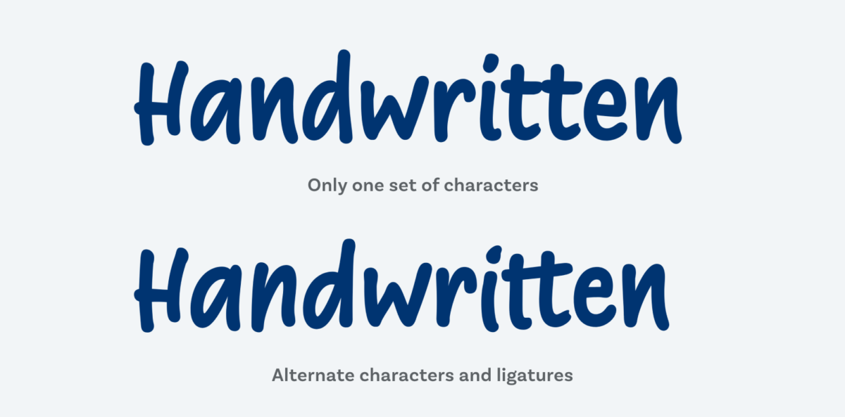
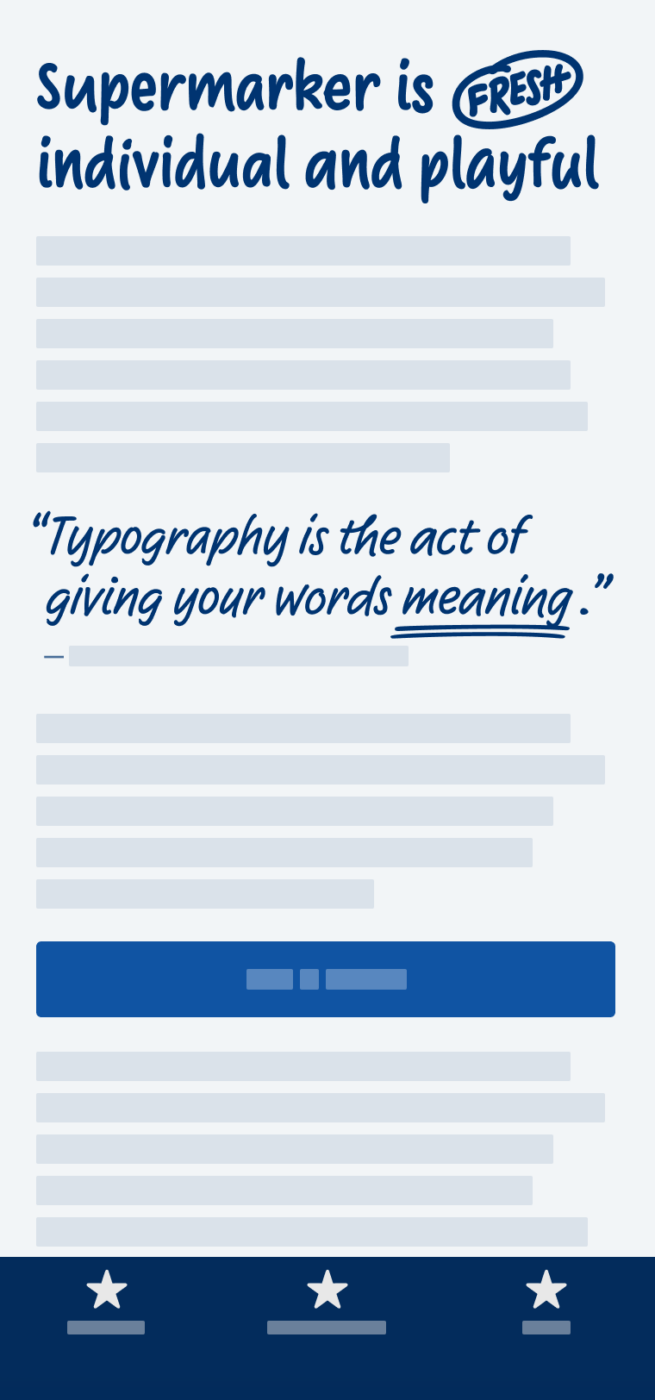
Supermarker by Ulrike Rausch is my recommendation, when it comes to convey the realistic impression of handwriting. It’s super friendly, super approachable, super authentic, Supermarker (wow, I should do the copywriting for a foundry). It’s so super because it solves a problem almost all fonts in this category have. They want to appear intimate, personal, unique, imperfect. At first glance they do, but that illusion is destroyed once you take a closer look at repeating characters and see they are exactly the same. You feel fooled, your anger against the world and humanity builds up, life becomes an agony – just because of a bad font choice! I seem to drift off … anyways. Supermarker cleverly uses OpenType Features to prevent that. Every character has at least three variations, which automatically get swapped, and this makes it seem so authentic. There are also some nice goodies like catch words (see “fresh” in the heading), underlines, and strike through.

If you really want to be unique, it definitely would best to use your own handwriting. But not everybody is a calligrapher and if you need the benefits of perfectly flexible digital text for your app or web design, and still want to create this nice imperfect feeling, go for Supermarker.


Pretty cool that you should mention this font! I have my eyes on it, too, for a comic book project. The aim here is to have a visual style that blends in with the drawings and feels handmade. I haven’t tried supermarker yet (but I will!), but so far it looks promising. Any thoughts on using it for comic book “lettering”? See a preliminary version of the comic here: http://kingdomdown.com/seite-1/
Hey Ben, I am glad you like Supermarker. 🙂
Fontwerk offers free trial versions on their website. So you can just try the font and check how it looks in your speech bubbles.
Very cool, Ben! I think you should definitely try it out. I have no experience with comic book lettering yet, I discoverd this foundry (https://blambot.com) that specializes in typefaces for it, some have alternate charcters, but they seem to be less sophisticated than Supermarker. I’m curious how it will look!
But your current font choice also looks quite decent yet!
Comment for a Ben: I won’t use it for your comics project simply because it’s already a hand-drawn style and you want to create a balance, taking some more “plain”, character-less font. But let’s see what Oliver will say. He is an expert.
For Oliver: Oooo, this one is a rare gem! ReFRESHing. If I’d use it, it would be only one, not the whole family and for a particular project like a Book cover or product’s package. Thank you for always nice Newsletter. You definitely need more establishment in the typographic/design world! Consider coming to Linked In and say hi to me there. I was an interesting typo content the other day but couldn’t tag you because you don’t have a Linked In account.
So happy to read that, Jana, thank you! And also thanks for the invitation to LinedIn, but I’ll let this one pass for now. I’ll keep it to those where my heart is, which is Twitter and YouTube for now.