Join Pimp my Type with a paid membership on Patreon by January 31st, get a free Stornoway style. Big thanks to Alanna Munro for the extra generous support!
My Stornoway Font Review
With its high contrast, elegant flared terminals, and soft, delicate curves Stornoway immediately caught my eye. Given that it’s also available in low contrast, makes it a versatile super family, suited for many different applications. So let’s discover how Stornoway pairs fashionability with utility.
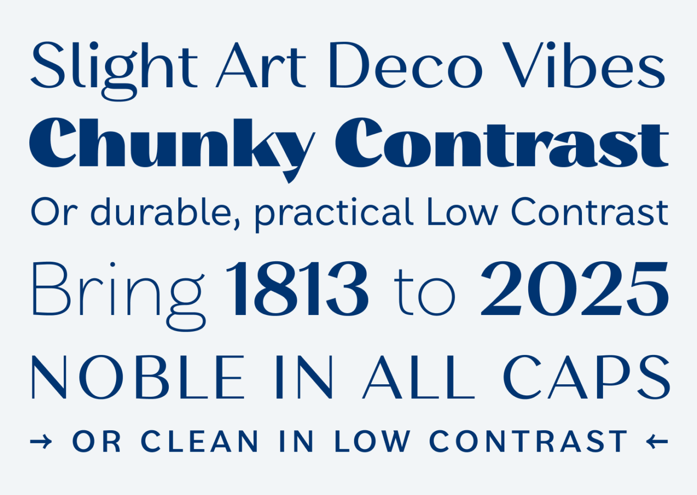
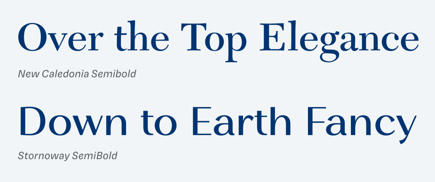
Stornoway is inspired by so-called Scotch Roman faces, 19th-century Scottish serifs known for moderate contrast, sturdy structure, and refined details. Building on this tradition, Stornoway removes the serifs, extends the height and width of lowercase letters, and retains a characteristic contrast. The result is a modern, sturdier reinterpretation of typefaces like Caledonia.
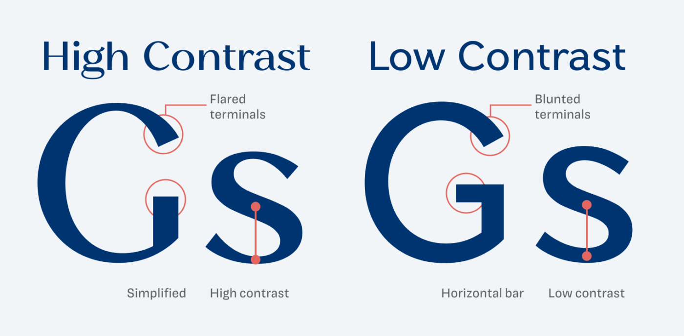
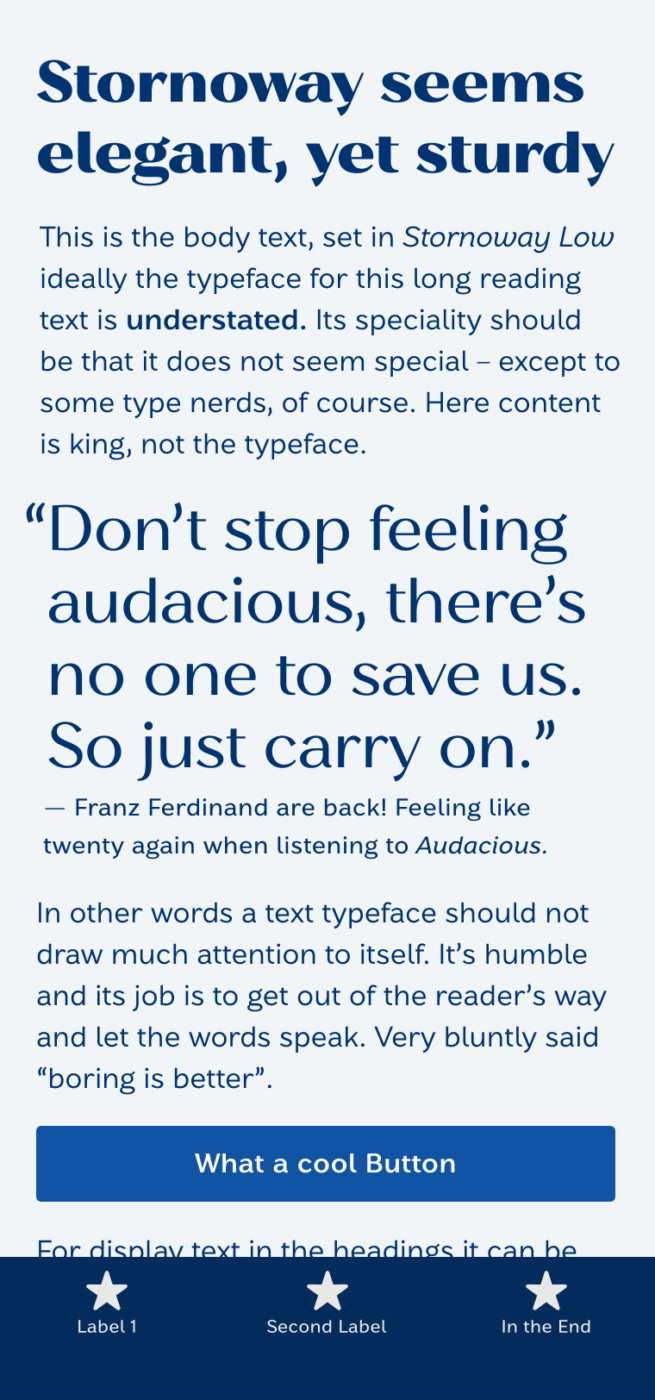
Two of my favorite characters are the uppercase ‘G’ and the lowercase ‘s’. They beautifully show how the typeface got adapted from high to low contrast. But low contrast doesn’t mean no contrast, you can still sense a delicate stroke modulation. It keeps Stornoway Low interesting in less striking usages – like in captions or body text, but without loosing personality.
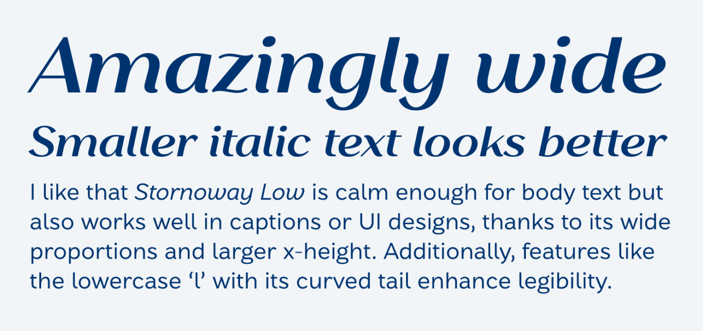
Stornoway’s italics are relatively wide. This is great for body text, but in high contrast and even in large sizes it feels a bit too dull for my taste. With wide proportions and a larger x-height, Stornoway Low works well in body text, captions, and even UI designs. Additionally, features like the lowercase ‘l’ with its curved tail enhance legibility.
The variable font lets you fine tune the contrast, if you feel it does not fit a certain size. It would be interesting to see that feature snapped to an optical sizing axis, so that it automatically gets adjusted. Maybe an idea for a future extension? Overall, Stornoway strikes a balance between historical charm and modern utility. It’s a great choice for packaging, branding, and versatile copy or UI design with a touch of elegance.
Font Pairings with Stornoway
Stornoway is a quite dynamic contrasting or linear sans-serif typeface. Pair it with one of my suggestions below.
- Headings
- Copy
- UI Text
Learn more about pairing typefaces using the Font Matrix.
I’m curious, share your thoughts in the comments! Also let me know if there’s another typeface I should review.

Great find, Oliver! The amazing “Chonky Contrast” style really steals the show, but that extravagance is so well supported by the low contrast styles. “Stornoway” seems like it could give you real superpowers for a branding use case!
So happy you also like it, Alex! I guess I know now which style you will pick for your free font 😉.
Stornoway reminds me a little bit of Freight Neo, a noble and luxury font 👌🏽
I do not preffer large letters but here they are somehow proud yet not loud and pretentious or even ‘obese’ 🙄 Love ‘em! Especially little a
… my two cents today🙂