Slab Serif typeface

from Florian Karsten Typefaces
designed by Květoslav Bartoš

Variable Font

2 axes: Optical Sizing, Weight

7 Styles

7 Weights: Thin to Bold

Best for

  • Headings (display text)
  • Long reading text (body text)
  • User Interfaces (functional text)

License

Free and Open Source

Specialty

A free slab serif font that combines quirky 19th-century charm with modern versatility.

My Montagu Slab Font Review

Hold on tight for this one, because Montagu Slab transforms even the most frivolous text into something with gravitas. A free slab serif font with roots in 19th-century display typography, channels the bold charm of Victorian headlines while updating them for modern use. Let’s discover what makes it so appealing.
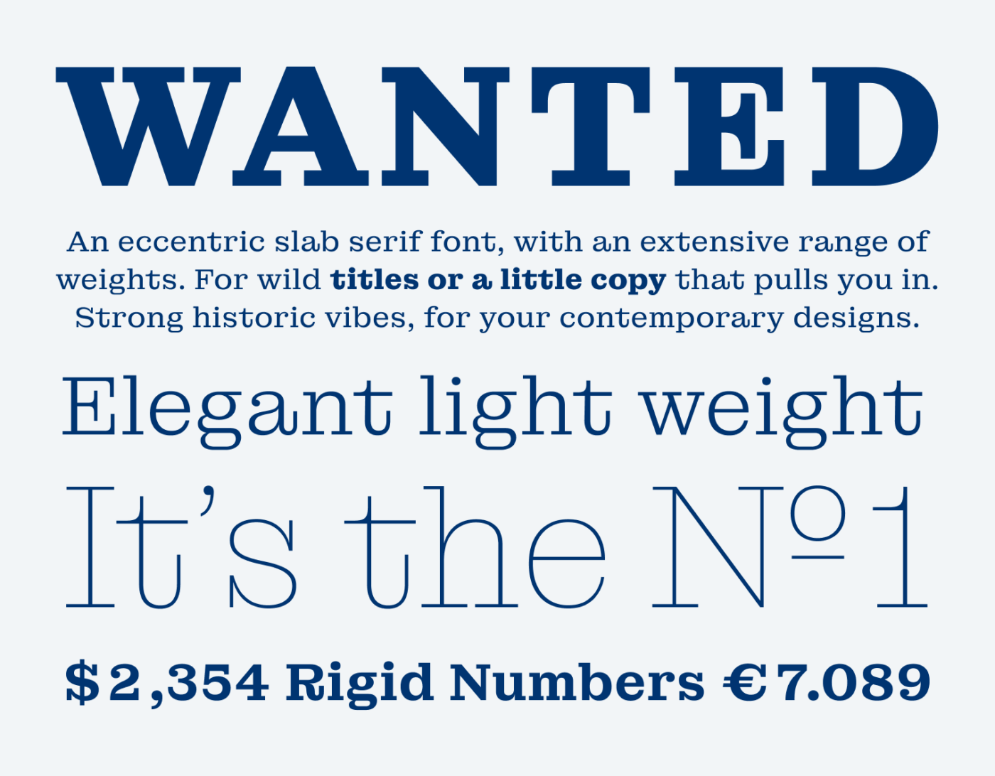
A sample of Montagu Slab in various sizes and weights. An eccentric slab serif font, with an extensive range of weights. For wild titles or a little copy that pulls you in. Strong historic vibes, for your contemporary designs. Elegant light weight and rigid numbers.
From elegant Thin to contrasting Bold

You see what I mean when examining the typeface’s details. Observe how well Montagu Slab pairs organic shapes and soft transitions with wide proportions and sturdy slab serifs.
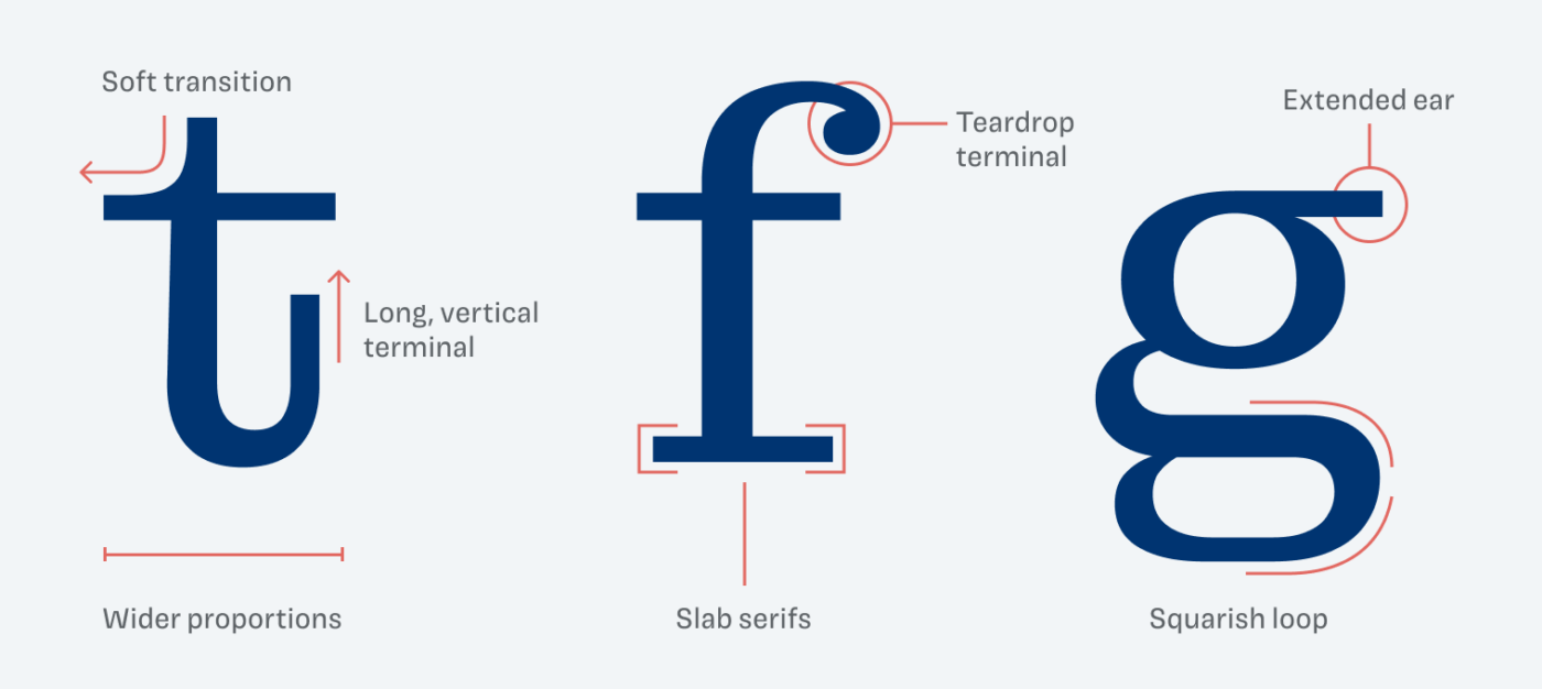
Details like the soft transitions on the ‘t’, the teardrop terminal on the ‘f’, and the wide loop of the ‘g’ give Montagu Slab its distinctive blend of charm and structure.
The relatively wide proportions give Montagu Slab almost a squarish touch

Thanks to its optical sizing, Montagu Slab is always in its best form. In the small sizes it has less contrast, is wider and less eccentric. This makes sure it works for a little copy as well. In larger sizes however, the serifs become longer, more contrasting and the x-height also slightly shorter.
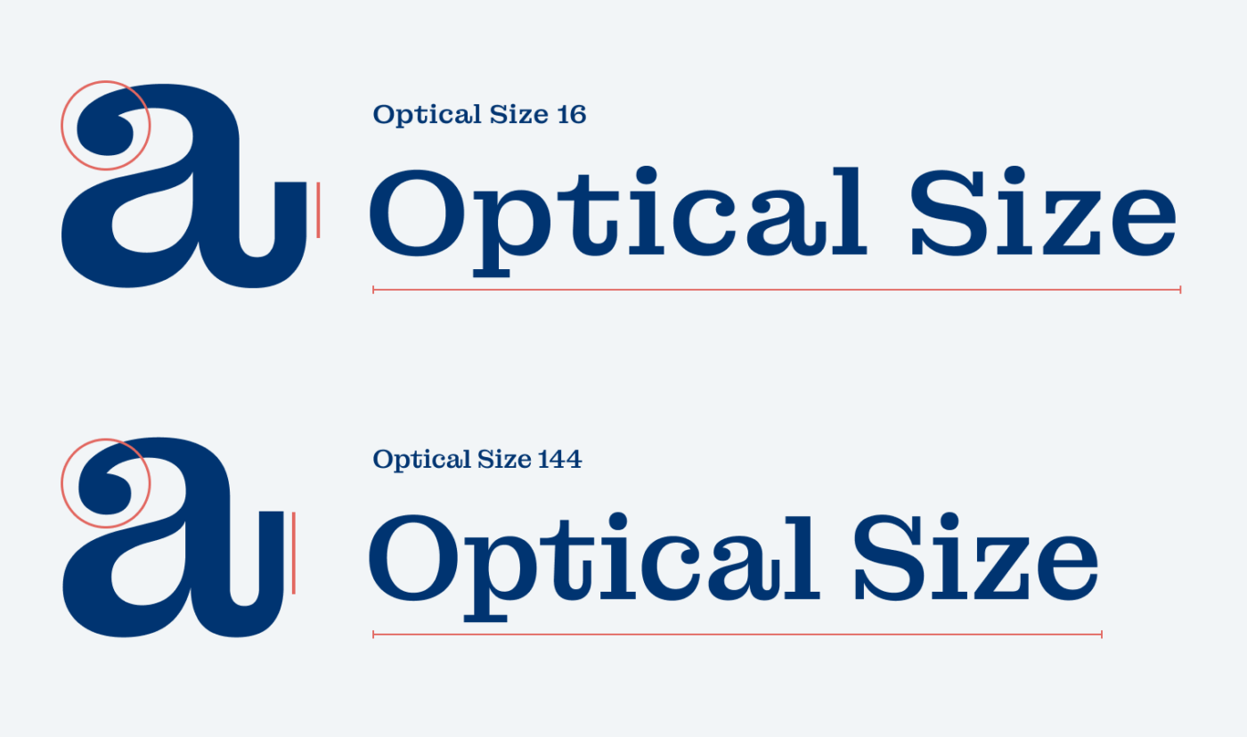
Optical size 16 performs well in small sizes, but is too dull for large text. Size 144 is too fuzzy when set in small, but ideal for large text.

Montagu Slab’s balance of historical elegance and contemporary flair makes it a go-to for bold headlines, stylish branding, and standout typography. Give it a try in your next design project and how it transforms your word’s personality.

Font Pairings with Montagu Slab

Montagu Slab is a rational, contrasting slab serif typeface. It pairs well with typefaces that follow the same form model, like Besley or Push.

Montagu Slab (free)
Montagu Slab (free)
  • Headings
  • Copy

Learn more about pairing typefaces using the Font Matrix.


How do you like it? Write it in the comments! Also, if you discovered another interesting font that I should take a look at.

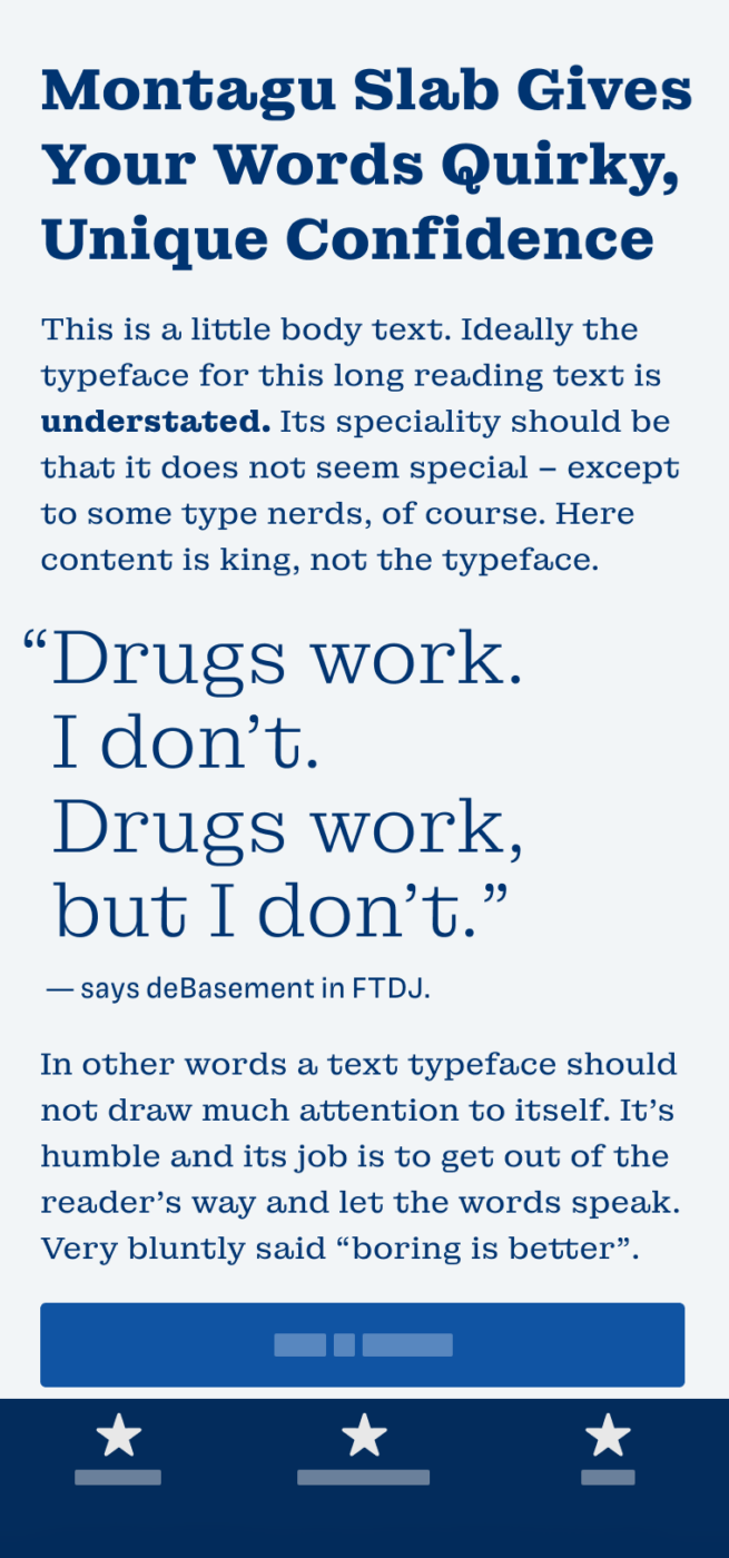
Typographic power to your inbox

  • Font Friday: I recommend one typeface per week, free fonts included.
  • Type Tuesdays: articles & videos that up your design game.
  • Join 2900+ typography enthusiasts, unsubscribe anytime.
Just a sec …

Hooray, typographic glory on its way! Check your inbox (or spam folder) to confirm your subscription.

Leave a Reply

Your email address will not be published. Required fields are marked *