
My Kalnia Font Review
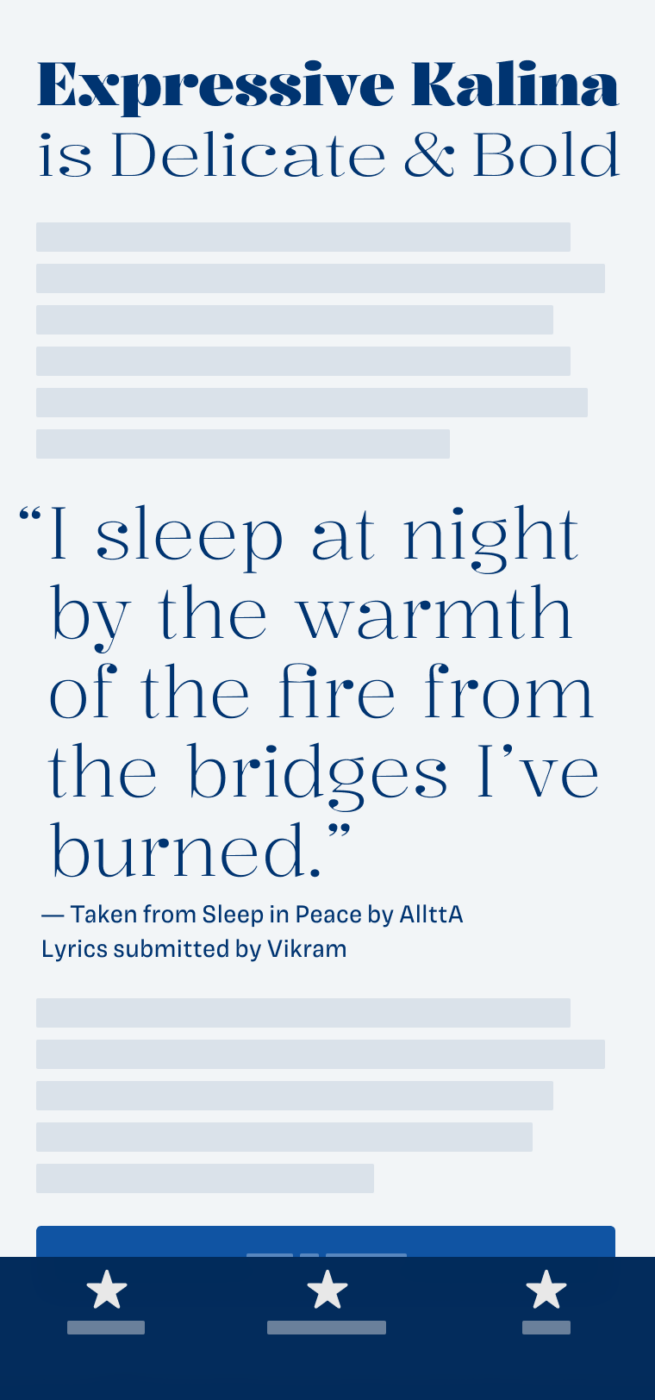
If you’re looking for an expressive, and playful free font, this one is an interesting addition to the Google Font catalog. Kalnia by Frida Medrano is a serif display typeface, inspired by the Victorian era. You see playful shapes combined with the certain, rigid touch of that time. The high contrast pulls you in, while interesting details keep your eyes entertained.

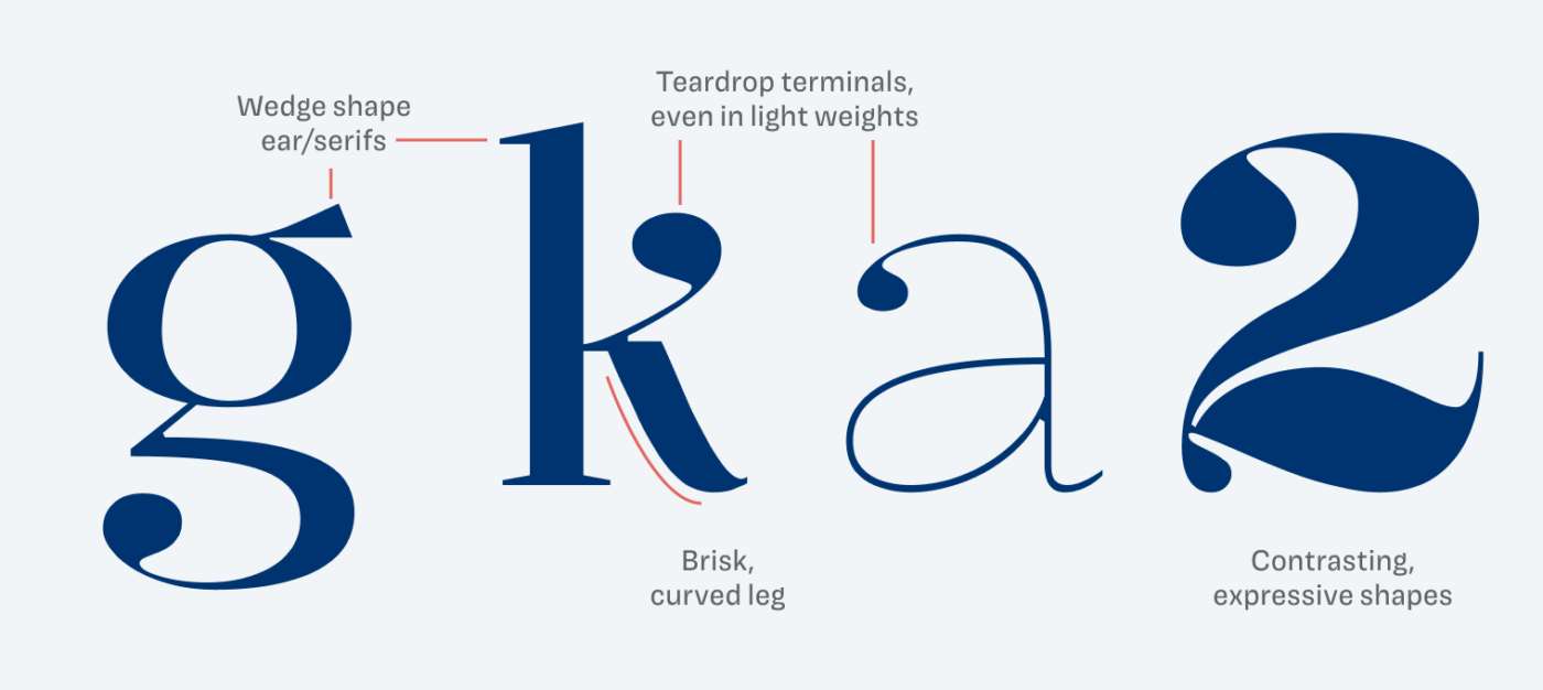
I enjoy seeing how the sober, rational construction and sturdy wedge shaped serifs are mixed with organic and joyful shapes. The soft teardrop terminals and dots become even more dominant in the light weights.
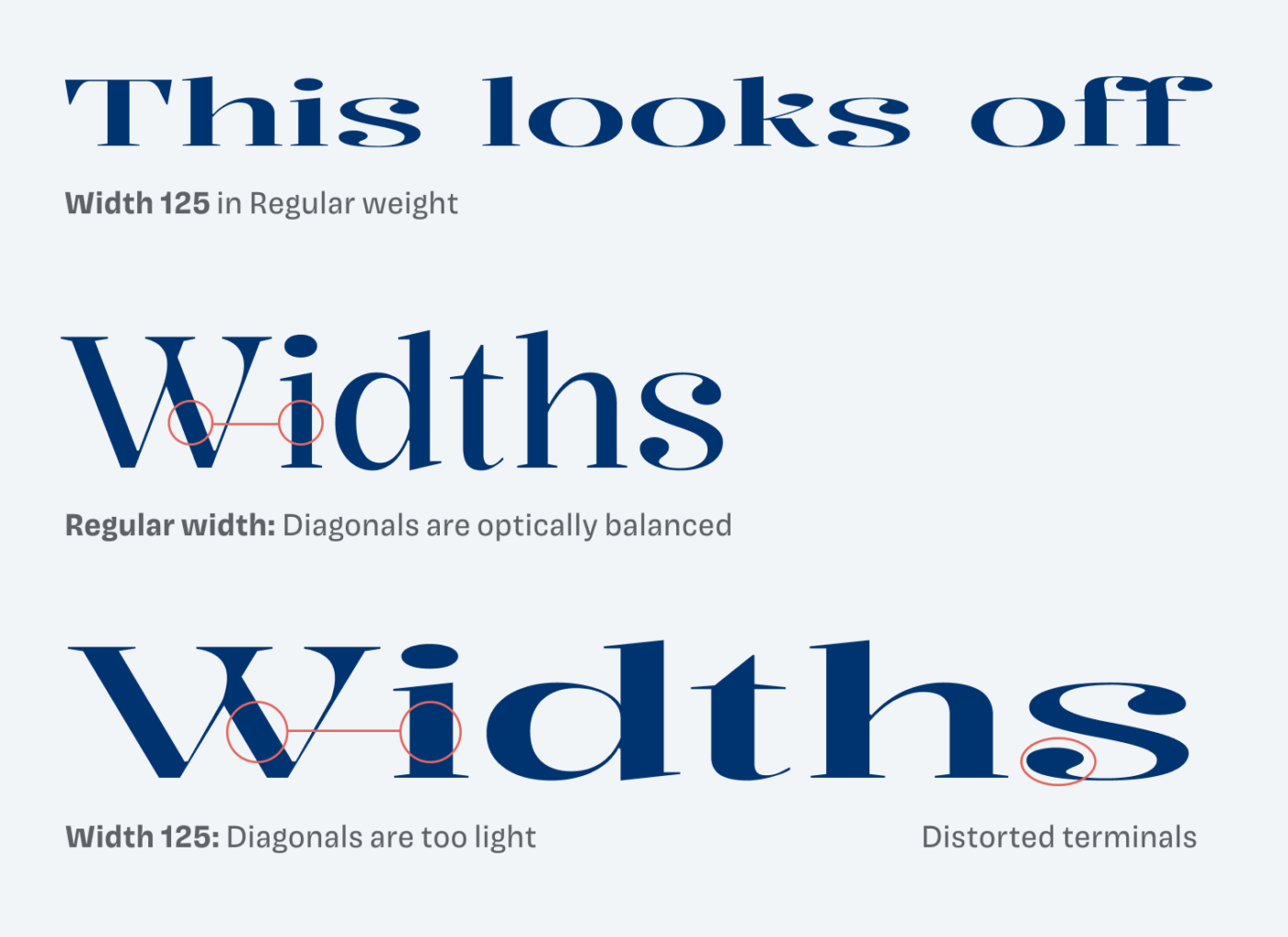
But not everything is perfect with Kalnia. The width axis appears unbalanced, especially in wider styles in the regular weight. There it looks somehow off, leaving a kind of strange and distorted impression. Diagonal strokes are too thin, while the otherwise elegant terminals seem skewed. This problem is less evident in the lightest and boldest weights. So I recommend only using the width axis with caution.
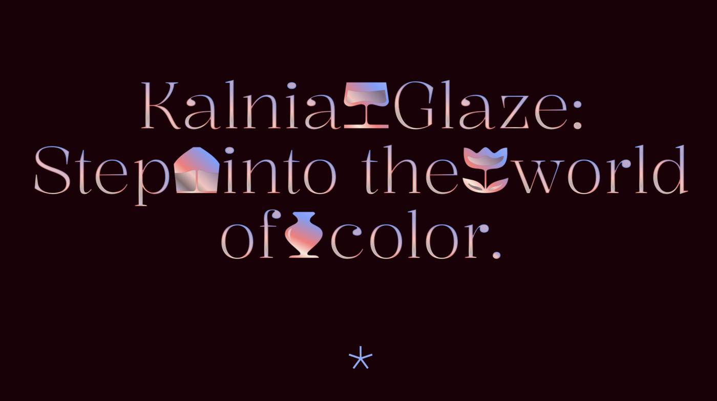
Another thing worth noting is the special color font version of Kalnia, called Kalnia Glaze. It is available in two palettes – suited for light and dark backgrounds – and also comes with a set of interesting icons. In my opinion, it looks best in very large sizes, 40px or more, like on a digital poster or a landing page.
Font Pairings with Kalnia
Kalnia is a rational, contrasting serif typeface. For body text, and UI text a rational sans-serif like Magnet or one of my other suggestions would work very well.

- Headings


Learn more about pairing typefaces using the Font Matrix.
What do you think about Kalnia? Tell me in the comments, also if you spotted a brilliant typeface that I should review.
That’s an interesting one Oliver. Definitely worth considering for headers on certain projects.
I’m curious to learn more about Kalnia Glaze and how to implement it. From what I can tell it has limited browser compatibility at this stage.
That’s true, Ashley color fonts are still quite new and only supported with limited availability in major browsers. But with feature queries you could progressively enhance the experience depending on the support.
Congratulations, Oliver! Your second talk, slowly but surely you’re positioning in a field that publicity deserves to hear from.
Your topic is spot on ’cause your type choices are quite challenging and brave, yet, they work.
Kalina or Kalnia, Klania!? 😉
Yes to expressiveness! Adore these wedge-shaped serifs. Each letter is like an art piece. The “g”! And “a” with a belly 🤭
I see Kalnia’s use as a decoration for example one number or one letter or create a pattern out of a few letters, not for headlines.
The width, oh man, that’s totally unnecessary! It looks like a mistake, even blurry to me.
Anyway, back to school, back to FontFridays, cheers 🤗
Haha, yeah, that’s what you get here, type with typos 😉. Luckily I can fix it on the blog, everything in the newsletter is exclusive to subscribers. Yeah, it is great for a little text. Good to have you back, Jana!