
My Geist Font Review
We live in sans-serif times, flooded by Roboto-like neo-grotesque typefaces. And I get it, people kinda wanna join the party, belong, but at the same time show that they are not like everyone else. Geist is your free font achieve that, a contemporary take on Helvetica, but with more personality. Let’s discover why.
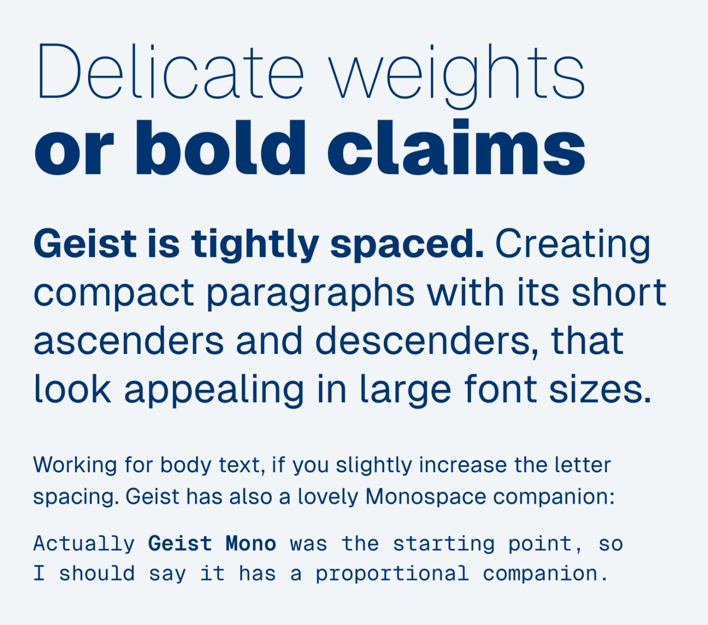
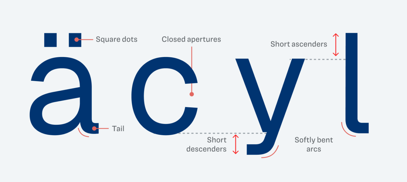
Geist is a custom font made for the Vercle, which is known from the web development framework Next.js. Not surprising for a tech company, Geist Mono was the starting point, followed by its proportional companion, Geist. It conveys a technical, sober impression, but also a certain coolness and sophistication that shows through the recurring softly bent arcs. Besides that, the short ascenders and descenders are characteristic.
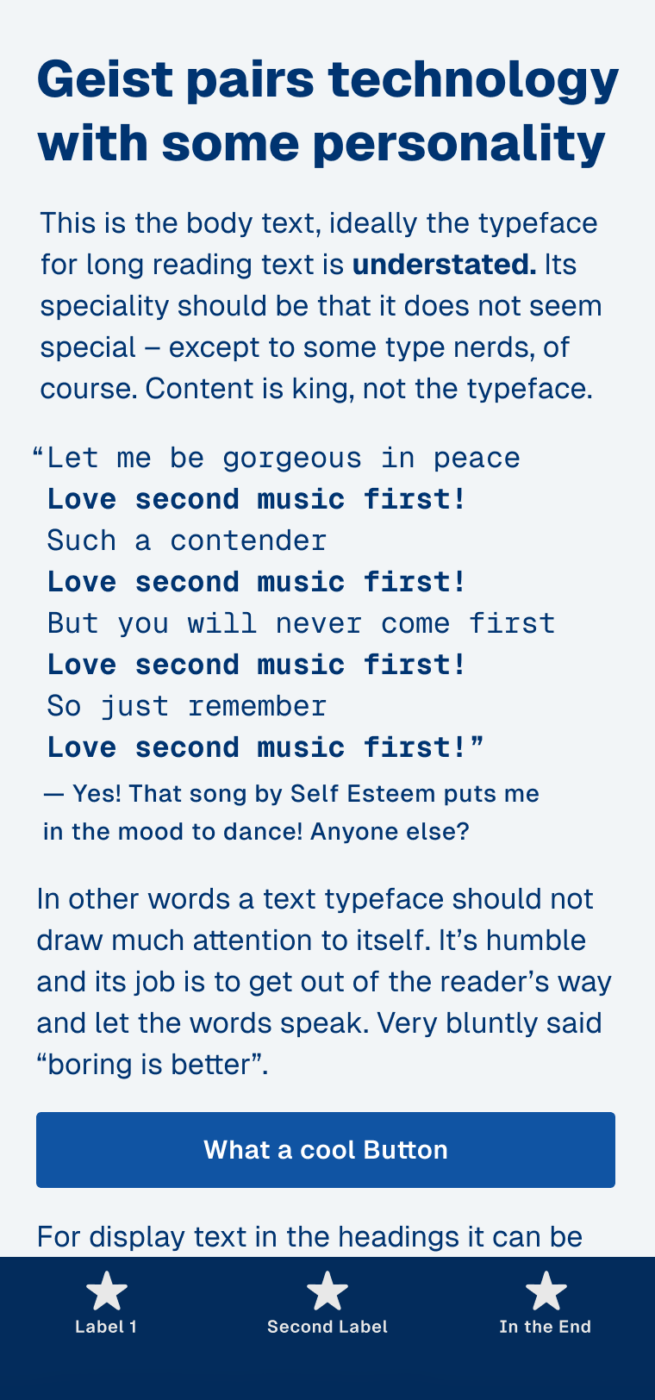
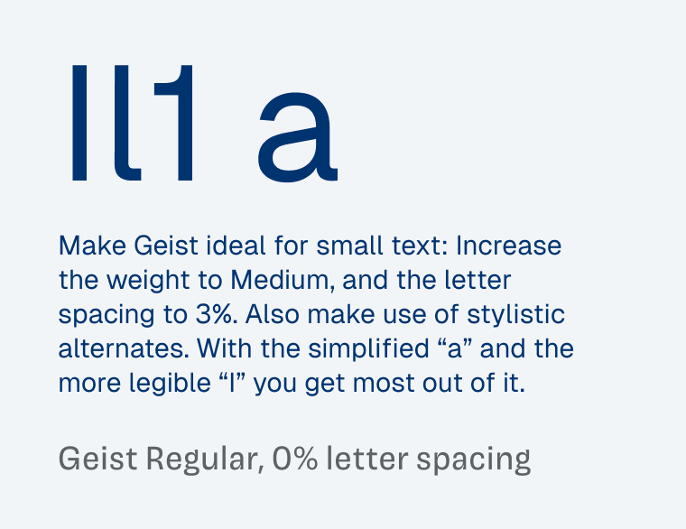
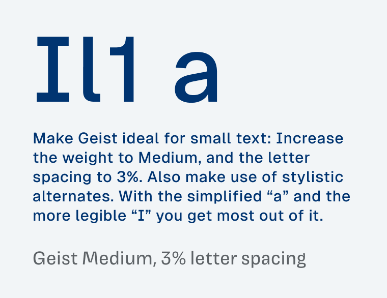
In my opinion, Geist looks gorgeous in larger text sizes, creating compact and appealing paragraphs. But you can also make it work for smaller sizes, if you know how. See in the example below how the same text is so much easier to read, when you increase the weight, letter spacing and activate the right stylistic alternates. It’s not only the typeface, it’s what you make of it.
Now if Geist reminds you of Helvetica, you’re not alone. It has quite some similarities, but also a few relevant differences, which I point them out more clearly to my supporters on Patreon.
Unfortunately, there are no italics, which might kill Geist for your body text choice. In that case, you might only use it for you intro and UI text, and pair it with one of my suggestions.
Font Pairings with Geist
Geist is a rational linear sans-serif font. I recommend pairing it with something contrasting for body text or something more striking for headings.

- Headings
- Copy
- UI Text


Learn more about pairing typefaces using the Font Matrix.
Thanks again to Mahali, who shared Geist with me. If you spotted a font I should review, let me know!
Oliver, whenever I see closed apertures, short descenders, upright letters like e and g here, and egg-like shapes, I see a child with eyes wide open staring at me, a little intimidating. 😯 But if we increase the spacing, it’s OK.
Aaand, I don’t appreciate Helvetica as the rest of the world 🤭
However, Geist Mono is the legend here.
Welcome to new subscribers! You’re in for a treat 🤗 2+ years happy subscriber here!
Haha, I’m not a Helvetica fan either 😅. Nice description, as so many times, Jana! And yes, Geist Mono is so cool!
Did somebody say Hell vetica?