My Cornbread Font Review
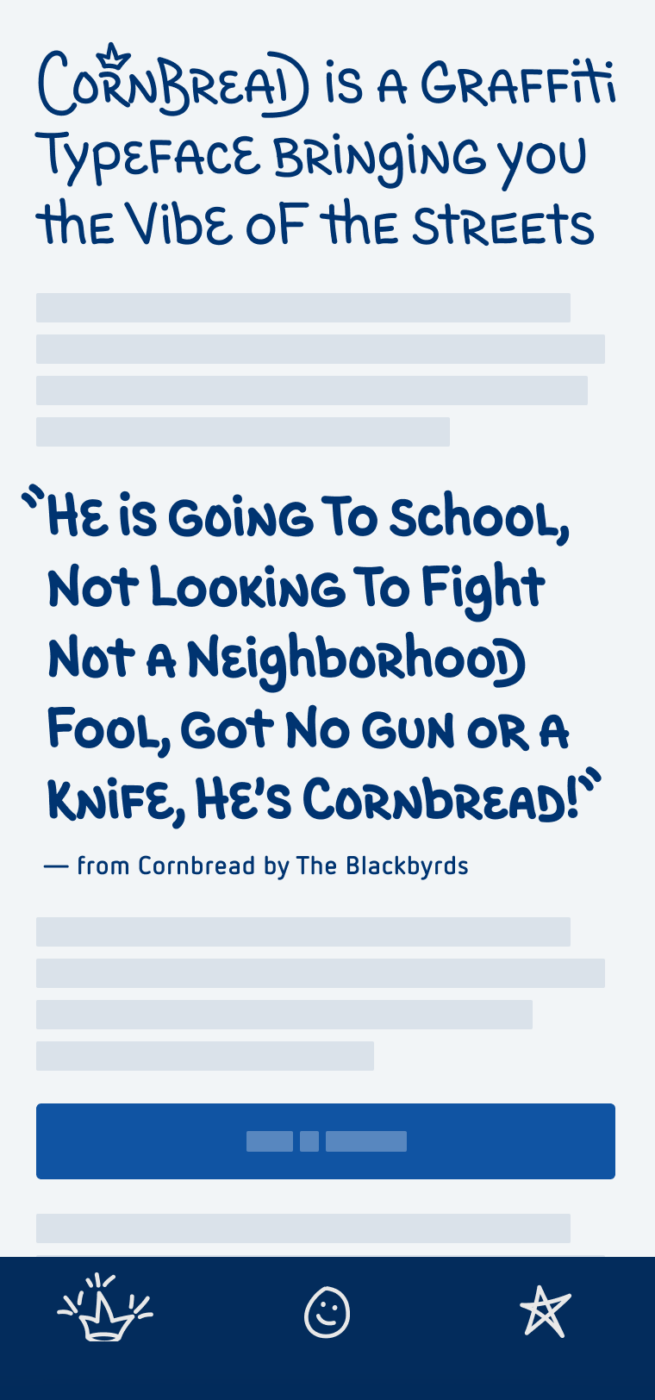
This week’s typeface transports us to Philadelphia’s streets in the late 1960s. Entering the scene: Darryl “Cornbread” McCray, the first modern graffiti writer. He’s considered a living legend, and now his friendly, casual handwriting was turned into a sophisticated font.
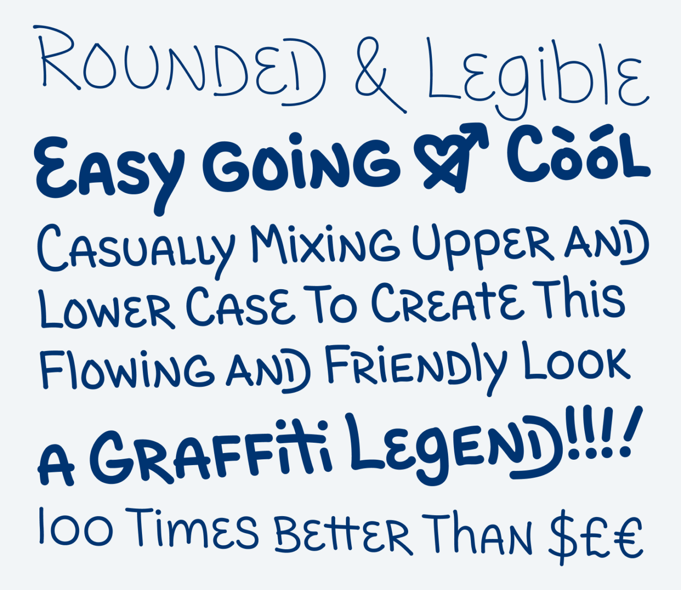
What I find most appealing is how relatable Cornbread feels. The font captures the aesthetics of casual graffiti writing so well. See how playfully the typeface combines upper and lower case letter shapes to create rhythmical word images. Cornbread seems basic, but interesting, soft, at times a bit rough, but always approachable.
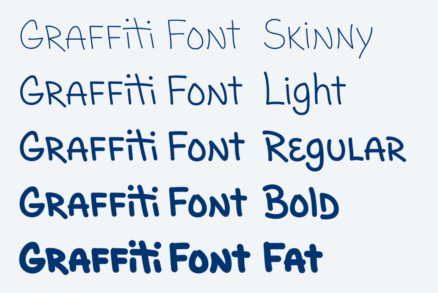
Cornbread’s biggest feature certainly is the refined contextual alternates. By providing a ton of additional characters and ligatures, they add more diversity to the typeface.
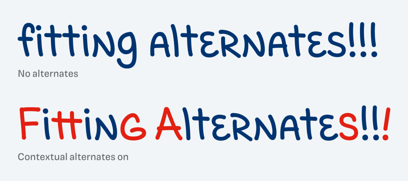
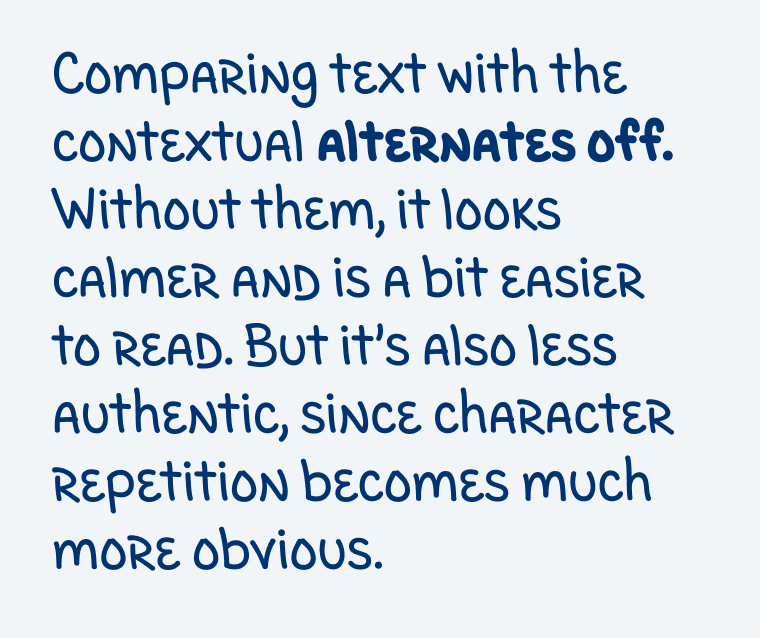
In my opinion, the stylistic alternates work best for headings. When it comes to a short paragraph of text, it might also be interesting to turn them off, as you can see below. This will make it a bit more readable, This makes it more readable but less authentic, as character repetition becomes more noticeable.
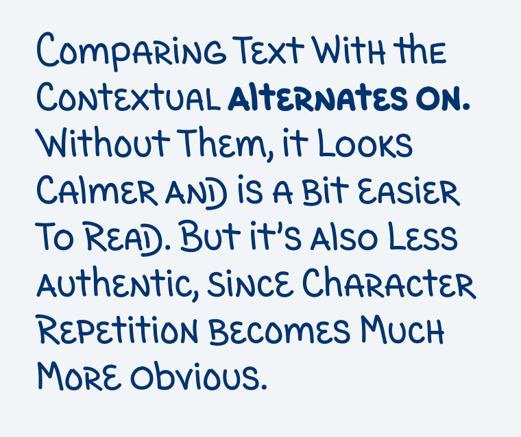
Compared to other handwritten-style typefaces, Cornbread comes with a friendly coolness. Compared to the artist’s original writing, it is a bit more polished, but still conveys the essence. Whether for editorial headlines or app design, Cornbread adds a friendly coolness that’s hard to ignore. Give it a try and bring some street art charm to your next project!
Font Pairings with Cornbread
Cornbread shows a unique blend of handwriting styles. Pair it with something soft and rounded or clean and geometric.
- Headings
Learn more about pairing typefaces using the Font Matrix.
What are your thoughts on in? Tell me in the comments! Also, if you came across another interesting font that I should take a look at.

On most Font Fridays’ in the past I was “Nah”. Not because your choices are bad/boring but it’s my high sensory bar to actually feel something when I come across anything visual.
But the last few FF are rockin’! Seriously, Oliver, each one was a gem, an object from a museum.
This Graffiti font is an art piece. I’m nowhere near your level of type expertise. I perceive them holistically!
Anyone who is working in a branding field, should come here and it will find its missing identity ingredient. Let’s be honest, without proper type, every design is a hard try. 😄
Cornbread – what a vibe!!!
Oh, Jana, thanks a lot! So happy to hear that ☺️.