
My Atkinson Hyperlegible Next Font Review
The font with the hyper long name has been updated, raising legibility and readability up to the next level. Based on the original design, Atkinson Hyperlegible Next has been extended from two to seven weights, from covering 27 to 150 languages. Now all neatly packaged as a variable font. So let’s see what has changed and improved.
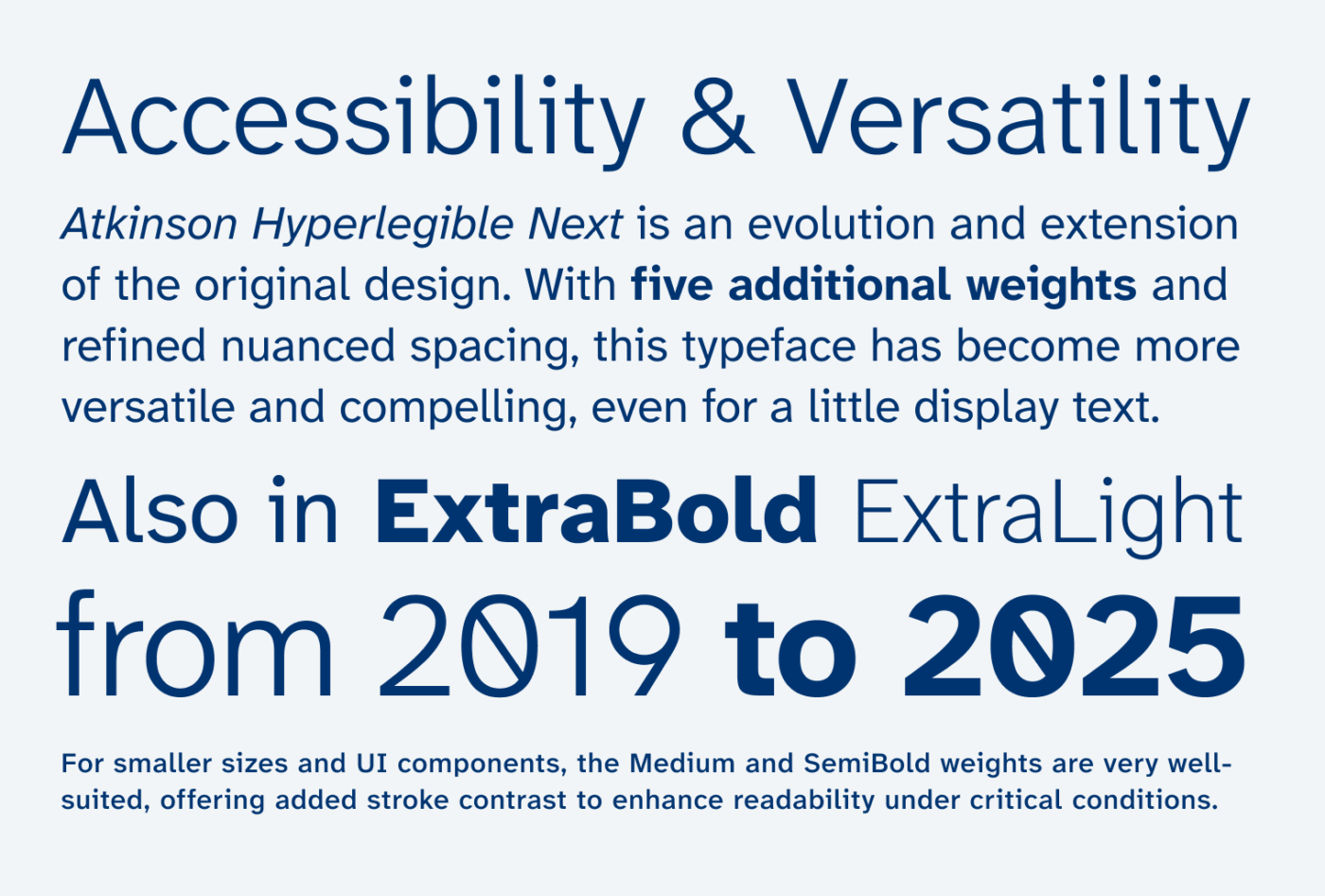
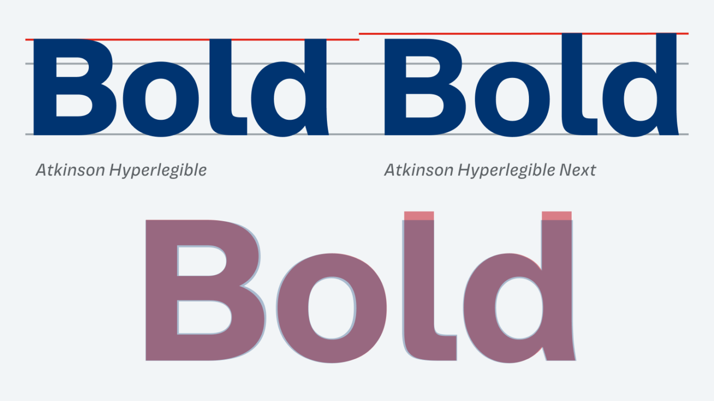
Atkinson Hyperlegible Next retains its distinct features that make it easily recognizable for low-vision readers – more about it in my original review. But one major adjustment has been made – the ascenders got higher. In the previous design they stopped at the cap height, now they go above it, which makes the design a bit clearer. Also, the Bold weight was turned a bit lighter, as the overall spacing also got tighter.
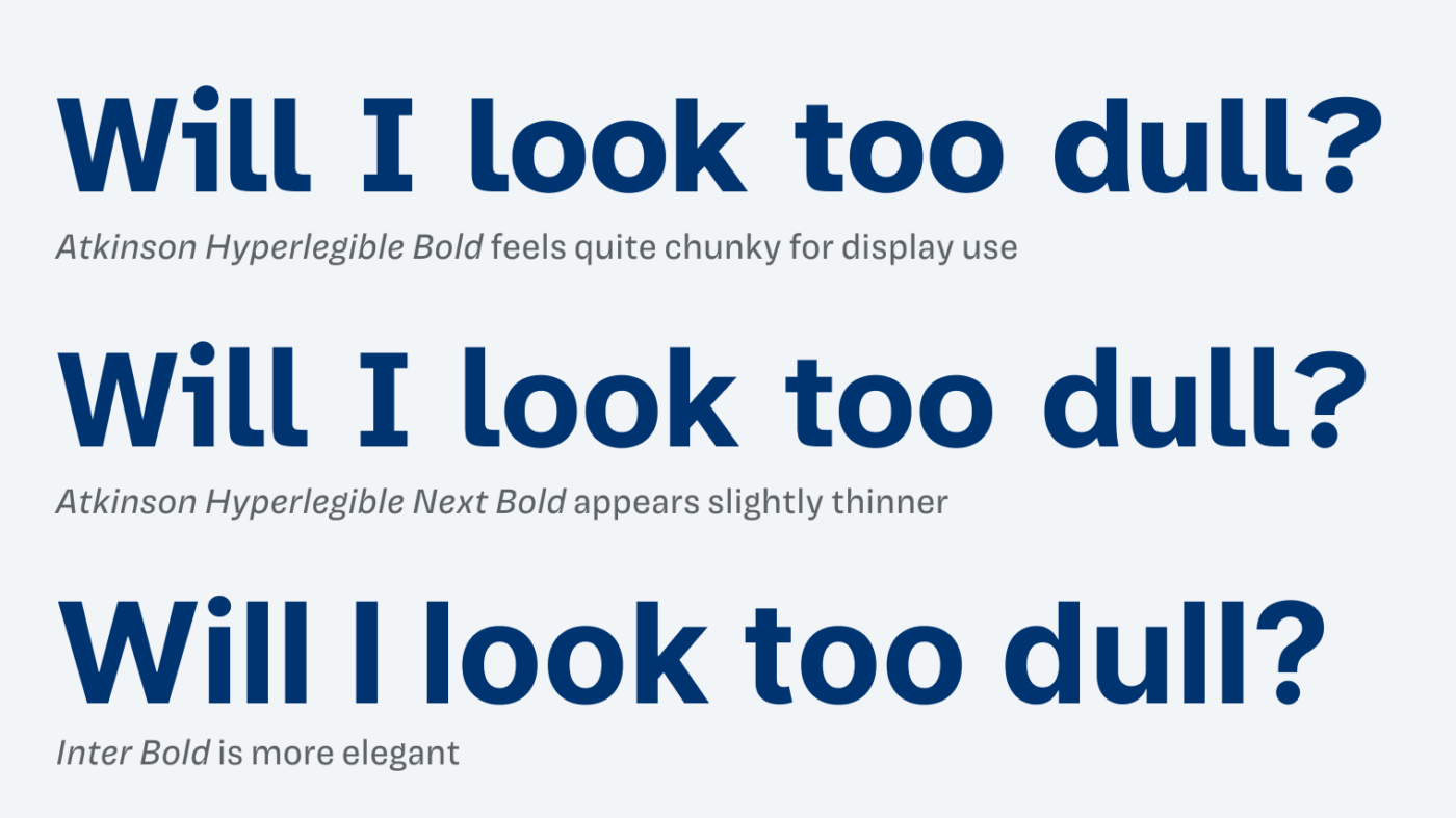
Even with the improved weights and spacing, Atkinson Hyperlegible Next remains a typeface best suited for body text and UI components. Because it takes up a lot of space at larger sizes and can feel less dynamic or less engaging. This is mainly due to its highly legible, wider characters, such as ‘I,’ ‘l,’ and ‘i’.
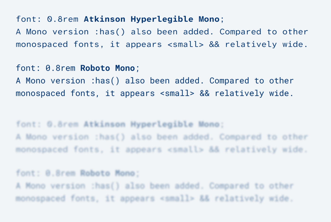
Another novelty is the addition of the monospaced version, Atkinson Hyperlegible Mono, with the goal to empower more low-vision coders. At first glance, the typeface appears smaller compared to other popular monospaced fonts. But this does not seem to be such a disadvantage, because the extra wide shapes make it clearly more legible when blurred.
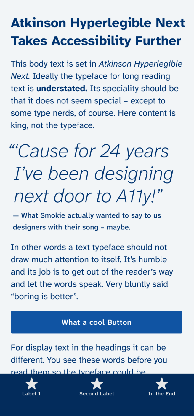
Overall Atkinson Hyperlegible Next a very well-crafted update to me. The additional weights, such as Medium or SemiBold, are particularly useful for smaller sizes in web and UI design applications. I think that this will make the typeface even more popular. For display text, I suggest pairing it with one of my recommendations below.
Recommended Font Pairing
Atkinson Hyperlegible Next lies between ration and geometric typefaces. Here are some suggestions for body text and headings, in my original review you can find additional suggestions.


Learn more about pairing typefaces using the Font Matrix.
What’s your opinion on the update? Let me know in the comments, and share it with me when you used it in a project!
I fell in love with this font but always found it too restrictive due to limited weights… not anymore!
Btw, aren’t letters “d” and “b” still too similar? The spurs differ, sure, and the strokes are a teeny bit different — but is that enough? Or is there research confirming that d&b don’t generally cause legibility issues?
After all, they worked out a q&p solution…
If you find Kolonia’s “a” and 9 as optimistic as me, I’d love to see it on PimpMyType! https://ecal-typefaces.ch/typeface/kolonia/
Every time you feature a practical, well-done typeface (or font, what’s the difference? 😉), I’m over the moon.
A light version, hell yeah!
I don’t like overly geometric fonts, but here, it’s balanced. Rarely are C, E, and S having a good vibe, but at Atkinson? They are open and confident, with no strings attached! Love that letter’s attitude.
i and l – kinda binary but with the soul. Oliver, you hit the spot this Friday!
PS. My fav section, “Font Pairings,” always reveals some gem!
Wonderful, Jana! Glad you like this one. Atkinson is a good mixture of all kinds of influences ☺️.