
My thoughts on Darkmode
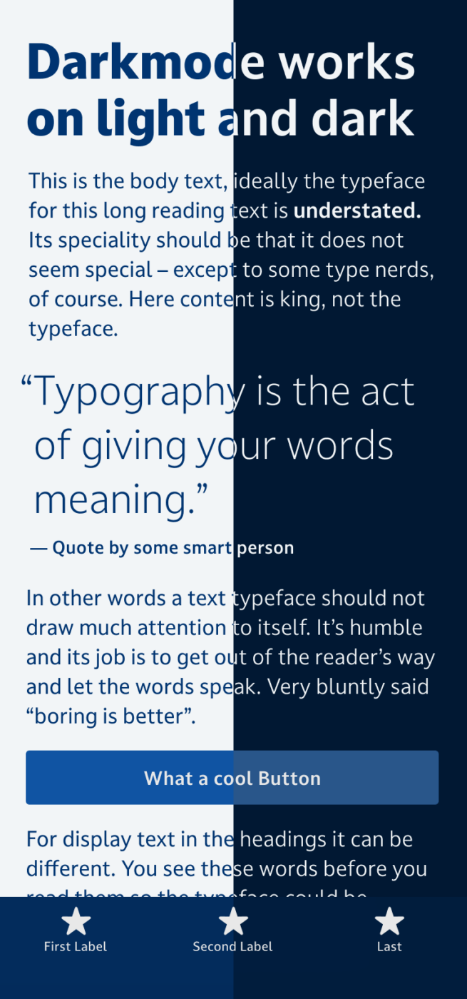
Darkmode tackles a problem most UI designers face. For dark text on light background everything works fine, but when the same text is set light on a dark background it suddenly seems rather large and bold. To compensate for that, Darkmode has a lighter style to maintain a visually consistent appearance on all backgrounds. It also comes with the most common UI icons, which is pretty handy. A highly legible and friendly font for your next app design.
In my talk with type designer Eleni Beveratou, she highlights in her second tip why the features of Darkmode are made with accessibility in mind by comparing it to often recommended Arial.
Font Pairings for Darkmode
Darkmode is a dynamic, linear sans-serif typeface. If you want something contrasting and wild for headings, choose the very different dynamic serif typeface PP Migra.

- Headings
- Copy
- UI Text

Learn more about pairing typefaces using the Font Matrix.