
My thoughts on BioRhyme
BioRhyme is a very lively, warm and approachable slab-serif in two widths, normal and expanded. It is designed by Aoife Mooney and available on Google Fonts. The short ascenders and descenders let BioRhyme appear very compact. It comes with a lot of OpenType features and variety of alternates, giving you the option to make it more playful or straight. This playful typeface works for display text very well. For body text it needs more space, even in the normal width, and might be too wide and tiring for very long reading text. For UIs and functional text it needs too much space and is far too dense.
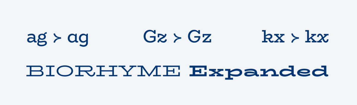
The expanded style is carried to the extreme, almost as if it was squished. I really like how expressive it is and love the uppercase letters in that extreme width with their striking serifs, it almost seems monospaced. On a screen, especially on mobile, BioRhyme Expanded will use up too much space. For desktop usage, the headings might look good. Maybe you could add a breakpoint to switch from the normal width to expanded there?
Recommended Font Pairing
For your body text, I recommend pairing this quite dynamic linear slab serif with narrow Inria Sans or Serif, but also sturdy Arpona Sans pairs well.

- Headings
- Copy


Learn more about pairing typefaces using the Font Matrix.