
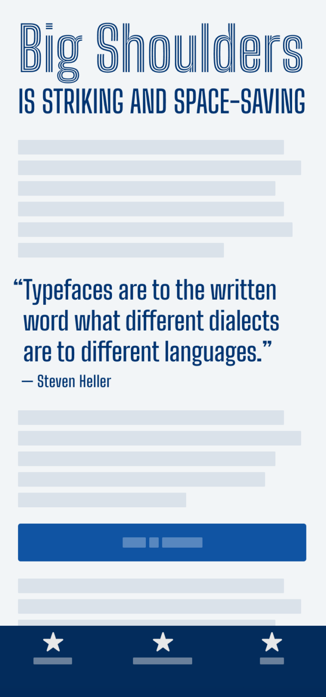
My thoughts on Big Shoulders
Big Shoulders is a free sans-serif display superfamily, consisting of 54 fonts. It was designed by Patric King for the Chicago Design System, is available as variable fonts, and also hosted on Google Fonts. What an interesting energy of this typeface – it is somewhat restrained, but still expressive. Big Shoulder is super narrow, almost squarish, and has very short ascenders and descenders. This makes it ideal for large, attention grabbing headings.
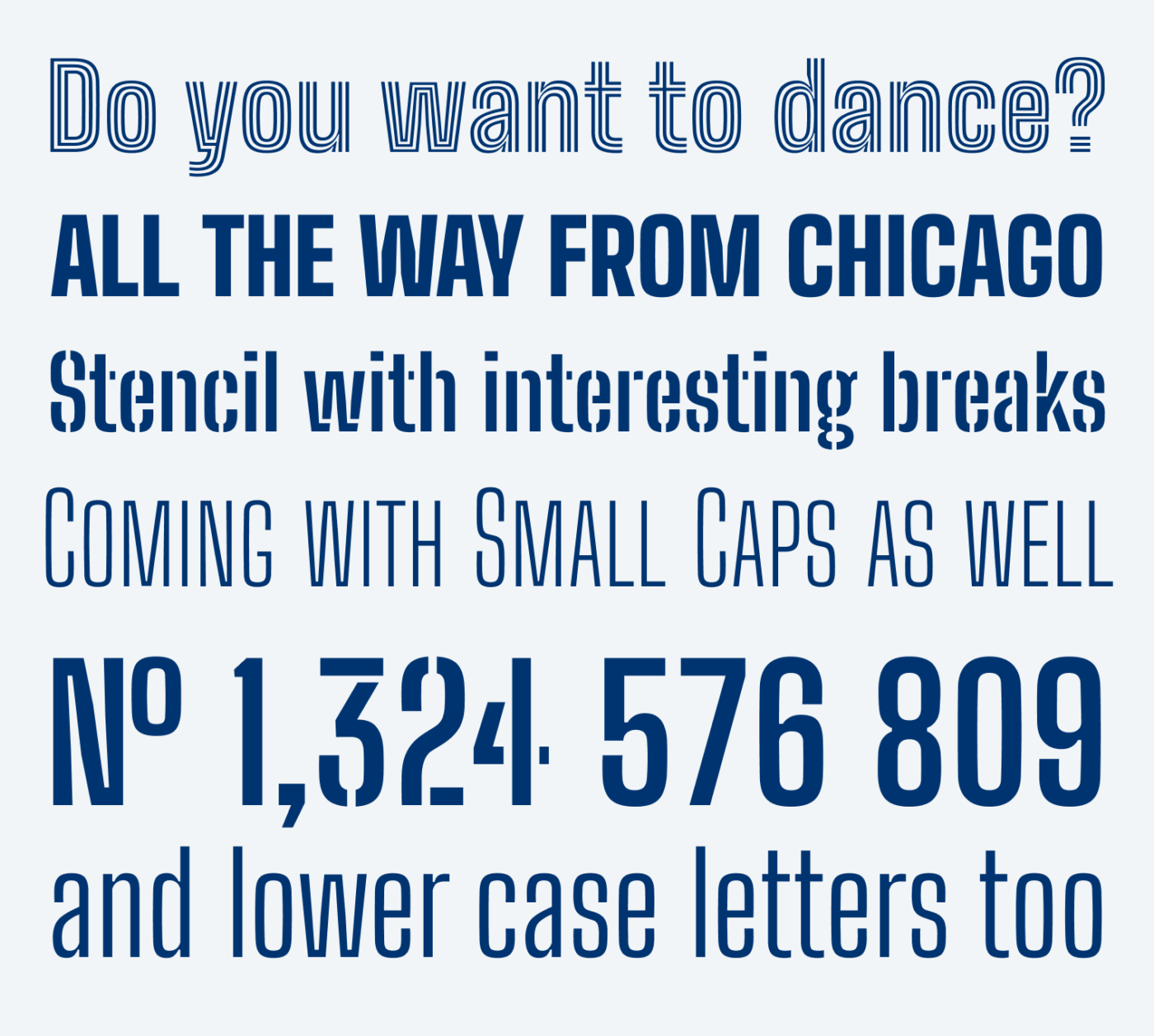
Plenty of quirks contribute to its uniqueness. I like the interesting positions of the breaks in the stencil style, and the engaging feeling of the inline style. To me, it looks best in all caps.
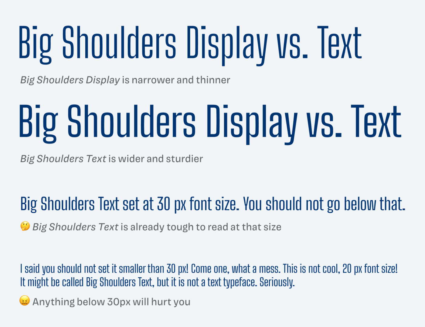
There are two styles, Display and Text, but the text style is really not intended for text sizes. In direct comparison, you can see how it is sturdier and wider, so it would work for font size between 30 and 50 px, but anything below that, forget it. So, there obviously is a reason why Big Shoulders has the word “big” in its name. Use it for posters, signs, large titles, the bigger, the better.
Font Pairings with Big Shoulders
Big Shoulders Display is a rational linear sans-serif font, made for large text. There is a companion for body text, Big Shoulders Text, however, if you want to make things more interesting, choose one of my recommendations.

- Headings

Learn more about pairing typefaces using the Font Matrix.
What do you think? Is Big Shoulders something for an upcoming project? Tell me in the comments below!