
In my Font Friday newsletter, I asked my subscribers about their favorite free fonts – and wow, I got sooo many replies! More than forty of them 😅, full of amazing suggestions. What I love most about it is getting to know new fonts – and digging through your replies was so much fun that I discovered, and also rediscovered, many great ones.
So here I’ll share three hidden gems that were all new to me. Then three more favorites I just had to show you, and finally, my subscriber’s Top 3 – the free fonts that were mentioned the most.
Three Hidden Gems
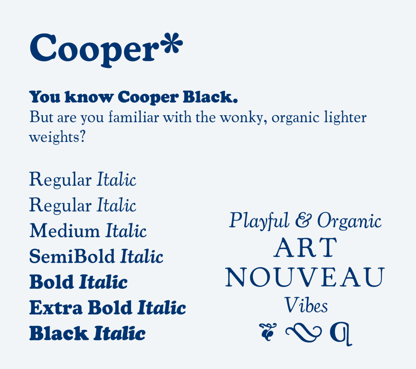
Cooper*
Claudia loves this “very cool, true revival” of the original Cooper* from indestructible type. Cooper Black is more than 100 years old now, and was extremely popular on album covers during the 1960s and 70s. The Black weight is very familiar, but there is a Regular weight too! And this version claims to be a historically accurate revival of this playful Art Nouveau typeface from 1922. Ideal if you want to show personality and be whimsical in body text and headings.
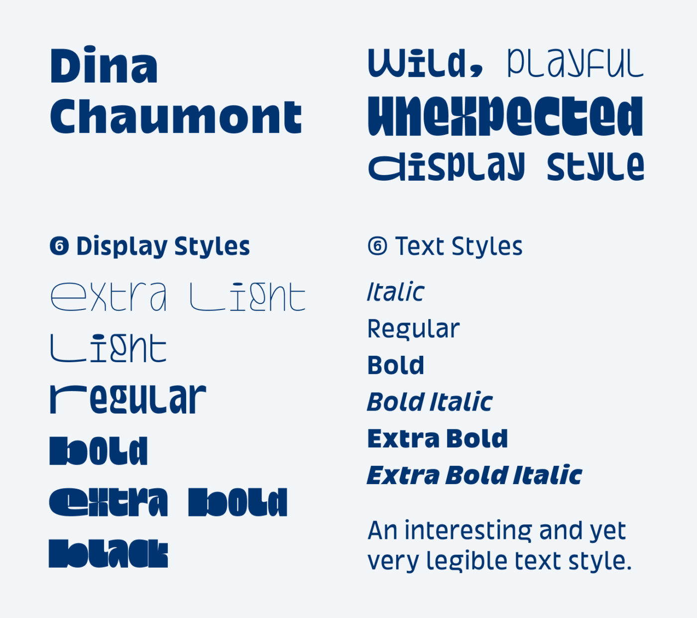
Dina Charmont
Dina Charmont from b•v-h type was created for the city of Chaumont, and consisting of a vivid and original display style and a unique text style. Richard, who recommended it to me, describes it as “a highly commendable project” that seems “too good to be free”. Agreed! The text style is something I can absolutely imagine for a cool UI project with a little text. The display text goes more into the direction of poster design, which was also its intent. Enjoy!
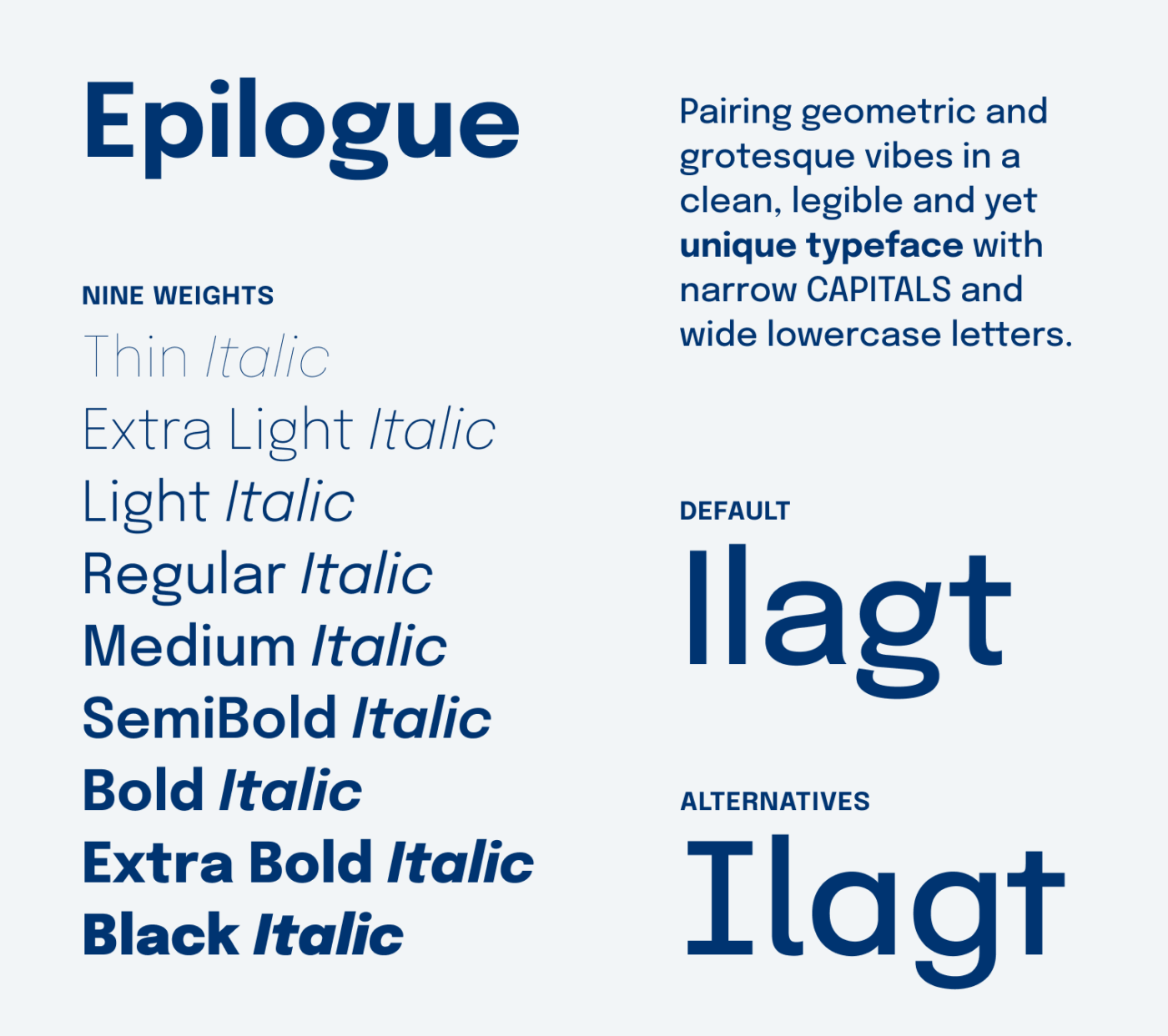
Epilogue
How could I have missed Epilogue from Etcetera Type Co.? Fletcher shared it with me, describing it as a “clean, hardworking sans”. And it definitely is. Familiar and yet unique enough to be remembered with its geometric narrow caps, quirky lower-case g, and that t reminds me of Lineto’s Circular. Most appreciated are the 18 styles, stylistic alternates, small caps … a font that keeps on giving, just waiting to be used for your next UI design.
Three Favorite Free Fonts
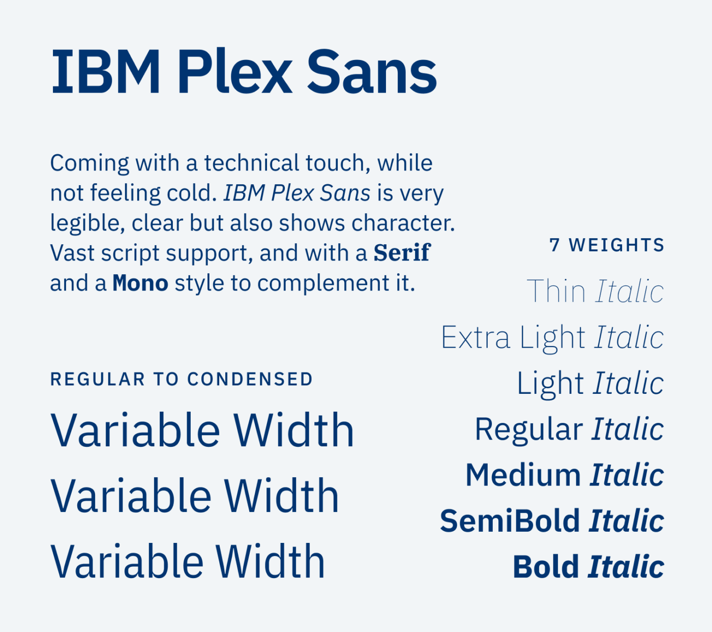
IBM Plex Sans
Michael calls it a true workhorse “It never groans or complains!”, while Johannes is a fan of the heavier sans weights too. And I have to admit I really was amazed when IBM Plex Sans from Bold Monday got released a few years ago. It pairs personality with a technical twist, works so well as a superfamily, with a sans-serif, serif, and a monospaced style. What often holds me back using it, is that IBM Plex Sans is a victim of its own success. But still, less overused than Inter 😉. I did not take enough time to appreciate it and in my opinion it works best for body and UI text.
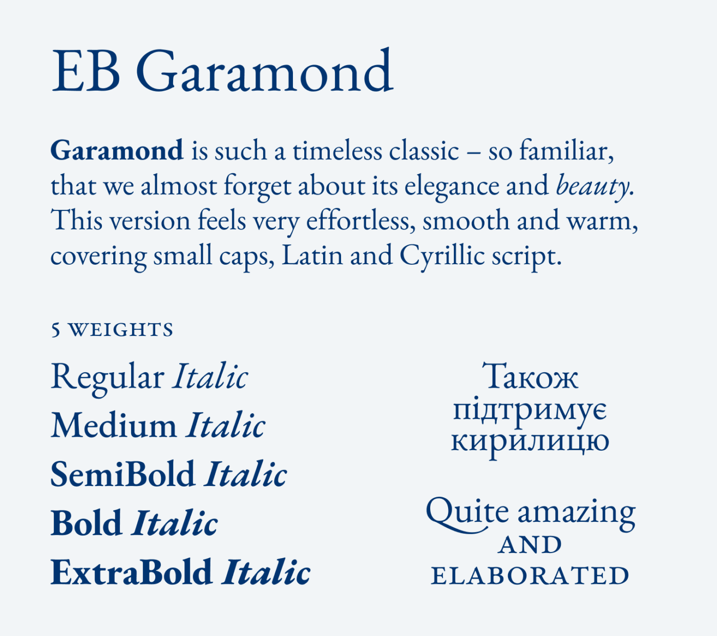
EB Garamond
I read Garamond and I yawn 🥱. But I’m just an ignorant bastard 😂. Nicolas says he loves EB Garamond “with all my heart,” appreciating how beautifully and effortlessly it reads, and its flawless Cyrillic support. And he is so right! I used Garamond too often at design school, so that I found it extremely boring. But Nicolas made me rediscover its beauty! EB Garamond from Georg Duffner and Octavio Pardo features gorgeous snappy italics, fine details, beautiful contrast. Clearly made for larger long form reading text – which you should never set smaller than 20 px.
Ronzino
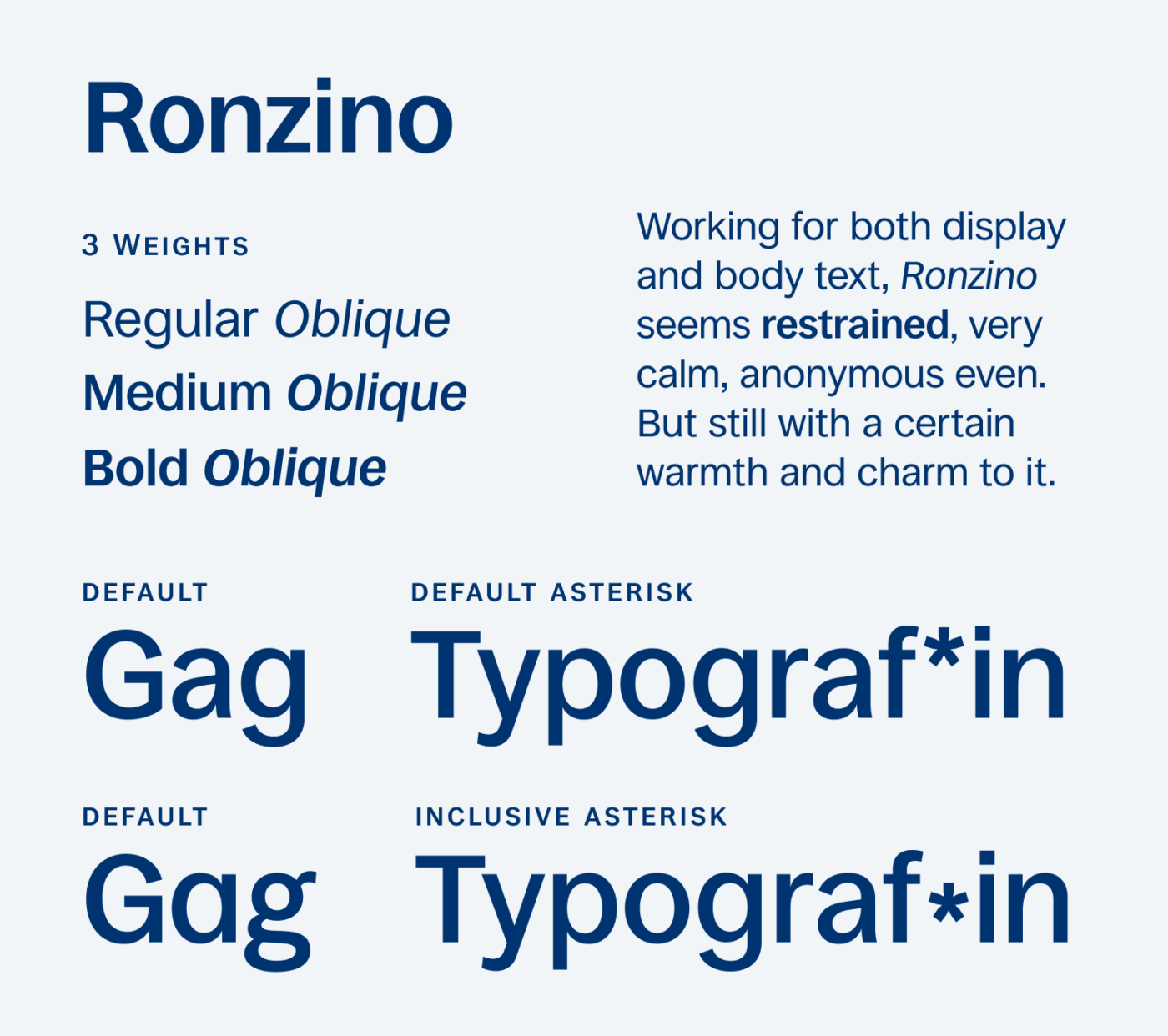
Isaac appreciates the warmth and charm of Ronzino, plus the details that too often go missing: case-sensitive forms, fractions, and small capitals. I really like this typeface from Collletttivo and how it reminds me of the 1960s, since it’s very close to typefaces like Helvetica. With its sober obliques and tight spacing it works wonderfully for body text, but also headings. German writers (like me) will also appreciate the less disruptive gender star.
Your Top 3 Free Fonts
These now are the three most popular free fonts among my subscribers. They might already be familiar to you, but that does not make them poor choices. It’s quite the opposite, I say.
3rd Place: Fira Sans
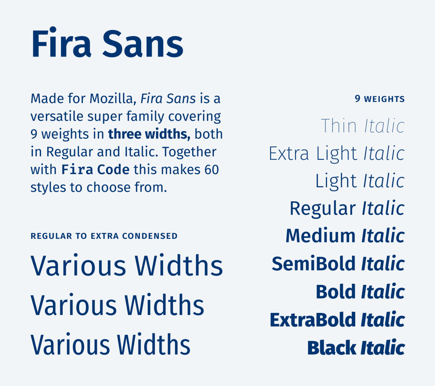
Fira Sans from Carrois Apostrophe was one of the early, brilliant free fonts. David appreciates that it’s “such an elegant and versatile typeface with a large family that means it can be used just about anywhere,” and it’s a continuous go-to font for Gerd and Martin. I use Fira Sans for such a long time now, and still value its openness, friendliness and how it works for any kind of use case – from posters to tiny UI text.
2nd Place: Atkinson Hyperlegible
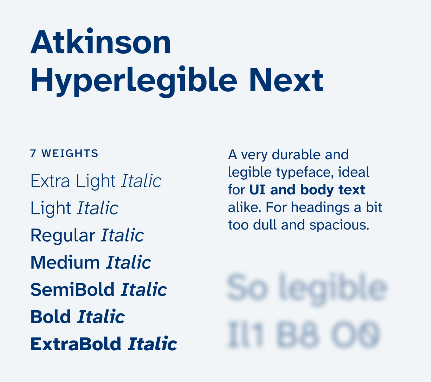
The accessibility champion Atkinson Hyperlegible from Braille Institute. And you love it so much! Gabriel appreciates its “ultra readable, round“ shapes and unique letters, Anne uses it whenever readability matters most, and Christina uses it to project crisp text to LED screens. I have reviewed both Atkinson Hyperlegible and Atkinson Hyperlegible Next, of which the newer version I find much better. However, I would not use it for larger headings.
1st Place: Bricolage Grotesque
Your clear favorite for personality is Bricolage Grotesque from Mathieu Triay. Verena, Gerd, Martin, and Moni all named it, loving its characterful, contemporary look – and it shines “best as a variable font.” I have reviewed it here and its best features are clearly its variable width and the optical sizing 🤩. It is so good that it unfortunately got even too popular in the past years and AI generated designs also seem to prefer it.
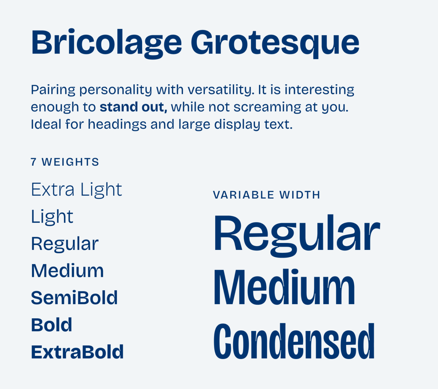
Nine amazing free fonts, all recommended my lovely subscribers. Thanks again to everyone who replied! And if you’re no subscriber yet, get on my mailing list below 😉.
Now I’m curious: which free font is your favorite? Is it already on this list, or did we miss a hidden gem? Let me know in the comments – can’t wait to discover even more great fonts 🤩.