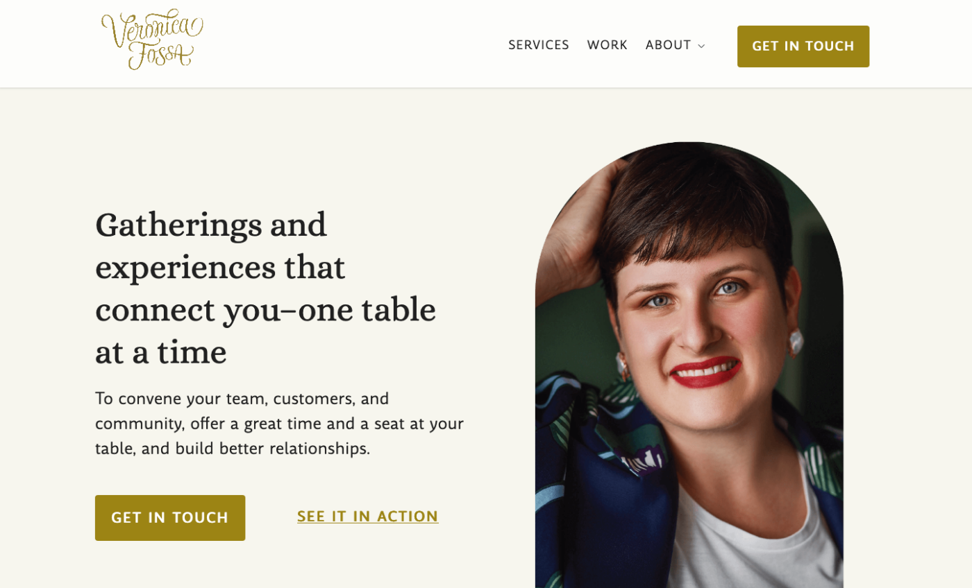
Food experience designer Veronica Fossa went through a rebranding, and submitted her website for typographic review. In the video, recorded as a live call, I cover some issues with font sizes, a little CSS, and how to improve the spacing of the headings of her blog section. You can jump to the parts that interest you most by checking out the chapter marks.
Veronica’s goal behind learning about typography
She went through a rebranding. With typography, Veronica wants to communicate what her brand is about and have it coherent and cohesive look and feel.
The design process
A friend was the brand strategist, a designer suggested the typography for the site, her brother did the web design, but she did the art direction.
Veronica’s values
People should feel welcome, she wants to bring in the senses as much as possible.
Font Choice
Alice for display text, and Amulya for body text. Both are free fonts. Veronica replaced ubiquitous Open Sans (yay!) with Amulya.
Key takeaways
Hero Section
Introduce your typographic choices in the heading section. If you use two typefaces, show them.
Testimonial quotes
Set the testimonial quotes smaller, so it’s easier to read them as a unit.
Blog section
Make the headlines in the blog section smaller and set them in the same typeface as the body text.
How it turned out
I did the recording for this video a while back, and what Veronica showed, was still in progress. In the meantime, she adopted some more changes and also reworked her logotype, which I really like. It shows much more personality, and fits her topic better. See for yourself and check out Veronica’s website.

Let me know in the comments, how you liked this new format as a call! Also consider submitting your app or website for a free typographic review.

Thank you so much for having me, Oliver! It was fun! I still can’t believe what great typography can do to communicate what your brand is about. And most of all, seeing the improvement between before and after. 🙂
Veronica, typography, for sure, is one of the primary visual elements that’s shouldn’t be underestimated. Most of the brands with which I work with (publishing) rely on good typography matching and hierarchy because it’s their biggest visual asset.
These changes seem subtle but they changed an overall impression! Good point on introducing both types, at the entrance. So that visitors get to know all the family brand members at the first step in your brand experience.
As a creative +copywriter, I’d still work on your blog sections and optimize headings and/or different web theme options for this part. I guess the blog is one of your primary brand pages.
Oliver, love this form of review🙌🏻 Your skills are shining
Thanks for joining, Veronica, and so glad it was helpful to you 🤩!
Thanks for that feedback, Jana, glad you enjoyed the format!
looks great!