My thoughts on Roslindale
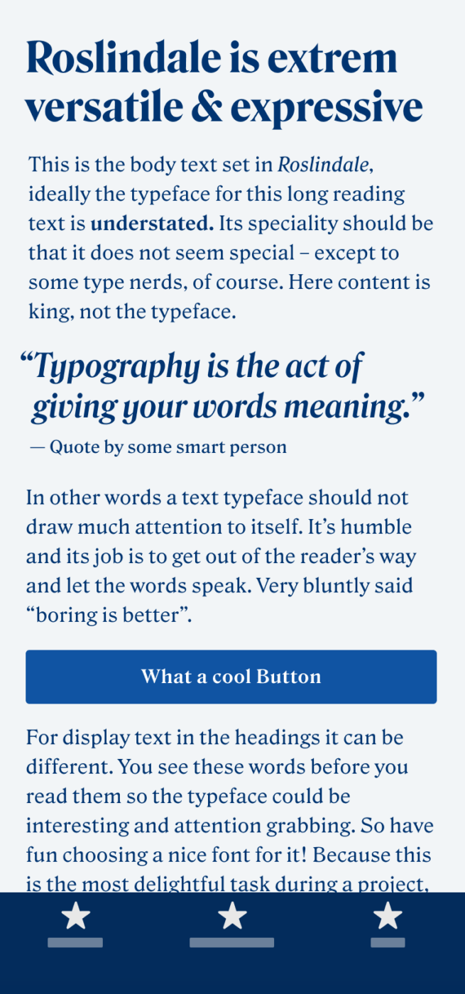
This is a typeface that’s extremely versatile. It’s an oldstyle with Victorian sensibilities, sharp, stubby serifs, bulbous terminals, and the occasional hint of diagonal stress. The display styles are expressive – great for attention grabbing headings and quotes. The text styles are more calm and geared toward readability. For functional text it might work, but not in tiny sizes (10 to 12 px). Overall it’s got a lot of character.
Roslindale’s design space as a variable font make it so outstanding. I specially love how the italic axis transitions from an upright to an italic in increments. This gives you a lot of possibilities to play with. But it also might be overwhelming to newcomers having so many options, since it requires some knowledge how to use it best.
As a member of DJR’s Font of the Month Club I could observe its evolution and release in progress which brought Roslindale near and dear to my heart. I appreciate David’s very accessible licensing packages that include desktop, web and app usage.
Font Pairings for Roslindale
Roslindale is a quite rational, contrasting serif typeface. If you are looking for something more sober for functional text, choose rational Inclusive Sans.
- Headings
- Copy
- UI Text
Learn more about pairing typefaces using the Font Matrix.

