I just started my YouTube channel Pimp my Type. It aims to help you to improve the design of a website, app or digital product by leveraging the power of typography. This article is a transcript of the first episode with some additional links.
In the first episode I cover something that drives me crazy for a long time now: the time display in iOS. Every minute when the time is changing all numbers shift around and this just annoys me. Find out why Apple made this decision, how we could improve it, and what to learn from it for your own designs.
The problem
If you take a closer look at the iOS lock screen, you can see below what’s annoying here. I rebuilt it in Figma and when I’m switching between the minutes you see how time jumps. It’s especially bad when it switches from or to a 1 which is the narrowest figure. To improve it, we first have to know what kind of figures there are.

Numbers in typography
There are two style for numbers: old style figures and lining figures. Old style figures are designed with varying heights. This resembles a typical line of running text so they better blend in with it.
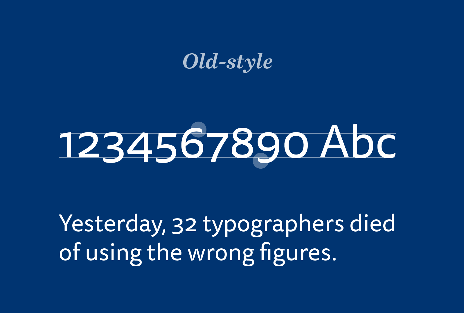
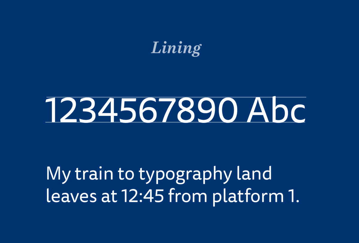
On the other hand, there are lining figures, also called modern figures, which are mostly the same height as upper-case letters. They work better when used alone, in user interfaces, or time displays. They are the more common style of numbers.
Now in addition to these two styles, there are two spacing formats: proportional and tabular. Proportional figures have variable spacing, comparable to that of upper and lowercase characters. This spacing maintains the even, balanced color of the rest of the alphabet, allowing the figures to blend in nicely with horizontal text.
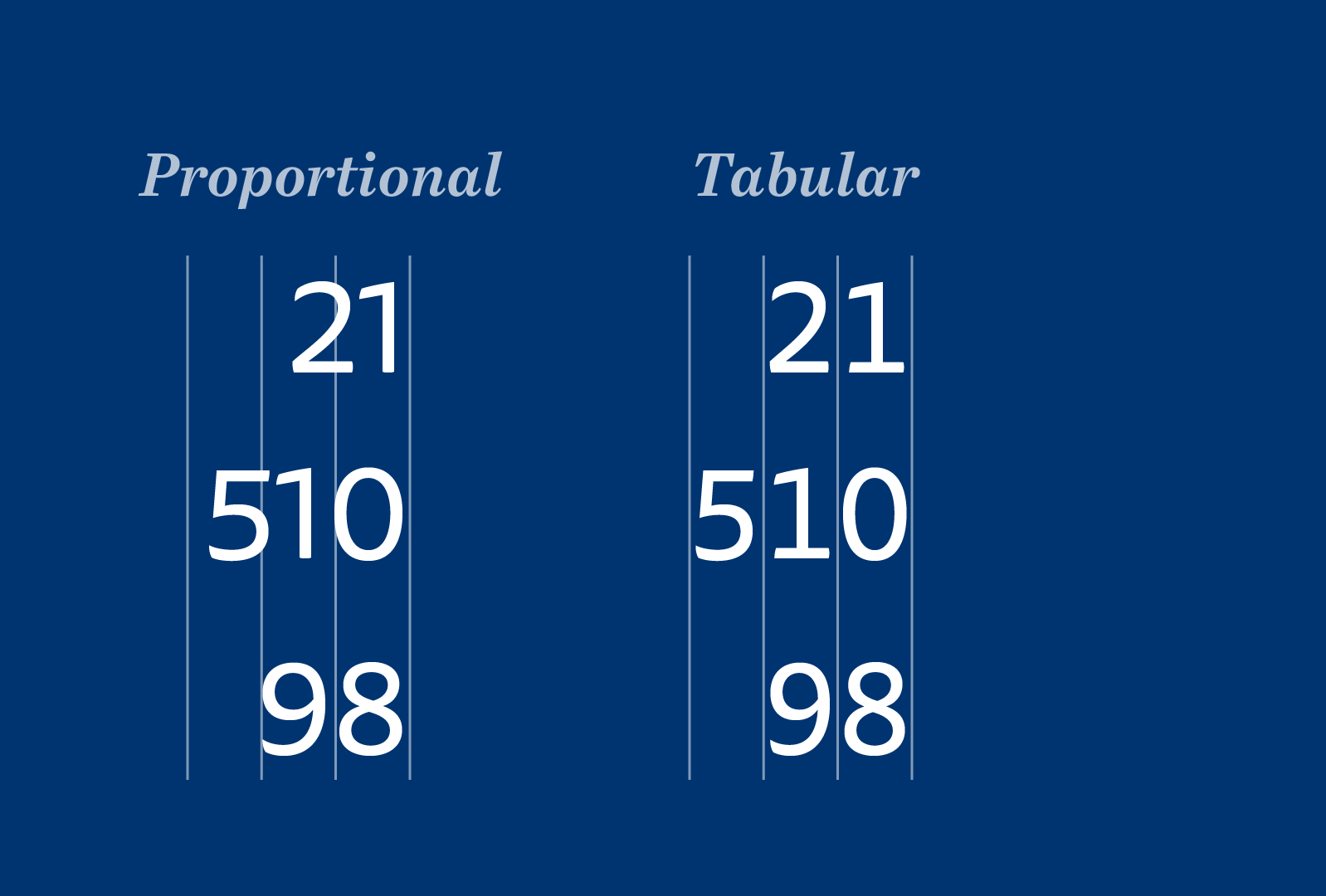
Tabular figures are monospaced. This means all figures have the same with so they align vertically as you can see in this example here. It makes them the preferred spacing for columns of numbers, such as tables, price lists and listings. Or in digital typography at places where you don’t want things to jump and bounce around, like the time display, maybe?
An alternate time displays for iOS
So, let’s take a look at the lock screen of iOS 13 again. The typeface used in all Apple products and interfaces is San Francisco. It’s a well crafted, modern sans serif optimized for screens and with a lot of Open Type features, alternate characters and so on. San Francisco contains proportional and tabular lining figures. The original time display in the lock screen uses the proportional figures of San Franciso. So let’s change that to the tabular spacing and see what it looks like.
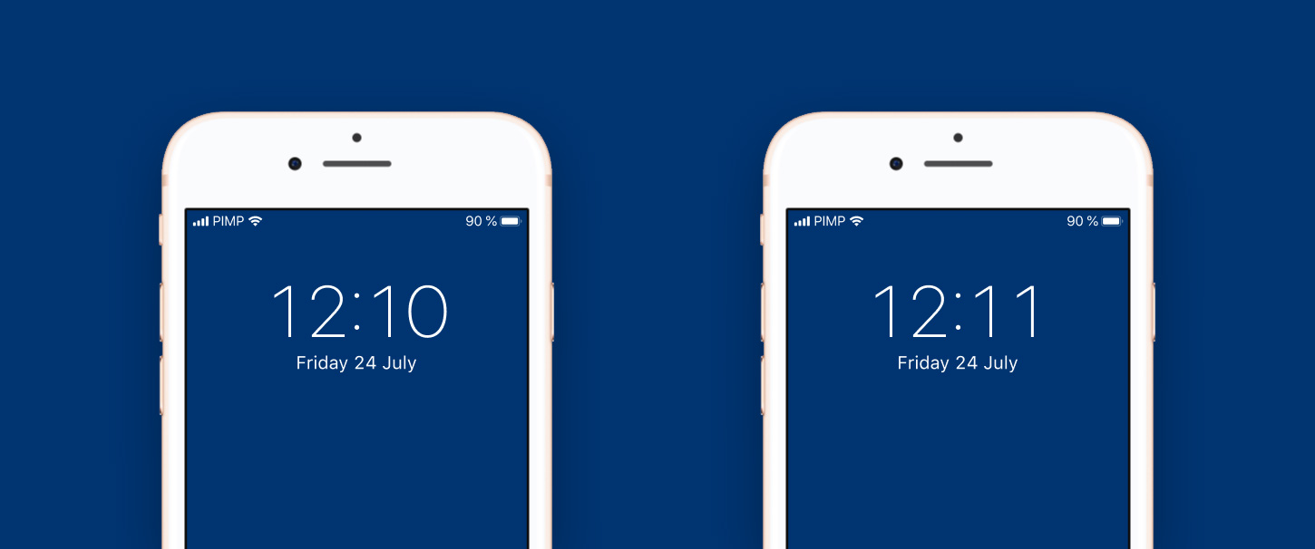
For 12:10 it looks quite okay with the tabular figures, for 12:11 on the other hand there is a lot of space between the figures which makes them almost fall apart. And the problem here is the number 1. To compensate for that, Apple could add an alternate character for the number one with a serif to fill the empty space. Some typefaces do exactly that, like FF Tisa (the typeface used for the examples above) where it automatically adds a 1 with a serif when I switch to tabular figures. Unfortunately there is no 1 with a serif in San Francisco, so for the purpose of this example I drew it and it looks better than with the original tabular 1.
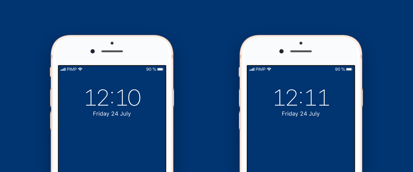
Now spacing is less of a problem, but it still feels a bis too far apart. What annoys me even more is, that the typeface now sets a different tone for the interface. The 1 with the serif makes it more technical, less elegant and simple.
My Conclusion
My conclusion comparing these three option now: the original design with the proportional numbers, the design with the tabular numbers and the time display with tabular numbers and an alternate 1. Knowing what I know now I would prefer the original design. It’s just more compact and simpler than the alternatives.
It’s not ideal though, I still hate it when something jumps around, but considering the alternatives, Apple took the best choice. At least it just happens once a minute and the shifts are not that dramatic when there is no 1 involved.
What this also teaches us is how to use the different spacings for numbers wisely. For example in a web design I recently made a counter component that uses tabular figures to align them.

Happy to hear your typographic thoughts or suggestions for future videos in the comments below!
Update: November 2021
Several comments to the video suggested centering the colon, right aligning the hours and left aligning the minutes. This idea came to me as well, but it visually does not work out, especially when it comes to one digit hours. See the example below. 9:32 just looks off, 22:11 as well.
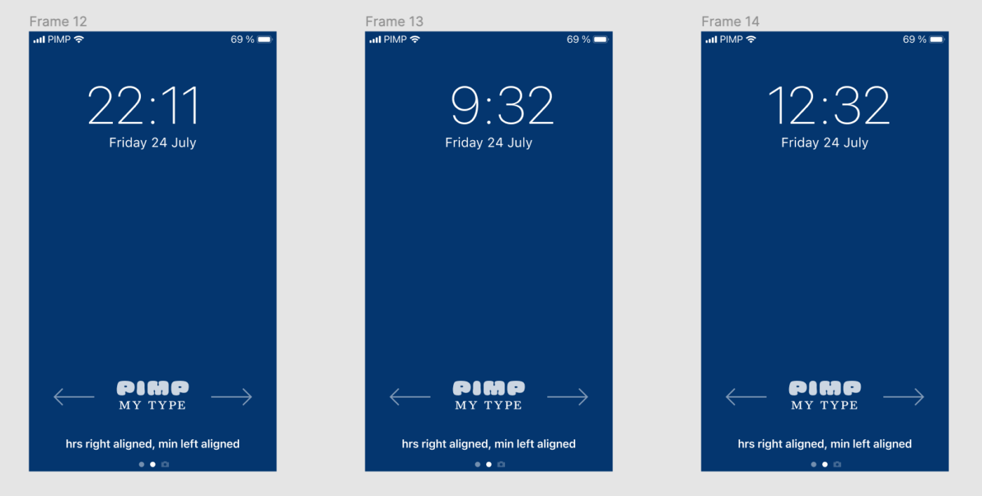

I’d keep the colon at the same position. But anyway, who but complete nerds would stare at their lock screens just to see the time change? 🙂
Fair enough! But once you realized it you can’t go back …
Makes sense to me. The kids today who grind through a couple months of typography classes don’t have the skills or knowledge to deal with tabular numbers. It’s sad.
I feel like this headline is a bit misleading. Maybe not intentional. But I was surprised at the end when you ended up not improving it because the original design was better than the alternatives.
Thanks for the feedback, Dan! You’re right, actually it’s not improved at the end. But it kind of brings awareness to the problem. Eventually I left the title as it was since this was my premise.
beat is right