It’s World Cup – and I didn’t really care … until I saw the typeface on TV 😳. Isn’t this a bit hard to read?! And then I got a message on LinkedIn, asking me what I think about the typeface on the scoreboard. This made me go into a rabbit hole that forced me to watch a game (or at least parts of it). So let’s find out what the issue with the FIFA World Cup 2026 font is and what it can learn us for UI design!
The typefaces used for FIFA 2026
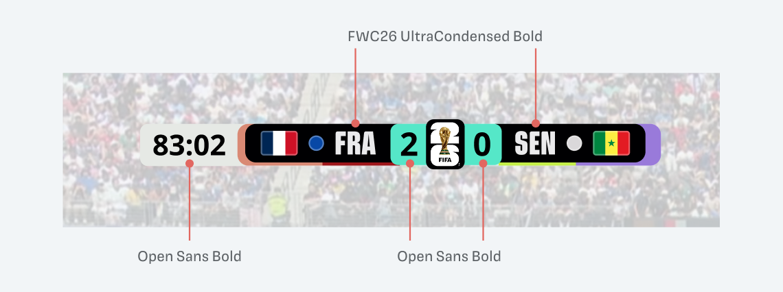
FIFA uses a custom-made typeface for the 2026 world cup, called FWC26 designed by Alistair McCready from the New Zealand based foundry Monolith. It’s a striking, vivid display typeface, available in various weights and widths. FIFA uses it mostly in all caps, Ultra Condensed, Black. That’s nice for a headline in their striking social media post, conveying a bold, dynamic and athletic spirit. But it is it appropriate for smaller sizes? Or on low resolution screens? No.
Analyzing the FIFA scoreboard
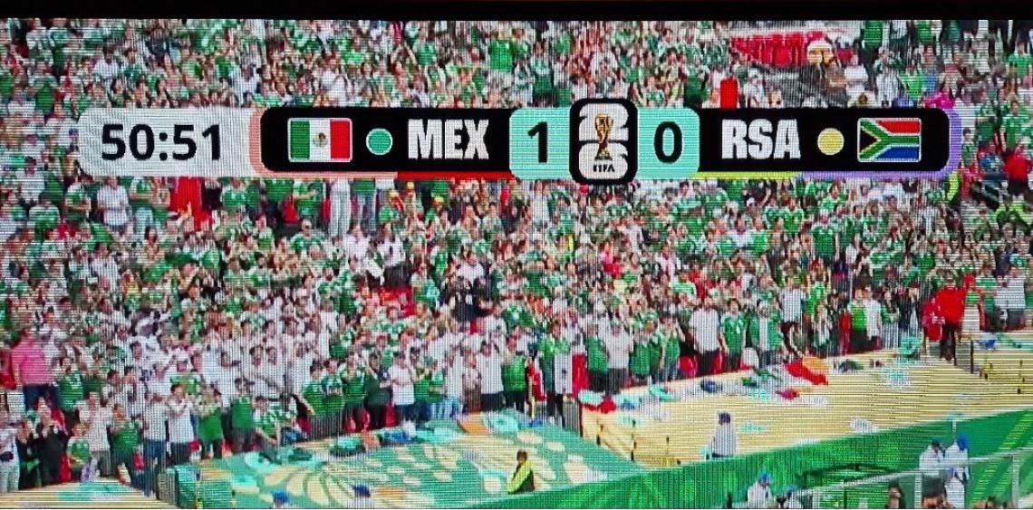
Now let’s go back to the thing that started all of this, the scoreboard in the top left corner. Compared to FIFA’s social media and promotional graphics, here it is not only the FWC26 font. It is paired with Open Sans used for the timer and the scores. Obviously someone found out that it would have been too challenging on a TV screen.
But they still kept the bold and striking typeface for the country abbreviations. This is problematic because:
- Letters are very tight and squarish, the inner shapes tend to disappear.
- This makes them harder to distinguish
- Tricodes for countries are not always that obvious (I learned that RAS stands for South Africa)
- Flags next to it help, but not everyone knows them either
- Plus, this will be seen on a variety of screens and resolutions, so it should be as legible as possible
How could this look differently?
If FIFA had used their custom typeface FWC26 for all the information (like they do on social media) this would have been much worse. I simulated it below, and it’s especially hard when you look at the score. The slashed zero could easily be mistaken for an eight. This typeface is simply inappropriate for information design.
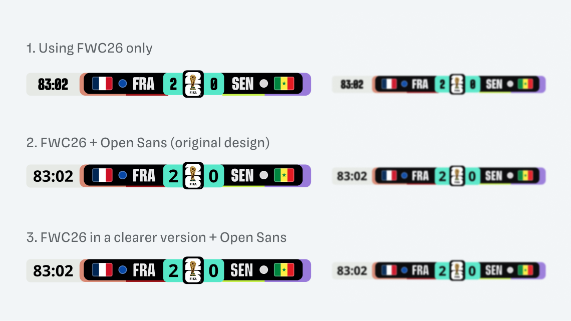
Looking at the original design in version 2 makes it clear why they picked the Open Sans typeface for numbers. But they still could have used a wider, and less bold version of their custom font to make it more legible without losing character. I simulated this in version three.
What can we learn for UI design?
If you pick a font that is very condensed and black and small it’s a perfect recipe for making things harder to read. It’s not that I don’t like the FIFA typeface, I think it’s a good choice for branding, but there should be a companion version for smaller sizes.
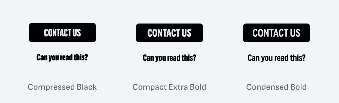
A typeface can also be too contrasting for its size. Which of these examples above do you find most readable? I bet it’s not the one on the left, using the Compressed Black style. So picking slightly wider and not too bold fonts can be very helpful for your design components.
Any more typography fouls that I should know about? Let me know, as I’m preparing a video about it. Until then enjoy the World Cup if you watch. I’ll only watch it to complain about the type 😉.