My Maku Font Review
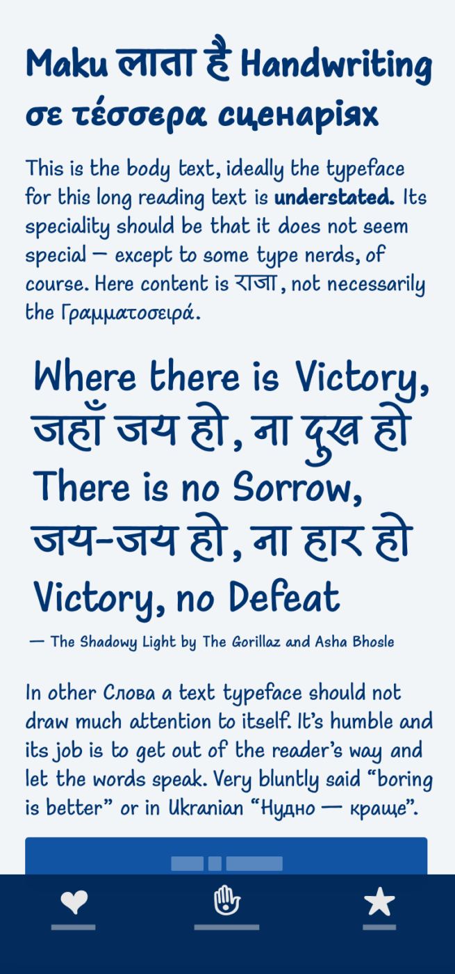
Maku is a charming handwritten-style typeface that covers four scripts. It seems very casual and approachable. The typeface comes as a variable font, with a ton of stylistic alternates and even includes a few playful symbols. I love how it authentically mimics a friendly handwritten look through utilizing alternates of one character. This way when the same letter appears repeatedly, it still feels natural.
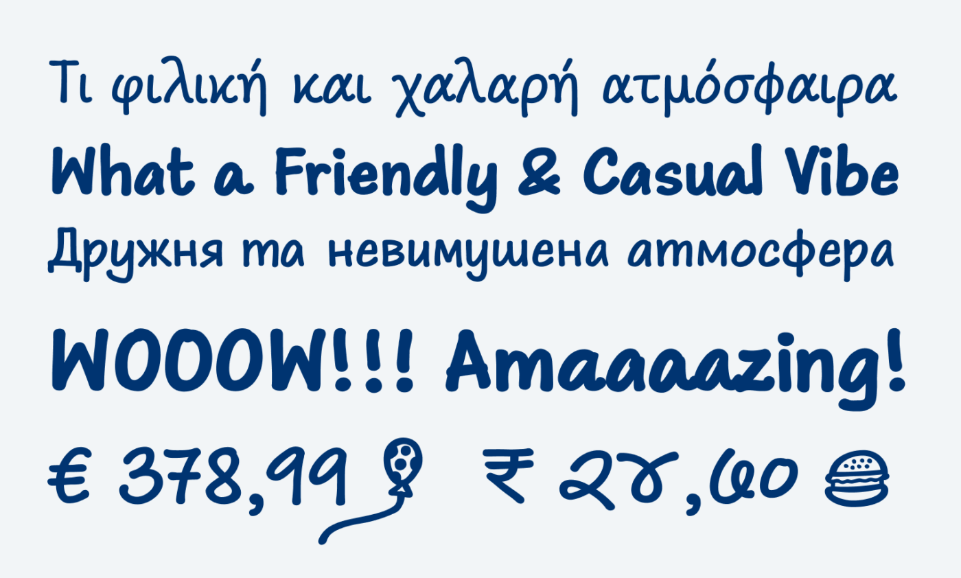
Most notable, however, is its support for the Devanagari script. I had the pleasure to learn a bit about it in Kimya Gandhi’s talk at beyond tellerrand. There are still relatively few high-quality typefaces for Devanagari, even though more than 600 million people use it. Especially natural looking handwritten styles are rare. What I find particularly interesting is that Kimya included a swash style for it, which is very uncommon in this alphabet.
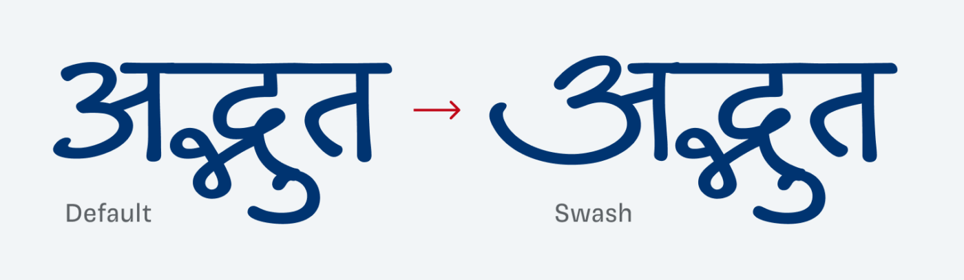
To me, Maku is a great way to bring a playful vibe into a design. It works best for display text or small annotations. It is also readable in body text, though it’s best used sparingly. If you do use it, set it about 15% larger than usual.
Font Pairings with Maku
Maku imitates a very clear, marker-like handwritten style – not too fancy. Pair it with something clean, like one of the suggestions below. But my favorite is Fig Grotesk, because it somehow underlines playfulness in a rigid way.

- Headings
- Copy
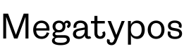

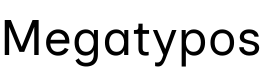


Learn more about pairing typefaces using the Font Matrix.
What do you think of Maku? And – if you can read it of my dummy text? Tell me in the comments below – also if you found any typos 😜.
I wonder if anyone outside of design, creative or type circles appreciates the craftsmanship that goes into creating a font, Oliver. I think of that especially when I see something naive, and playful like this. A unified system with laid-back letters that still holds together… I trust that’s actually the greater challenge. Love the Cyrillic, of course.
And when pairing, I enjoy reserved and sans, almost boring with Maku (and similar) to let them shine but still be a supporting companion.
And for the fav letter, all Cyrillic are cute, I don’t have proper keyboard to list them 😬 Slavic girl
Love that you love the Cyrillic characters! 😊 And I guess we’re the only ones that appreciate the effort that goes into a decent typeface 😉. Many people I talk with think fonts are just there.