
My Karst Font Review
I’ve been wanting to review this font for ages. Karst is a geometric sans-serif typeface with a twist. It comes with wide proportions, sharp cuts, and clean shapes, all spiced up with interesting diagonals that give it wonderful personality.

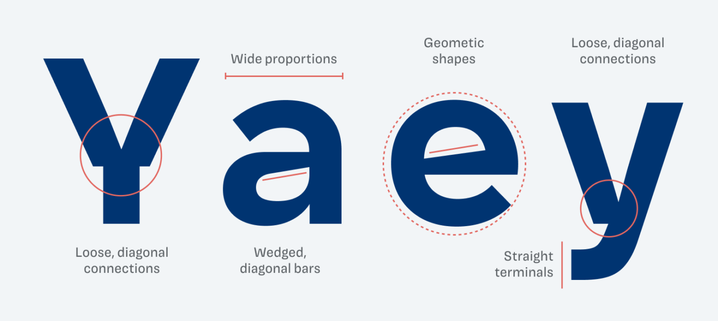
You can see how these small decisions stem from carefully crafted details – like the lovely wedge-like angled bars in the lowercase ‘a’ and ‘e’. I also love how the diagonals of letters like ‘Y’ and ‘w’ are so loosely connected that you can really see how they’re constructed. To me, this makes them feel honest and interesting at the same time.
Karst works extremely well in smaller sizes, making it an ideal candidate for UI design. The wide range of styles, from delicate Hairline to bombastic Black, really gives you room to express. Recently, I tried it out in a web design for a friend, using it in the headings. Paired with elegant Source Serif, it truly becomes an eye-catcher.
Make use of the two free styles, Karst Extra Bold and Karst Light and try it out in your designs.
Font Pairings with Karst
Karst is a geometric, linear, sans-serif typeface. Here are some interesting font pairing for body text or headings.


Learn more about pairing typefaces using the Font Matrix.
What do think of this one? Would you consider Karst for your UI or web design? Tell me it in the comments!
My new fave font — Karst! Now all I have to do is figure out how to score any of these free fonts … gimme a second … OK! Thank you, Oliver. I can tell I’m going to be jonesing every Friday until I open my Friday Font!
So happy to hear that, Marlene 😊.
Karst, don’t like the name.
Shines in ćirilica.
Cuts are ideal for some playful children’s brand.
Alternate letters are beautiful, especially the little g.
e is the star of this font, you could literally use it for a logo on its own (plus add some design).
Number 3 is confident.
Thanks for coming to my FF talk!
Let’s just name a company “e” and use it as a logo then 😅. Would not have come up with a playful children’s brand … but now when you say it … 🤔.