
My Coconat Font Review
Right now, I’m losing myself in The Greatest Billie Eilish song. Man, I love that build-up – it hit me hard and soft! But does the font of the lyrics video really fit? I made a short video exploring it.
Because as I was browsing for Font Friday fonts, free Coconat from Collletttivo stood out to me. Something fascinates me about this display typeface, and it’s the build-up as well that comes with a surprise! So let’s dive into it, learn about its quirks and how to use them. Maybe for expressing parts of the lyrics of that Billie Eilish song better?
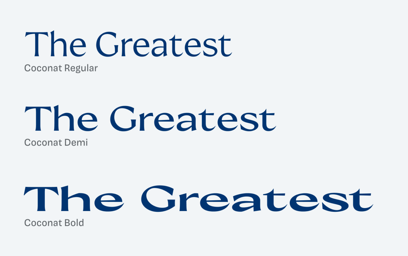
Coconat comes in three weights: Regular, Demi and Bold. However, not only the weight, also the width and contrast change in these three styles. This is something you don’t see that often. The fairly common proportions of the Regular style go wild, turning into eccentric letter shapes, as it gets bolder. You can see best what happens when comparing the extremes. Observe how the typeface develops an oblique stress, dancing on the edge of feeling distorted. Interestingly, the flared terminals don’t really change, but the apertures become more closed and sharper.
Now, what does this mean in practice? For a little copy, the bold style is an unexpected eye-catcher. But this only works in smaller doses, and only in larger sizes. I would not set Coconat much smaller than 20 px. Even in the regular weight, it looks too busy for long reading text.
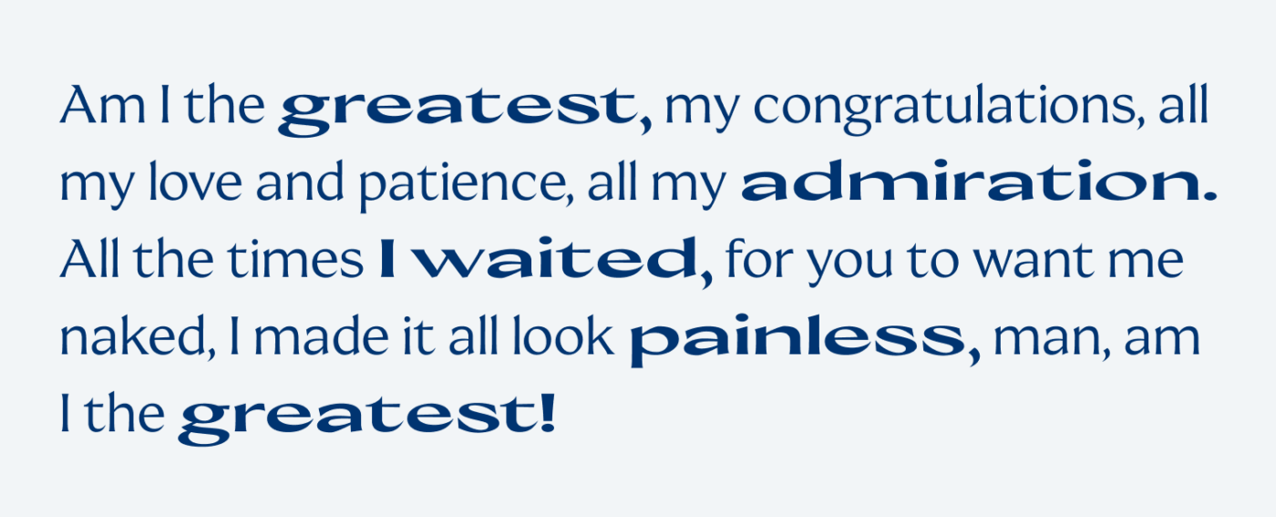
So let’s be daring and playful in our typesetting and use Coconat in larger sizes. Express ourselves and that powerful lyrics! Here, the divine lies in the details. I want to go for a blocked layout.
My changes mostly circle around these three things:
- For the first line, I use the Regular style. My emphasis lies on “unappreciated”, which is why I’m making it in bold. But I’ll make it a bit smaller so that it has the same width.
- With the next line, “I shouldn’t have to say it”, but that’s not a curled apostrophe. So let’s fix it, also in the last sentence.
- Also the kerning of the caps is not ideal. Let’s make it more even and adjust it, more about this here. Sames goes for the last line. It sticks together too much. So I’ll optically adjust it.
Compare the before and after, and you’ll see:
Now, is everything perfect with this font? No. Especially the bold style feels a bit too far off, when it’s not really large. Specifically, the lower case “w” seems too light in way. However, I can accept that it plays with this somehow distorted look. And I think for a poster or the lyrics video, it is more than fine! To me, it feels much more epic and expressive than the current one. Especially in caps.
Font Pairings with Cononat
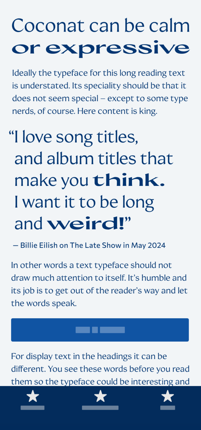
Coconat is a dynamic, contrasting serif typeface, ideal for large text. If you want something similar for long reading text, I recommend quite similar dynamic sans-serif Commissioner.

- Headings
- Copy


Learn more about pairing typefaces using the Font Matrix.
What do you think? Do you like Coconat better than what is currently used in the lyrics video? Tell me in the comments!
The contrast is still not enough.
It sure is not 😅. It’s 3.6:1, passing WCAG, but it should be more, you’re right. I wanted to make it better, but not too far away from the original, so that not all the attention is going to the text contrast.
Really cool content, Oliver 🙌 I really like both the font and your presentation (style / content).
Not to mention my book on your shelf. 🙃