Dan Alan from the wonderful podcast Graphic Design Is Fun, where I also had the pleasure to guest and talk about type choice, sent me this question after the interview:
You’ve inspired me to pimp my type, haha. I’ve been exploring typefaces for the podcast cover, to replace the somewhat generic Acumin I currently use, and was never totally happy with. I discovered ‘Big Shoulders’ in your Font Fridays, and think it follows the feeling I’m going for a bit better; it’s kinda groovy, a bit more fun. Curious to know what you think.
See this short video or continue reading to find out if that typeface fits.
Dan’s before and after
Dan used Akumin before, and this truly feels a bit generic. Like any graphic design poster somehow, reminding me of honorable but too often seen classic Akzidenz Grotesk. It fit to the grid in the background, but it is less interesting and only shows little personality.
Dan’s new choice, the free font Big Shoulders, is much more interesting. With a more squarish look it fits even better into the grid. Also, the restrained ink traps you can see at the A and N give it something special. The type is also more condensed, bringing me to my suggestion.
My suggestion
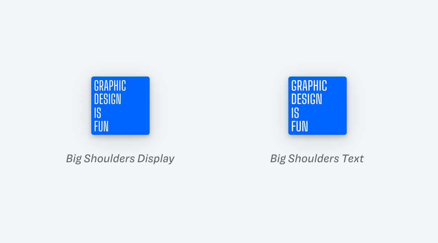
Because Big Shoulders in the Display style is very narrow, it becomes quite hard to read at smaller sizes. Not illegible, but not ideal either. And since the artwork in podcast apps is quite small, this might matter. So my suggestion to improve this would be to use Big Shoulders Text style, that is a bit wider and sturdier.
When you compare the small covers, you can see that the Text style is less blurry. Of course, it then will look a little less elegant in lager sizes. Decide depending on how much this matters to you, Dan. Whichever option you choose, the redesign already is a much better direction than before.

Do you want typographic feedback for your project? You can submit it here!

This is a great font—the detail is brilliant and striking. I downloaded it a while ago but haven’t yet found a specific use for it.
I like it as well! For a little text, it works just fine. If you use it, let me know!
Without the attention to detail shown, I would have simply assumed display should work better than text.
Well, depending on the situation and how much weight you give it. Happy I made you see something new, Richard 😉.