Join Pimp my Type on Patreon until July 2nd, and you might win the entire family consisting of 16 styles in 1 variable font. Many thanks to Fabio Haag Type for the generous support!
My Pitanga Font Review
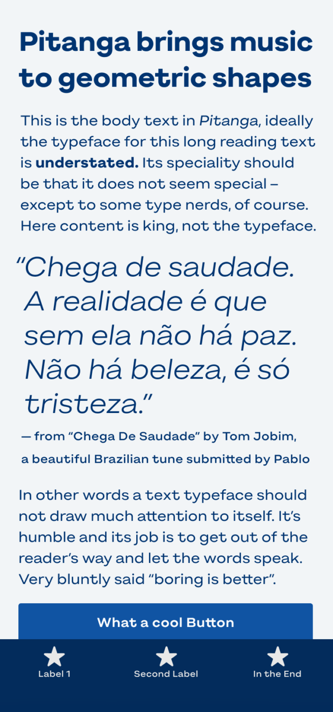
Soft, playful and with shapes so cool that sway so gentle – meet Pitanga, a special geometric sans-serif typeface. It is music to my eyes, particularly in lager and bold! But what gives this typeface its unusual, approachable vibe? Let’s find out!
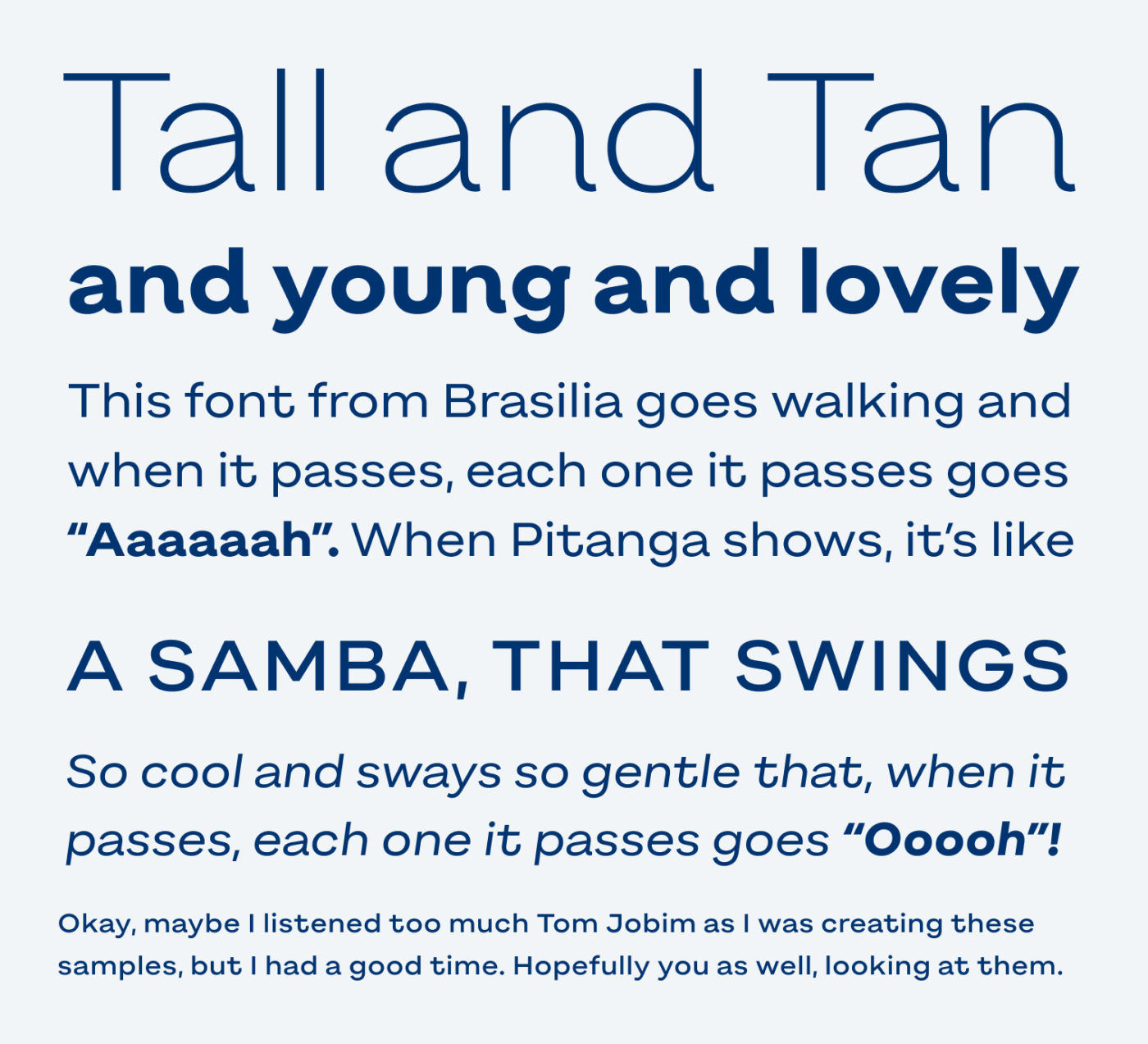
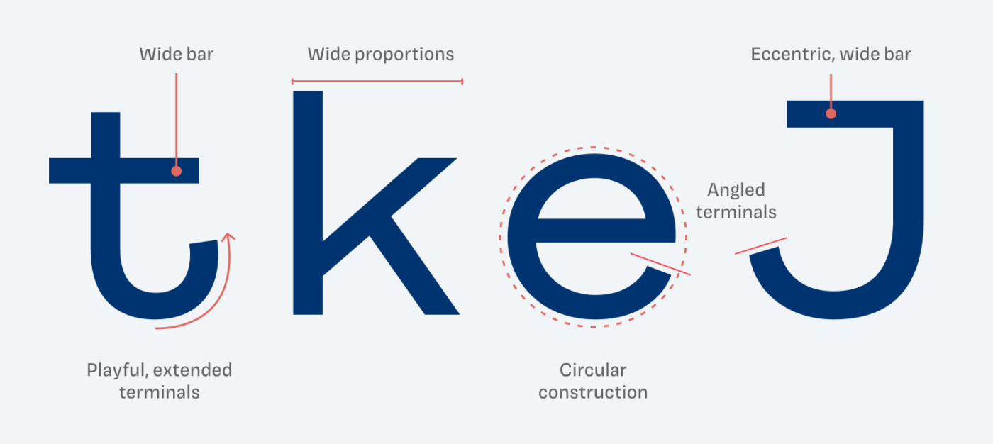
Pitanga is based on a geometric construction. But compared to many fonts of this genre, it is not taking it into a sober and clean direction. The typeface seems sturdy, but in a friendly and playful way, mainly because of two things. Firstly, the fairly wide proportions. And secondly, a few eccentric characters, like the lower case “t” or uppercase “J”, that emphasize on the wide shapes.
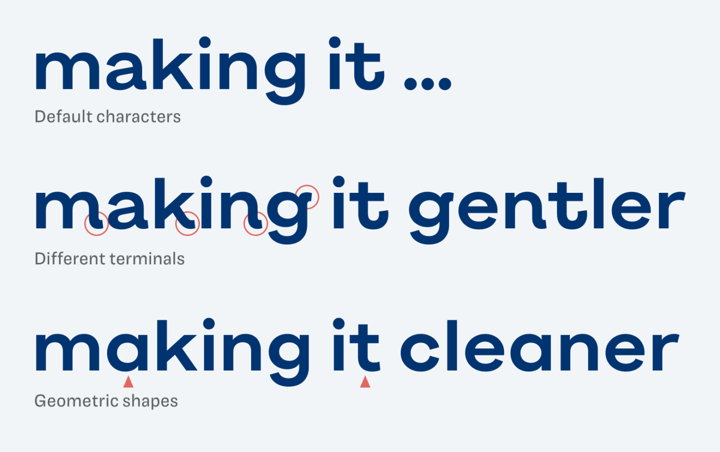
Pitanga is confident, but it does not take itself very seriously. What I really like is how you can change its voice by activating different stylistic alternates. Make it even gentler with soft, wavy terminals, or go for a cleaner design with a simpler “a” and “t”.
In my opinion, the typeface works best in headings, maybe a logotype. However, it would also work for a little body text or even UI text. But I would not use it extensively there, since Pitange is very space consuming. In these cases, I recommend pairing it with one of my suggestions.
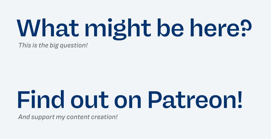
Font Pairings with Pitanga
Pitanga is a geometric, linear sans-serif typeface, ideal for larger text. Looking for something classic for long reading text? I recommend the very different, dynamic, contrasting serif typeface Rasa.
- Headings
- Copy
- UI Text
Learn more about pairing typefaces using the Font Matrix.
What do you think? Do you see music when looking at Pitanga? Tell me in the comments!

Not my cup of t… of type Oliver! But I see more and more fonts of this style, around the web.
Looking at “and” a seems smaller than n and d who eat a for breakfast.
The word “young” – again problematic. It might be my not-so-metrical mind. But then t and J are gorgeous… 🤔
Anyway, I could spend another 2 hours staring at fonts but I have to run from the screens.
3/10 imho