No one is web-safe anymore! 😱 At least no font is in 2024. Find out why and if it is still relevant to use system fonts in this short video and post.
Tim asks:
“Do web-safe fonts make a page load more quickly? Does it really make a difference?”
Tim is referring to an article by wix.com, where they claim web-safe fonts are a good choice because of:
- Consistency – which is not true
- Accessibility – which depends on the system font
- Performance – which can be true
Web-safe fonts are not web-safe anymore
Web-safe fonts system fonts that are pre-installed on most browsers and operating systems. While this was true 15 years ago, when you would find Arial, Times New Roman, Georgia or Verdana on Windows and Apple machines, this drastically changed with the mobile era.
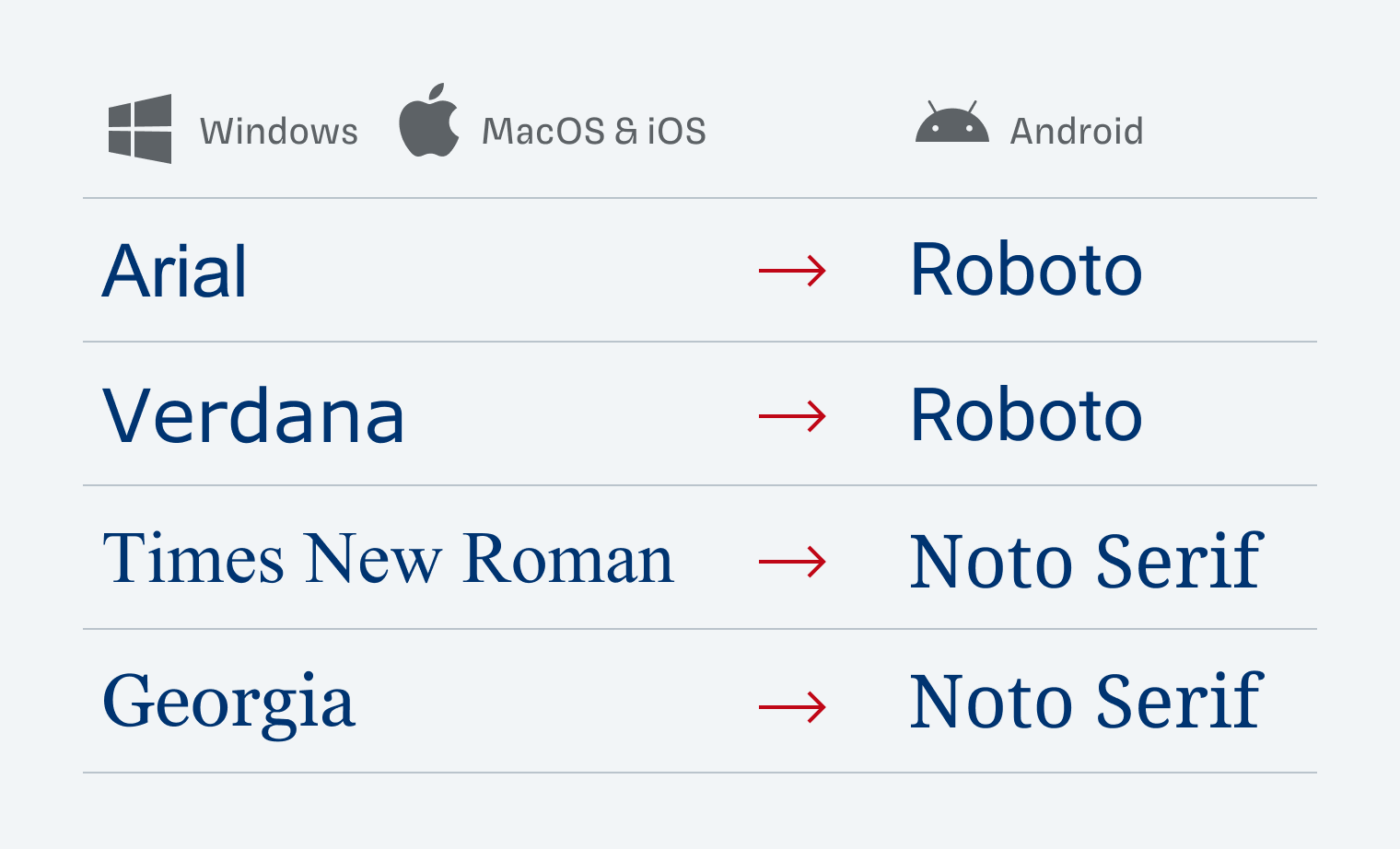
While iOS kept the most common ones, Android ditched all of them, using their own fonts. You can find on good old fontfamiliy.io, what will be the replacement for these defaults. And since Android globally is the most popular operating system with 43% (source), this matter a lot.
For Android, there are no documented font names. It falls back to the default sans-serif (Roboto) or serif (Noto Serif). Here you can find a list of the system fonts on Apple and Windows.
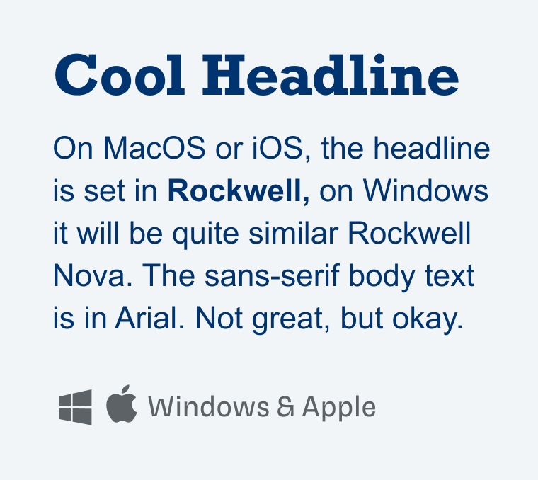
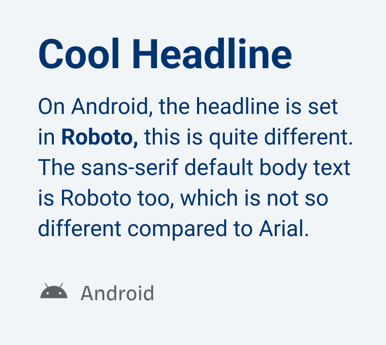
System fonts make your website inconsistent
Depending on the platform your website is viewed on, it will create inconsistencies in your type choice. Especially with headings, which will convey most of the personality of your design, this can be problematic, resulting in a very different mood. In this critical area, I would not don’t bet on system fonts.
It can be less relevant if you are using the default sans-serif or serif typeface for body text or UI text. Of course, there are differences, but they are less obvious in that role. Tools like Modern Font Stacks might be helpful here.
Do system fonts make your website faster now?
That depends on the amount of fonts you are using on a page. If it’s, let’s say, twenty different typefaces and styles, it will have an effect. Because the browser has to download them before rendering the page, and that can take time, depending on your connection. But a font file is only downloaded when it is actually used on that page. And if you really have twenty different fonts on one page, your design might have other problems than the font files along 😉.
Let’s be more realistic and consider 2 to 5 different font files. If they are served in the compressed woff2 format or a variable font even, it could be as small as to 30 to 80 KB. This is still less than most images on a website will have, let alone video files. So don’t think too much about it and express yourself with web fonts.
By the way, I do not want to say that file size does not matter at all. You should try to keep your font files as small as possible, and next to compressing them, also subsetting fonts (excluding characters and scripts you don’t need) is a great approach.
In summary, I recommend:
- Prefer web fonts, especially in headings, because of consistency.
- Keep it to 2 to 5 font files or below 100 KB.
- Use system fonts for body text or UI text, if you have to.
What do you think? Performance over style? Or both? Tell me in the comments! Also if you have a question for me.
This is my dilemma when I do rebranding. But style can’t suffer and the true expression of a brand’s soul.
I’ve recently introduced two new fonts to a brand I’m working at. I’m waiting for the devs to implement/redesign the entire website – soon.
Lovely blog post, Oliver! Thank you for staying on top of every font insight!
P.S. Check this out-of-ordinary type https://www.laborandwait.xyz/fonts/esperanza
What a fantastic typeface, Jana! Upright Italics! Sophisticated Stencil style! I just asked them about being featured on Font Friday 😉.
What are your thoughts on font swap Oliver? I use web fonts, but if I enable swap in the font display settings with a so called web safe font I see a flash as the page opens with the web safe font before the correct font appears.
I see many pushing to use font swap, however the advantage does not seem clear. After all, if the web font is loaded on the server it should load like everything else.
I think font-swap is a good thing, because any content is better than no content, even if it might result in a slight reflow. But if you connection is fast, then it most likely will work. If not, you will have text, which is great 😉.
Zach Leatherman has written extensively about the pros & cons of various font-loading strategies. See https://www.zachleat.com/web/comprehensive-webfonts/
If you use WordPress, I’ve written a plugin to make implementing his recommended strategy easier. Search for “WP FOFT-Loader” in the plugin repo.
Thanks for the links and the plugin, Chris! Zach is great ☺️!
Hi Oliver,
Thanks so much for giving such a detailed answer! Essentially, it’s one less thing for an amateur webmaster like me to to worry about.
Very best wishes and thanks again for Pimp My Type
Tim
Of course, Tim! Happy you found it helpful ☺️!
Thanks for the post!
Found some typos in the post, was looking for a place to submit a PR on your GitHub (https://github.com/glyphe) but didn’t see anything. Is it open source?
Always appreciate it! Thanks for taking the time, Karl! It’s not, just shoot the an email 😉.
I thought those ancient Arial, New Times Roman fonts will be available every where. I think originally they were introduced due to Print media.
It’s not quite that simple, while they are often based on old typefaces, the files to use them on computers are still proprietary.
Absolutely right. Only because a typeface is available on an operating system does not mean you can use it for whatever you want. For instance, San Francisco by Apple is only available on Apple Devices.
Thank you for extra tasks. I was living under the believe that “web fonts” are safe on all devices with access to the web.
Of course, Ziga! Happy you found it useful!
Google has metrically compatible font’s for Arial and Times New Roman (as well as Calibri and Cambria), I unfortunately have no idea if they are included at all in Android.
https://en.wikipedia.org/wiki/Croscore_fonts#Crosextra_fonts
How cool is that! I did not know about it, what a great resource! I might make a video or article on that, thanks for sharing it with us, Ciaran!