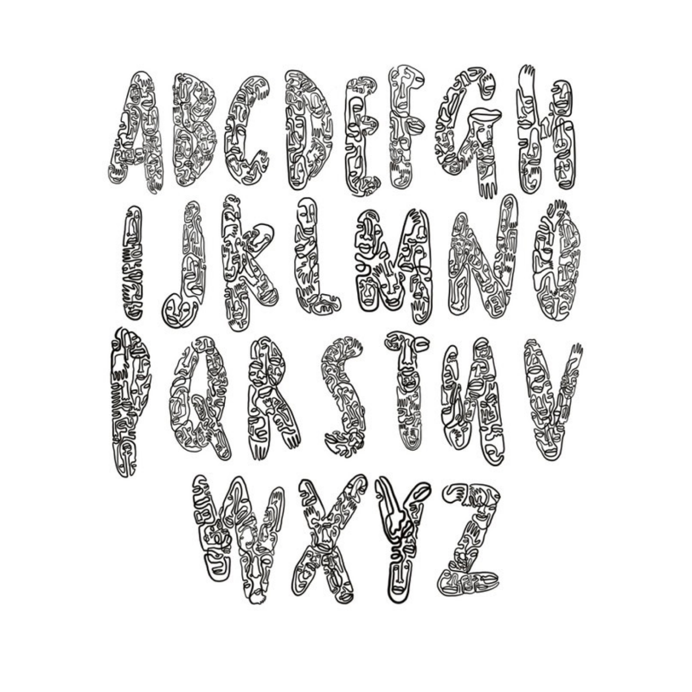
The Dutch artist Salventius shared his bold, line-drawing alphabet with me. It’s visually stunning, filled with hidden details and lively shapes. But is it practical for design? In this quick video and article, I’ll give my take on where it excels – and what could make it even better.
“This might hurt your eyes”
It all started with a message I got from the amazing Dutch artist Salventius on Instagram:
“This might hurt your eyes 😀 But seriously … I am really curious what you think of these kinds of fonts. Although they are in the ‘wild type’ category, I am curious about your honest opinion (and critique).”
These alphabets definitely do not hurt my eyes, it’s actually quite the opposite. I really love Salventius’ style – the continuous line, there’s so much to discover! And used as letter shapes, it adds a layer of meaning. Now when I assess type, my focus isn’t on whether it’s “good”, but rather on its strengths and untapped potential. Because the real question is: What is it good for?
Use it in big sizes
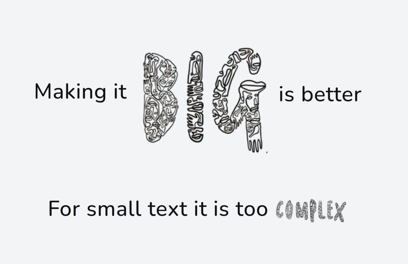
So what makes these letters interesting are the ornaments, the hidden, ambiguous faces and shapes, all the details. This means they definitely need to be used in large sizes, the bigger, the better! Like in drop cap. Because it would be too complex for small sizes and only look messy.

Provide alternatives
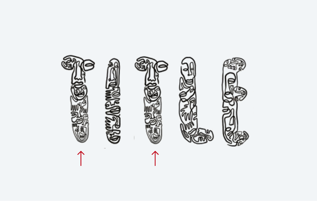
Now if they are used in a big title, there should be some alternative letters, otherwise it would not be interesting anymore and lose its authenticity, when the illustration repeats.

Make the details work
Also, it would be beneficial if the letters were a bit wider, so the inner space does not disappear, like here at the D, B, or P.

I also think that the Helvetica example works a bit better because it combines a very sober typeface with a very lively illustration. But here, a consistent stroke and level of complexity would help. As you can see below, the “H” has a lighter stroke than the lowercase “l”. Compared to the “v” the “a” is not very dense. This is not dramatic for this drawing, but it would be undesirable for a whole alphabet.

I would not vectorize it
For now, I don’t think this needs to be a vectorized font file. A simple set of transparent, high resolution images would be enough, for designers to work with it and create unique looking type. And since it should only be used for a few letters, it’s okay. Of course, once it becomes more popular, it could be offered as an image font, which would make it easier to use. The latest expansion stage would be a vectorized font, but this would be very complex, and maybe even technically too challenging. But I’m not a font production expert here 😉.
Overall, I see these alphabets still more like an illustration, ideal for one word in a title, or a drop cap. There they will add a certain playfulness and artistic vibe to the message. I’m curious how Salventius will take this further! To find out more about this amazing artist, I recommend following Salventius on Instagram.
If you need an opinion on a typographic problem, consider scheduling a private coaching call, or submit it here.


If the intent is to use them for drop caps, I think the artist need not provide alternatives. But for headings and display text, alternatives are a must!
I absolutely agree, Chris!