Trump’s latest White House “upgrade” includes a paper Oval Office sign. In this article and spontaneous video I’ll talk about the font choice, why it feels insecure rather than elegant, and what it says about the use of script fonts that want to pretend to be luxury.
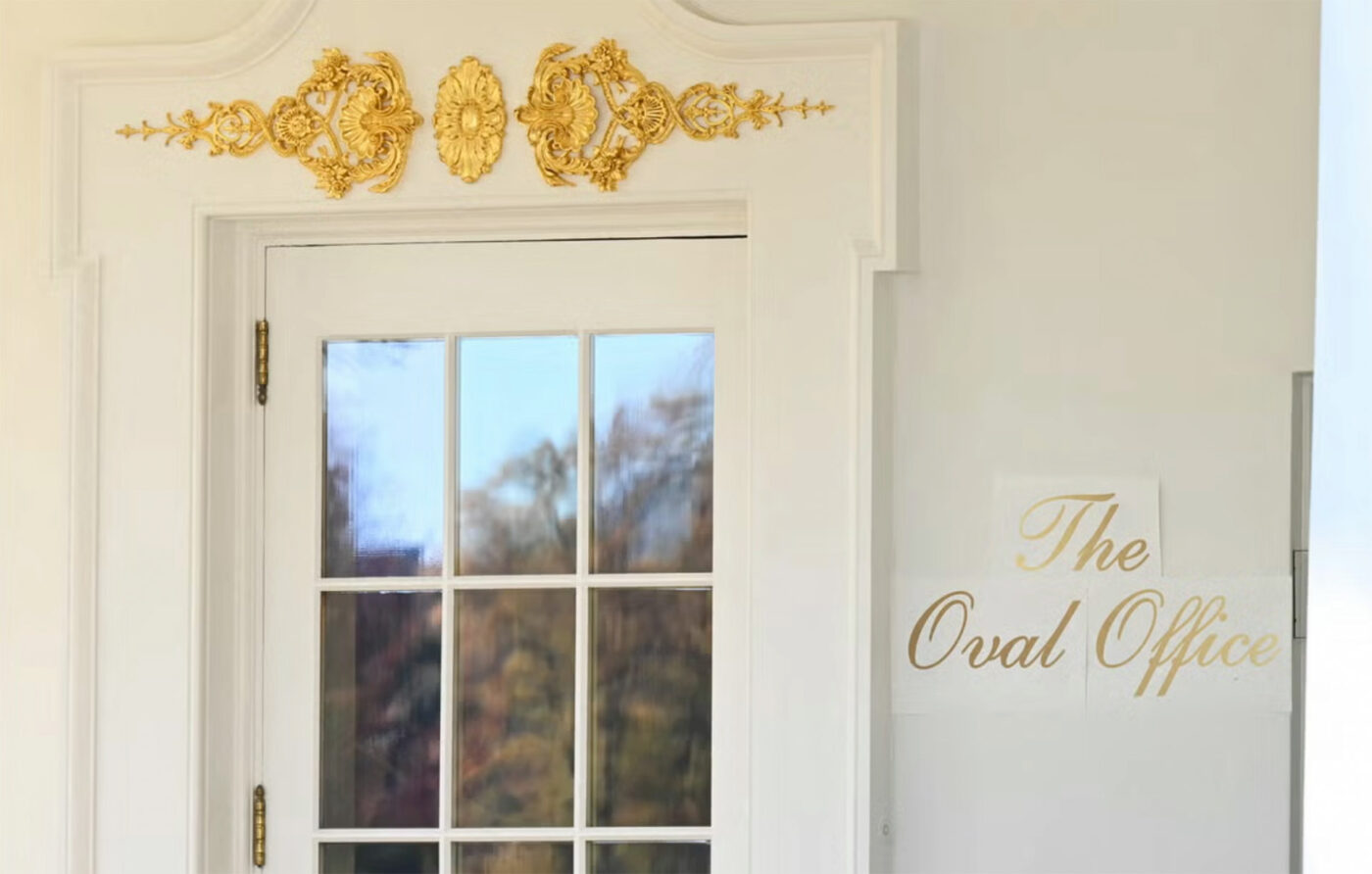
Some background: If you caught last week’s photos from the White House Rose Garden, you might have spotted a curious little detail – a temporary paper sign outside the Oval Office, set in shiny gilded script. HuffPost asked me for thoughts on it. So here’s my analysis on why this sign feels so strange, and what it teaches us about design choices that over-promise and under-deliver.
A sign that wants to look fancy
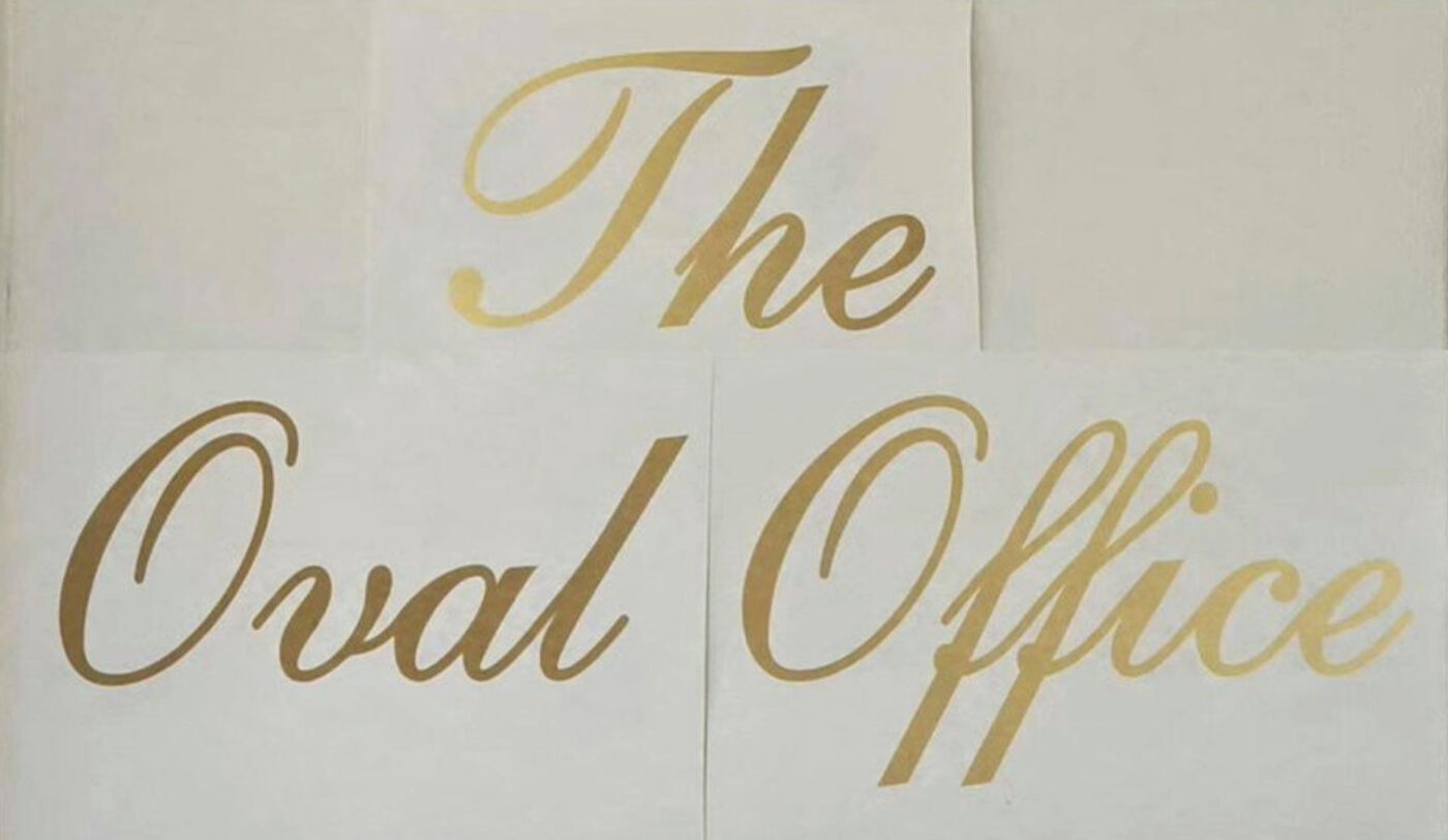
The sign uses a gilded script font on a plain paper, a placeholder obviously, for something more permanent. And to me, this is the cheapest way to signal something is noble. It’s lush and golden, but it feels insecure, like trying a bit too hard. Think of a cheap chocolate brand using a shiny font to look luxurious or a low-budget hotel conference room that is going for grandeur but lands on kitsch.
It is also reminiscent of the Mar-a-Lago font, while it is not that exact one. But it’s a style that often appears in Trump-branded stuff. So this could be an effort to make the White House more Trump, or it is just the “luxurious” aesthetics that Trump finds appealing.
A proper typeface used in poor way
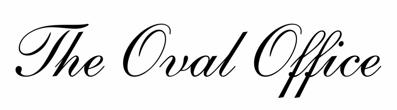
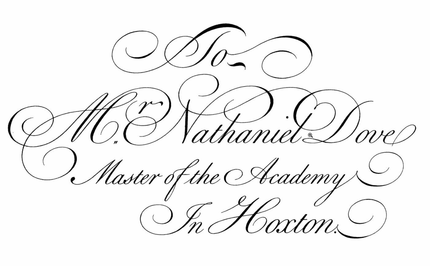
Let’s dig into the typography itself. The font appears to be something along the lines of English 111 Adagio or Shelley Script. Both solid, respected script typefaces with roots in English roundhand calligraphy.
But here’s where things get messy:
- There might have been an outline added to the font so that it works as a sign. But this way it looses the strong contrast of thin and thick strokes and therefore its elegance.
- The letters don’t connect properly in a way calligraphic script should. Look at the capitals that stand there alone next to short entry strokes of the lowercase.
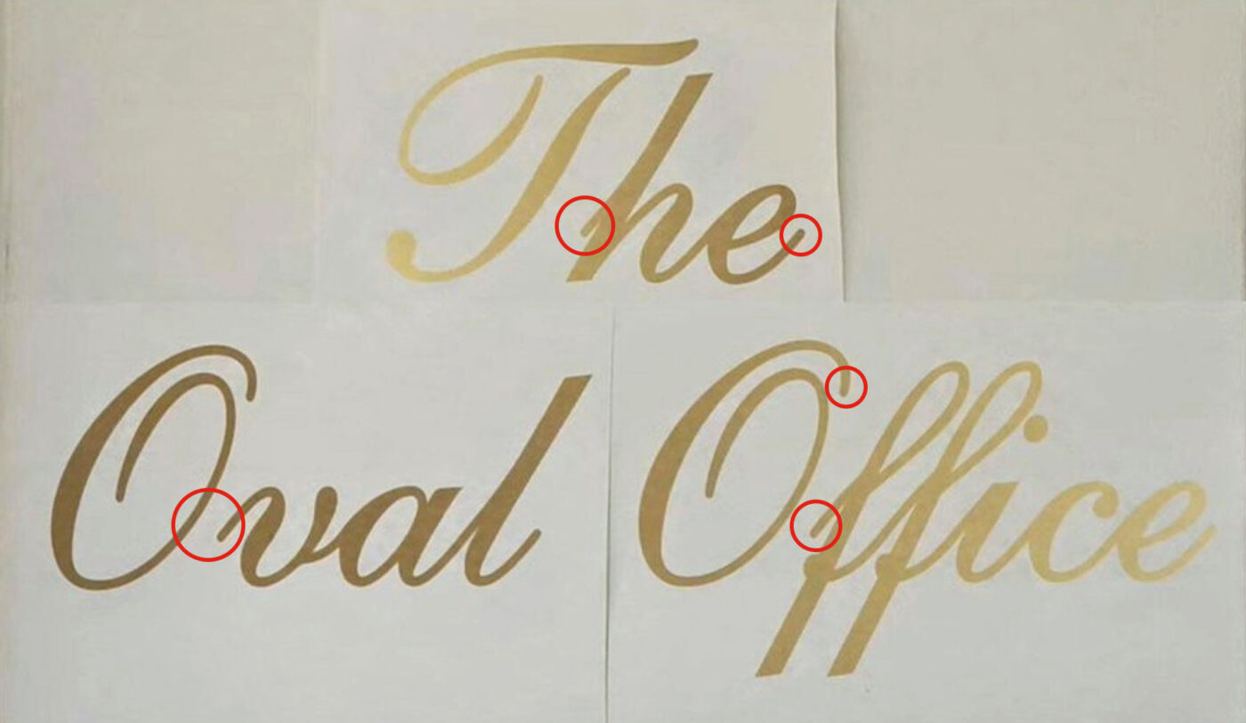
You might wonder why the original script font also does not show connections to the capitals. This is due to the technical limitations when English 111 font was made, so that it is not offering contextual alternates for these cases.
Script fonts are inappropriate for signs
Besides the poor execution, there is another, bigger issue: script fonts are often inappropriate for a sign, and especially for cut-out letters. They’re narrow, decorative, and sensitive to bad spacing or low-quality rendering. They are also harder to read. And that all besides the fact that you really do not need a sign in front of the Oval Office.
Overall, the sign’s design shows the intent to look refined, yet it ends up feeling hollow and predictable. It signals aspiration rather than authenticity. Typography doesn’t just communicate words. It communicates confidence, tone, and intent. And when the styling feels insecure, the whole message wobbles. But maybe that fits this presidency.
It is already real
As I learned from a few sharp-eyed viewers, this questionable type choice isn’t just an accidental printout. It already exists in the wild at the recently revealed Presidential Walk of Fame. The exact same font in full in distasteful metal. Or as Trump explains: “So that’s half-inch-thick bronze. Carved. By a very talented person. And it’s brass, pure brass. It’s half-inch thick. And you can’t just do that. You look at that, that’s quality, right?”
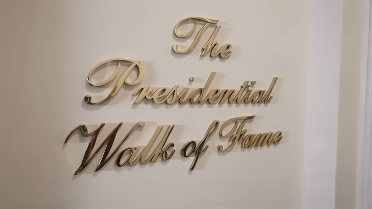
Now, on one thing I agree: you can’t just do that. It takes effort to create something this unnecessarily excessive. The font, the proportions, the material – whatever this from-bronze-carved-out-pure-brass is supposed to be – all of it is dialled up far beyond reason.
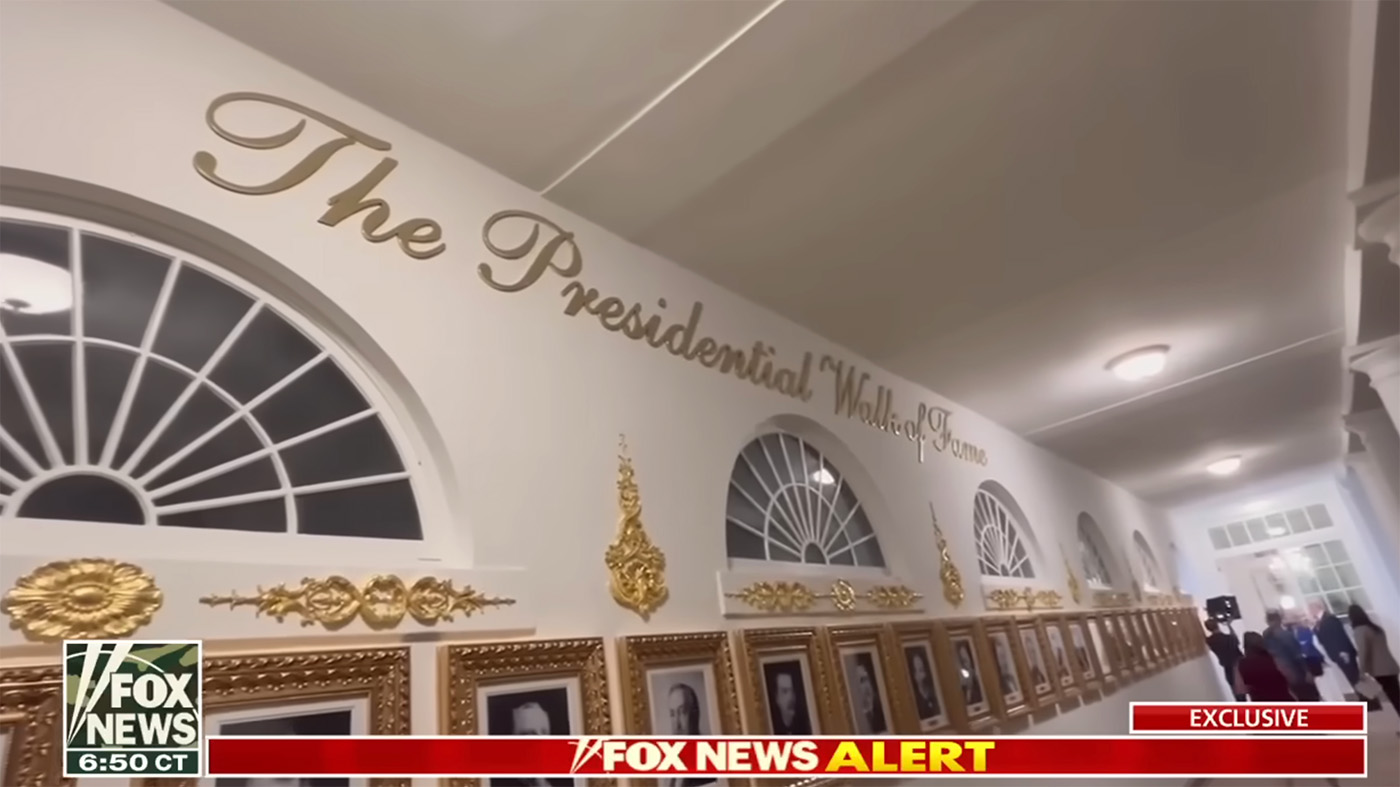
Look at the size of the type. It’s comically huge, not just at the start of the walk but even up top, as if there were any chance you’d miss it. Then again, it has to hold its own next to those wild, exuberant frames. I’m pretty sure we will soon see this “quality work” in front of the Oval Office too.
What you can learn from this
Even if you’re not designing signage for world leaders 😉, there are two takeaways:
- Let materials match the message: If you want something to feel premium, the typography, material, and execution all need to work together. A fancy font needs to fit the environment.
- Choose script fonts with care: Use them sparingly and intentionally. Test how letters connect. Check whether the elegance holds up at the size and medium you’re working with.
Here you can find a few script fonts I recommend in my Font Friday reviews.
What do you think of the sign? Share it in the comments! Also if you’ve got other examples of script fonts gone wild.
always appropiate, and inspiring!
D.
Thank you and of course, Debora 😊!
So true.
Thank you for your precise, critical and entertaining investigation!
True and sad 😂.
I believe in minimalism as a principle in everything. Only have what matters. Poor efforts spent to compensate for lacking things is just worse than not having them. This applies to both design and the people who ask for the design. Thank you for this post!
“Poor efforts spent to compensate for lacking things is just worse than not having them” – I love this, Metehan! So true!
Thank you for putting into words when I felt. A glittering script on cheap paper = pretension without substance. Ironically, perfectly on target.
Oh Dan, it just got worse. I’ve updated the article, and you can see what this soon will look like, as the “ Presidential Walk of Fame” shows that exact type in all its awfulness.
The target audience don’t deserve a truly elegant font.
And you do? Spare me your gross generalizations about millions of people you understand nothing (except media lies) about. What an elitist thing to say.
I’d like to keep it friendly here, everyone. I think everyone deserves a fine font and a friendly response.
What is going on with your t-shirt?!
It’s so amazingly annoying to look at, with the bad kerning and the typo. I love/hate it.
Sharp eye, Barbara! 😂. I love type, but typo seems to love me 😉
Please help out.
As a non-native english reader, I just can’t find the typo.
Sorry.
But there being a typo at all, means that it is clearly not:
“Carved. By a very talented person.”
but just sloppy work on the key board of some big fat laser cutting machine.
One would think that at least the very prophets of fake should understand how all that cheap fake gold underscores the the lack of substance of their position.
The typo is on my shirt in the video 😉.
One yes – nothing is carved here by a talented person 😅.
Good design analysis and insight into the fundamental and subconscious insecurity driving authoritarian leaders. I’m reminded daily of the Paul Rand quote, “The public is more familiar with bad design than good design. It is, in effect, conditioned to prefer bad design, because that is what it lives with.” In Trump’s case all his branding can be seen as ignorant of all design, or maybe as “anti-design,” if it’s intentional meaning a product of thought. I see this trend in Musk’s “X” logo–intentionally bad typography; or the lines on the Tesla Cybertruck. It’s like a message that visual design doesn’t matter, only engineering matters. I can’t explain it, but it fits with a sort of bland populism, implying that education and design is “elitist” in some way.
Thank you and that’s a very interesting viewpoint! Never thought of it that it might look “too good”.
If it were more correctly called The Offal Office, it would be spot on
Absolutely, Eric 😂!
Right on!