
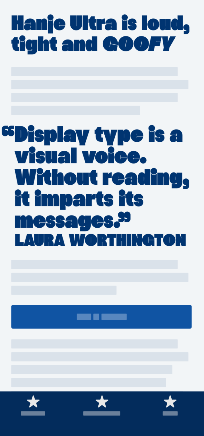
My thoughts on Hanje Ultra
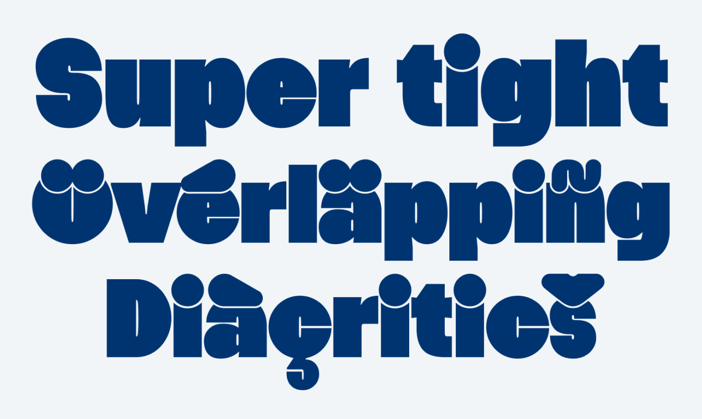
Sometimes I just want to show you a typeface, because I find one or two tiny things very cool about it. Even if I don’t know if there might be a lot of projects for it. This is the case with Hanje Ultra. It is a super tight, ultra bold typeface. It is very geometric and constructed, but it does not feel dry at all. The reason for that are the tiny apertures and counters – basically just a dot or line – and the overlapping dots or diacritics. They turn Hanje Ultra almost more into a pattern of shapes, than text.
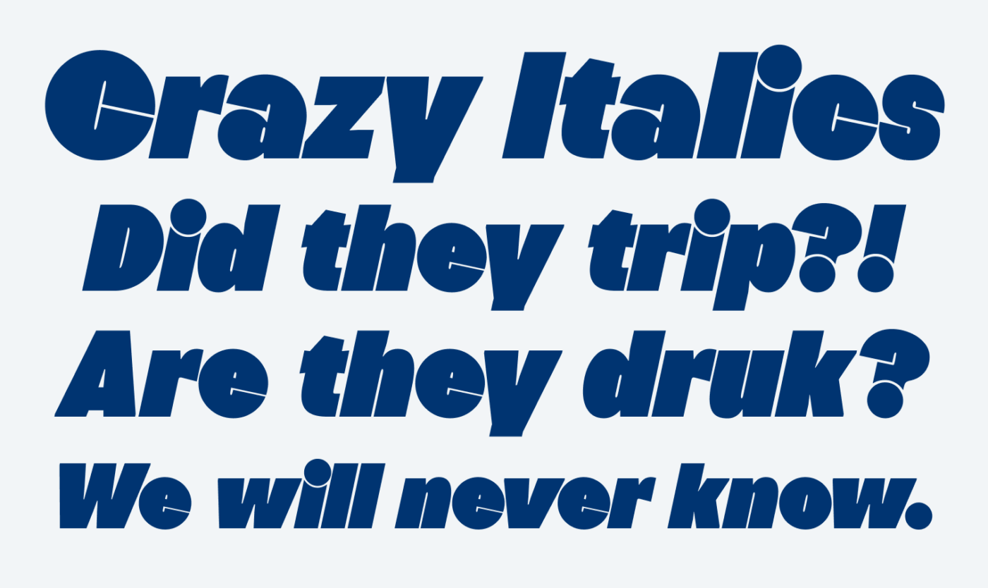
But there is another thing I really like, it’s the goofy italics. The round shapes are just rotated, which you can see at the c, e, s, or o. The characters are slanted, and seem more stable, like the l, n, i, or v. Overall, this creates a wonky and lively impression, as if the round letters fell over and were stopped by the others. Hilarious 😂, but only if you use it as a well dosed joke 😉.
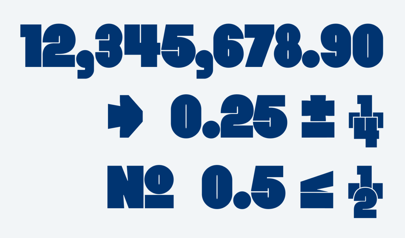
Lastly, I want to point out the numbers, which I find super intriguing as well. Hanje Ultra comes with a lot of numerals, crazy fractions, arrows, and symbols. Something you would not expect from this kind of display typeface. And it stays true to the bold and overlapping style here as well.
So, what to do with this typeface? Hanje Ultra will work best for super short text. One or two words, or just a single character as an initial, or a gigantic number. Use it with as little line height as possible and as large as possible (40 px at least). Don’t expect it to work for longer sentences, my example at the top is already an edge case. Embrace its weirdness and you’re good to go.
Font Pairings with Hanje Ultra
Hanje Ultra is a quite rational, contrasting sans-serif typeface made for large display text. Combine it with one of my suggestions for your specific use cases, like UI design.

- Headings

Learn more about pairing typefaces using the Font Matrix.
What do you think? Is Hanje Ultra something for an upcoming project? Tell me in the comments below!