
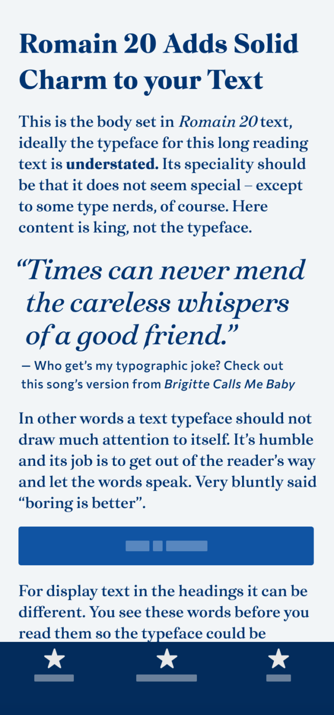
My Romain 20 Font Review
Are you familiar with that: sometimes it takes only one character to fall in love with a typeface? With Romain 20 it only took the ‘A’ to blow me away … Am I weird? Yes! But I’ll invite you to be weird with me here. This French serif font combines elegant and yet durable shapes in a contrasting text typeface. Something that will give your typography a unique twist. So let’s discover its details and then see what you can use them for!
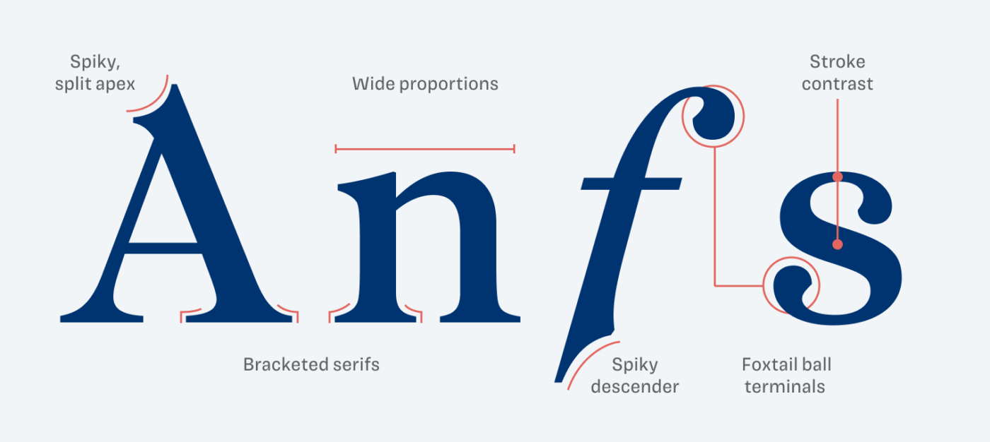
As already said, this extraordinary uppercase ‘A’ took me in a snap with its snappy apex. Can I feel a broad nib pen here? Also at its counterpart, the spirited descender of the lowercase italic ‘f’. This is where you can also find an elegant yet playful foxtail ball terminal – yes, I googled how these are called. This is all rounded out with bracketed serifs and fairly wide proportions.
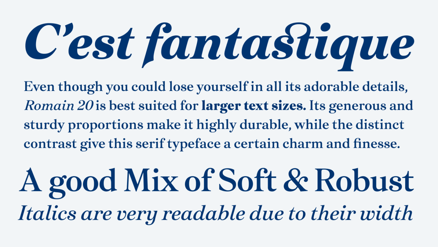
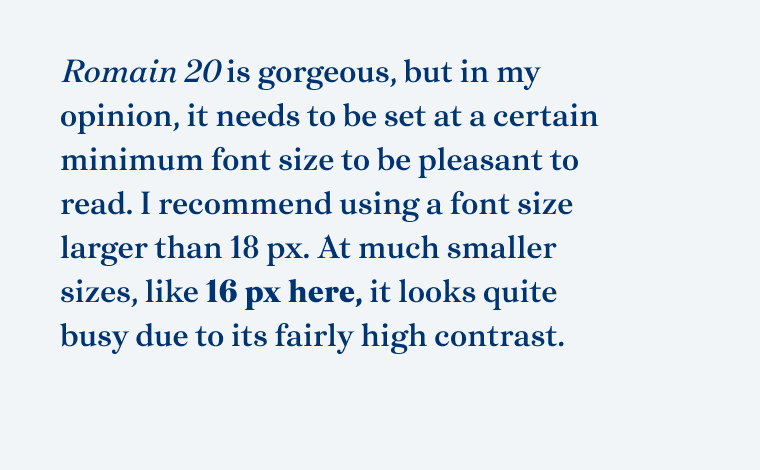
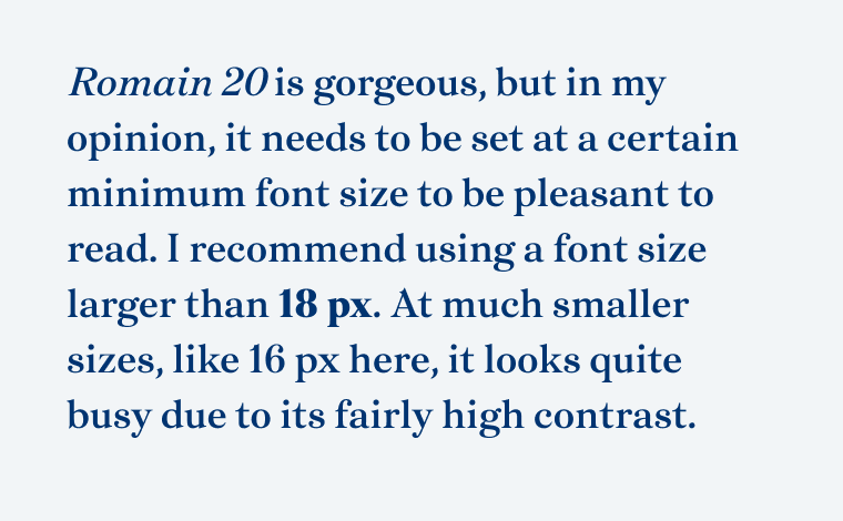
But what does this mean for body text now? Romain 20 was definitely designed with that in mind. Its spacious design – even with the italics – and its availability as a classic set of two weights show that. However, because of the typeface’s relatively strong contrast, it needs to be set at a minimum size of at least 18 pixels. Otherwise, it just looks too busy – especially on screen. But see for yourself below.
Bringing together elegance and stability in one typeface is quite a task. But on my search for similar fonts, I also discovered a few free alternatives that go into a slightly different direction. If you’re curious to explore free alternatives, I’ve gathered a few for my Patreon supporters – check them out here!
Overall, I recommend using Romain 20 for larger body text with an editorial design touch. It’s also a great fit for elegant logotypes and headings, though its generous spacing may feel too roomy for large display text. Be sure to test it with the trial fonts before licensing.
Font Pairings with Romain 20
Romain 20 is a quite dynamic, contrasting serif typeface. Here are some font pairing suggestions for smaller body text, functional text and headings.

- Headings
- Copy

Learn more about pairing typefaces using the Font Matrix.
How do you feel about Niven’s elegant vibes? Would it fit into one of your projects? Drop your thoughts in the comments and suggest the next font to review!