My LINE Seed Font Review
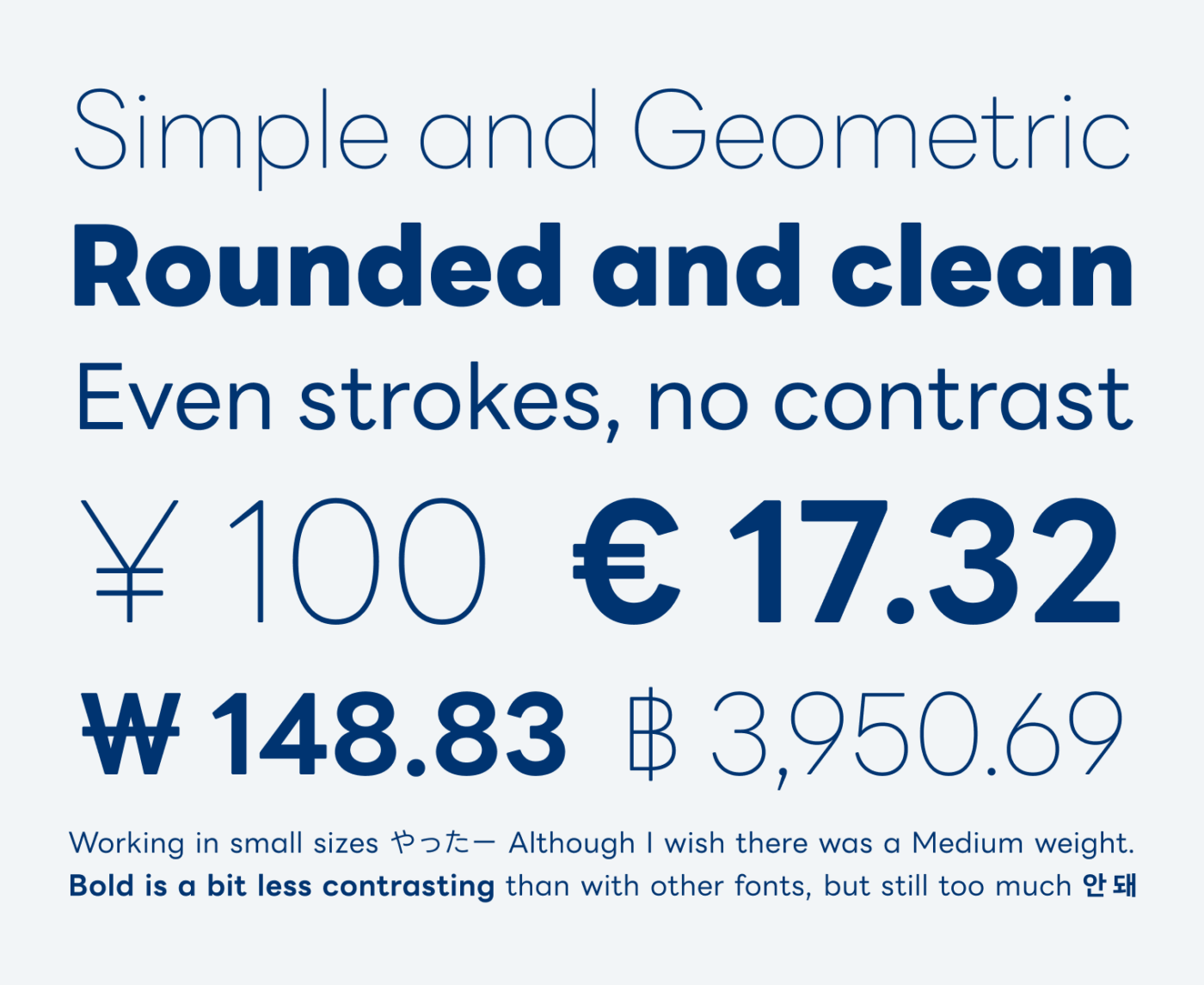
With its soft touch, a friendly impression and clean shapes, LINE Seed is a hidden gem. This geometric sans-serif free font was designed for the LINE messenger app, which it is used by an international Asian audience. Therefore, LINE Seed is available in various scripts, supporting next to Latin based languages also Japanese, Korean, and Thai. And the beauty is, that they all work smoothly together.

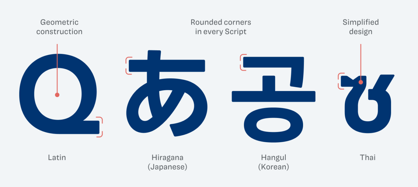
Various type design studios worked on how to translate similar aesthetics across very diverse scripts. For example, Thai was very much simplified. Next to the linear, non-contrasting strokes, you can also see how features like the rounded corners are used across all writing systems.

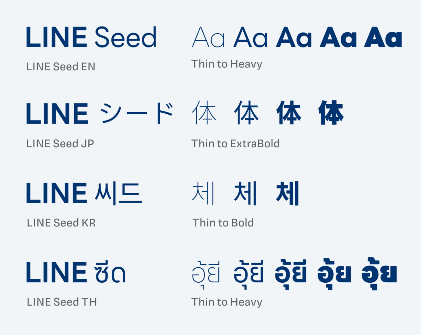
LINE Seed is available in five weights, but not every script contains each weight. Maybe because a Heavy weight would be too dense in Japanese Kanji script? The character in ExtraBold already looks very blotched, as you can see below. Korean Hangul contains only three weights, so if you have any assumptions why this is, let me know in the comments!

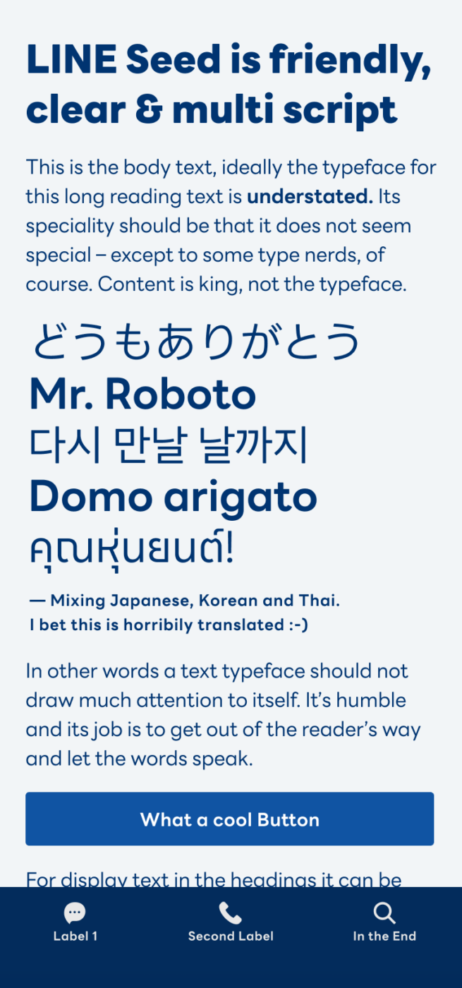
Regarding the the weights, it would be perfect for UI design if there was a Medium style. Because for text smaller than 16px the typeface soon becomes too delicate. And even though the bold weight feels a bit lighter than with other typefaces, it is too sturdy for small sizes. But besides that, I think LINE Seed is a wonderful, modern and versatile typeface.
Unfortunately the biggest drawback is, that the typeface obviously does not really support a Latin extended character set. The English version of the font only covers basic Latin characters, so no umlauts, accents or other diacritic marks. However, the Japanese version includes them, but they look off.
Font Pairings with LINE Seed
LINE Seed is a linear geometric sans-serif typeface, in my opinion best for medium-lenght copy and larger text when used in the lighter or stronger weights. Pair it with one of my suggestions for UI text or more interesting headings.
- Headings
- Copy
- UI Text
Learn more about pairing typefaces using the Font Matrix.
Many thanks to Mahali, who told me about LINE Seed. If you spotted a font I should review, let me know!


That’s a big deal, Oliver—font crafted in such a way as to support totally opposite languages/letters. And it looks nonchalant, effortless! o and e are super unified.
This font is almost smiling to us 😁
Have a wonderful time with your fam this summer !!! Cheers to rest 🏖️
Thank you Jana, you too!
this is a gem for sure!
there are so many nice corporate freebie fonts out there that go unnoticed
is a shame the character set is so limited
But what characters do you miss, Lucas? Italics would be great, in my opinion.
Well, I’m from Brazil, so basic diacritics are what would render it truly usable for a good chunk of the projects I work on. With what it offers, I can only use of it in website projects I do via the tech coop I’m part of, which takes mainly english speaking clients.
And absolutely, italics are always welcome. Can’t think of a situation where I would prefer not having the option of italics in a typeface.
But I think they are rare in typefaces originally intended for asian languages in general. In principle, latin languages are the only ones that make use of them traditionally, isn’t it?
I absolutely love the typical look of Mincho fonts, but using them in text heavy projects is always tricky due to the lack of italics.
arrows, circled numbers are also always welcome
and I find old style numerals very underrated in many sans developed for screen use
Yeah, Italics are something for Latin, Cyrillic, Greek Script.
The Latin diacritics are interestingly included in the Japanese version 😅. But then you’ll have to strip it from all the Japanese characters, haha. Not sure why they is not a latin version that covers more than English.
Hey Oliver, have you checked out the free font Geist? ( https://vercel.com/font )
It may not be interesting / unique enough to feature on your font fridays, but to me it seems very solid.
Keep up the good typo grahpy work!
Yes, Jasper! It is already on my list of upcoming fonts. But happy that you are curious about it too, it motivates me to dig into it after the summer break.
Aspekta comes to mind here as well … https://github.com/ivodolenc/aspekta/tree/main
Dear Oliver,
LINE Seed looks really great. I like it so much that I even suggested it to a client of mine. BUT unfortunately it’s not made for the German speaking market – it lacks the letter “ß”! So I could implement this font only for the client’s logo type, but not as their corporate font.
You should definitely add this remark to your review in order to save other German speakers the pain …
That said, I love your reviews and the inspiration I get from them!
Greetz, Marianne
Oh, I was too quick to send …. The “Umlaute” unfortunately are also missing!
There are all the German characters, however, they are only included in the Japanese file … I’m not sure why they do not provide Latin extended in the English version. That’s a strange thing.
Oh, really? How strange. Thanks for clarifying! Would nevertheless be helpful if you included this in your review. Not sure everyone reads the comments …
I was wrong … they are included in the design, but they actually have a different design. That’s sad 😕. So Latin basic only.