My Host Grotesk Font Review
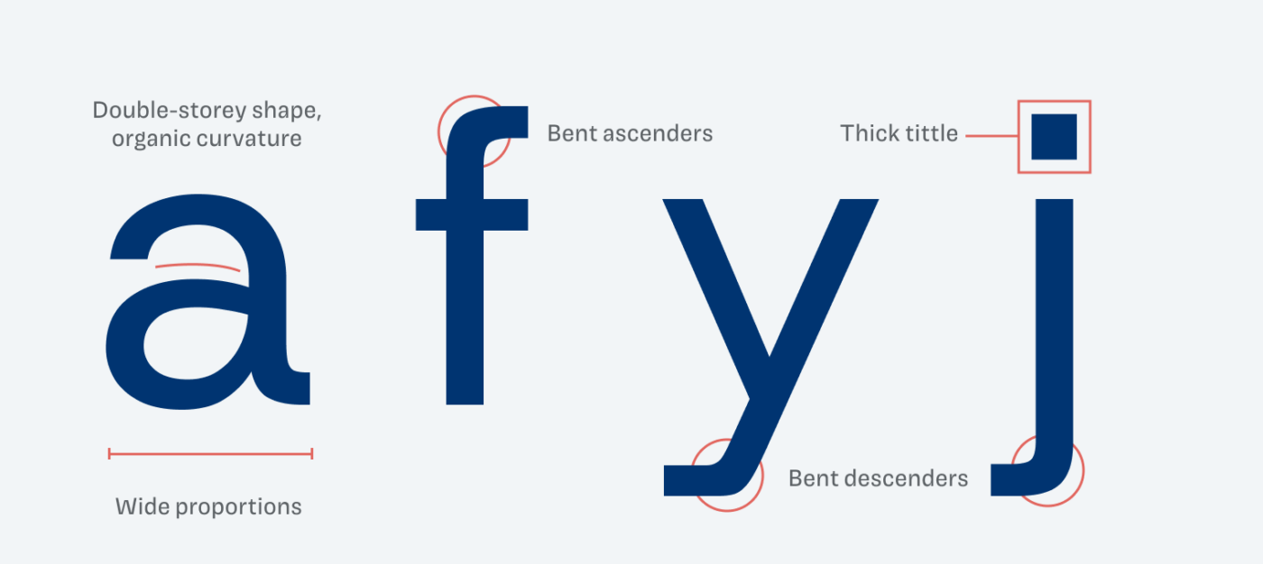
Host Grotesk may seem like a typical sans-serif, but its mix of soft geometric shapes and sober influences offers some unexpected surprises. What caught my attention first were the tight spacing, elegant monospaced numbers and bent descenders. This all adds contemporary flair, but not without drawbacks. So let’s discover how it holds up.
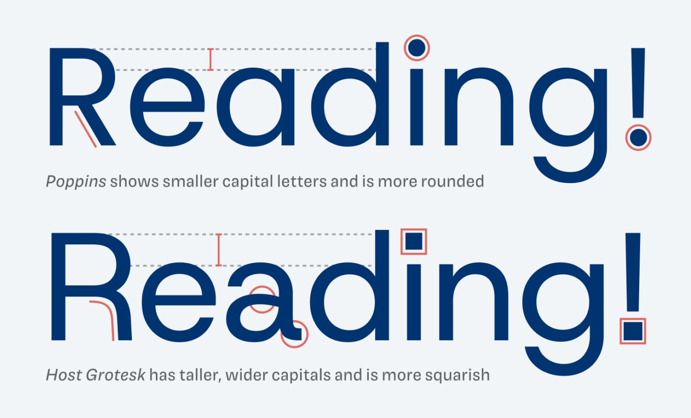
I was surprised to find out that Host Grotesk is based on Poppins, the popular geometric sans-serif. You can still see it in the round lowercase ‘e’ or ‘g’ below. But Host Grotesk comes with taller and wider capitals. Also, some letters got changed – like the lowercase ‘a’ – and other rational elements were introduced – like the square dots. This results in a quirkier, more lively overall appearance.
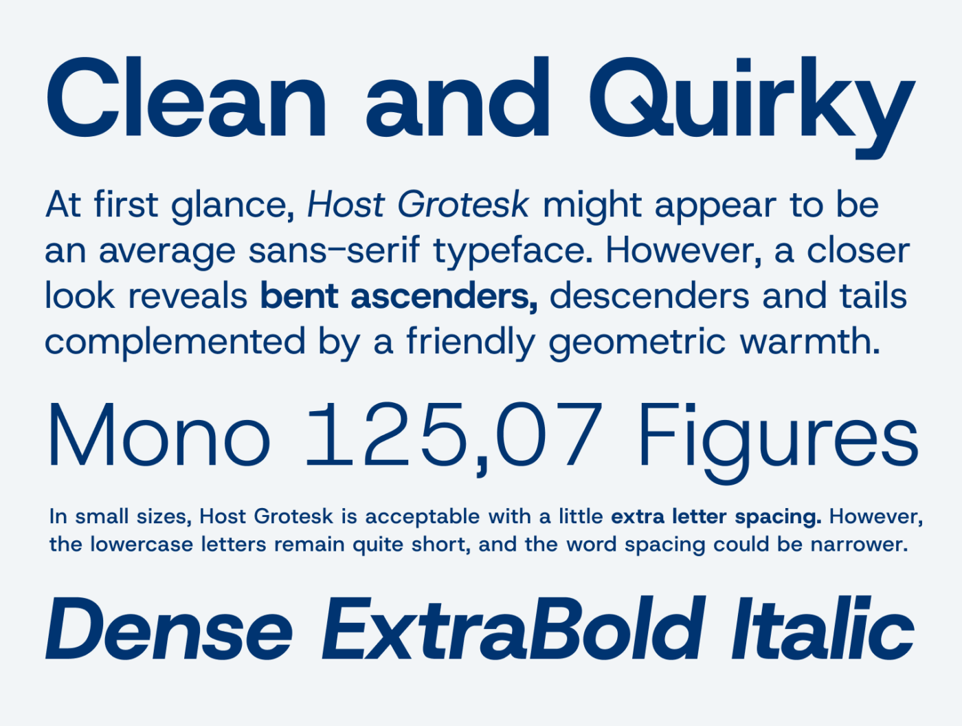
But the typeface also comes with a few issues. Unfortunately, Host Grotesk does not seem fully optimized for any specific size. The excessive spacing between words causes uneven visual flow in larger display text, which you can observe in my samples before. At the same time, the letter spacing is very tight, which is challenging for small text sizes. In my experience, Host Grotesk still works best at 24 pixels or larger.
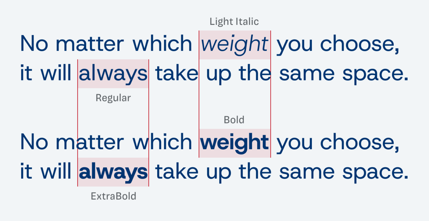
A neat feature is that Host Grotesk is a uniwidth typeface. No matter which style you choose, it always occupies the same space. This means you can change your Light Italic text on hover to an upright ExtraBold without resulting in any text shifts.
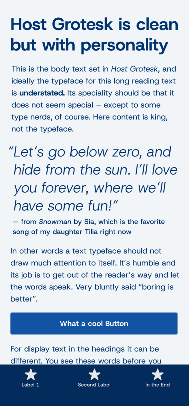
I think Host Grotesk is a good choice for projects that are not too text heavy. Like an app design where you can show labels in larger sizes or poster. Leverage the uniwidth feature in UI or web design. But I’d also recommend reducing the word spacing, and maybe adjusting this one character to get more out it, like I show on Patreon for supporters.
Font Pairings with Host Grotesk
Host Grotesk is a quite geometric linear sans-serif typeface with a rational touch. Pair it with one of my suggestions below.
- Headings
- Copy
- UI Text
Learn more about pairing typefaces using the Font Matrix.
Share your thoughts in the comments, and let me know if there’s another typeface I should review.

Happy NY Oliver 🥳
I don’t like bent descenders.
Uniwidth typeface 😯 Great catch!
Wider proportions – generous attitude, love it!
Can you share your precious opinion on Maison Neue? Thank you very much 🙏🏻
Haha, I love your dry comments, Jana! Well, bent descenders aren’t for everyone 😉.
Oh, Maison Neue ! Sober, a bit quirky, like a Helvetica with more personality. But I see a lot of it in Inter … it lost a bit of its drive. Really like the mono version. Unfortunately, it is all now Monotype property, and I’m not sure if I’ll be able to get the font files for review from them …
Thank you 😊
Hey Oliver,
Great review as always.
Thank you, Carl! Did you find something helpful in it?
Yeah definitely. The face that it’s based on poppins makes total sense now. I think overall I still prefer going with Rethink Sans for a “similar” look.
Oh! Rethink Sans is nice! Did not know that one, thanks for adding it.
Hi Oliver,
Uncanny. I was about to commit to this font for UI/body for my next project due to my recent infatuation with variable, particularly uniwidth fonts.
Great insights: excessive word spacing and overly tight letter spacing is a BUMMER. Stumbled upon a great site that uses HK for everything, and you’re right! At smaller sizes, them letters do get too tight and impede legibility.
Do you reckon it’s worth tinkering with the word/letter spacing in CSS to try to make it more suitable for body text, or is it best recognize one’s biased preference and move on to other options?
The issue I found is that, at least on G-fonts, HK is the most geometrical of the available uniwidth sans serif fonts:
Recursive
PT Root UI
Golos UI
Asap
WWOD (What Would Oliver Do)?
Thanks as ever,
Step
That’s a great question – let me answer it in a live stream where I review this month’s fonts. So stay tuned 😉. But in short: Yes, you could make it work, but I think it’s a bit critical having to change so much, as this also might affect fallback fonts, if the web fonts are not loaded. However, this might only occur in rare cases.
Disqualifiers, in addition to those already mentioned:
db & qp are mirror images
UC “I” and lc “l” while not identical, are nearly indistinguishable
The partial counter below the horizontal stroke in lc “e” is too close to the horizontal stroke
The dot below the exclamation point and the tittle look silly being wider than the line width
No true italic
I absolutely agree that ambiguous and mirrored characters are problematic in certain situations, Steve. I would not recommend it for body text, but still for a headline, a very short paragraph it could be fine. In these situations, I feel that this is less critical. However, project standards and personal preferences will always vary.