

Join Pimp my Type on Patreon until April 30th and get the chance to win this font and all future updates. Many thanks to Sophia Tai for the generous support!
My Hetskelet Font Review
I usually don’t review fonts with a limited character set, but I had to make an exception for Hetskelet. This typeface is still a work in progress, yet its concept truly fascinates and inspires me. It’s a serif inline display typeface that shows very interestingly how a very distinct inner and outer shape create something new and surprising.

Its uniqueness shows when examining the details. A sturdy sans-serif shapes the inner skeleton. While it mostly appears clean and rigid, playful letters like the ‘e’, ‘g’ and ‘Q’ add personality. But the true eye-catcher is the “flesh” – flared serifs attached to the skeleton. What makes it so intriguing is that the inner and the outer shape have differently angled axes. This creates a fascinating tension, you can see best at the lowercase ‘o’, but also at the ‘a’.
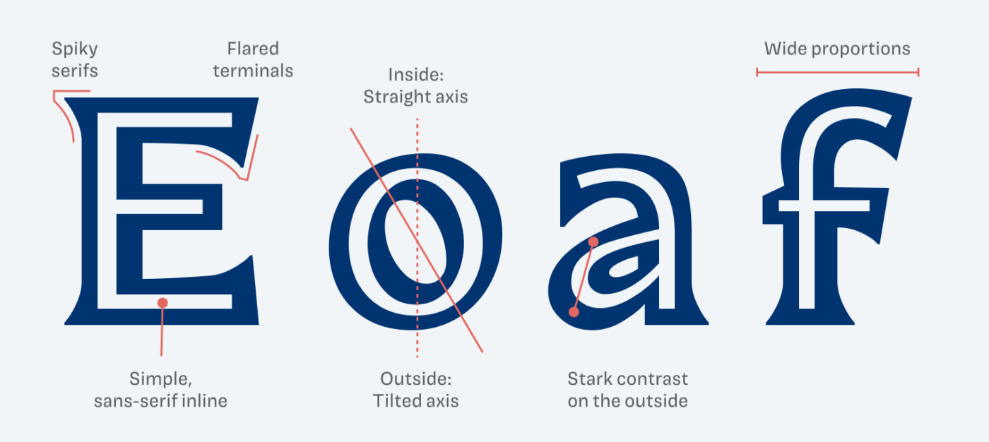
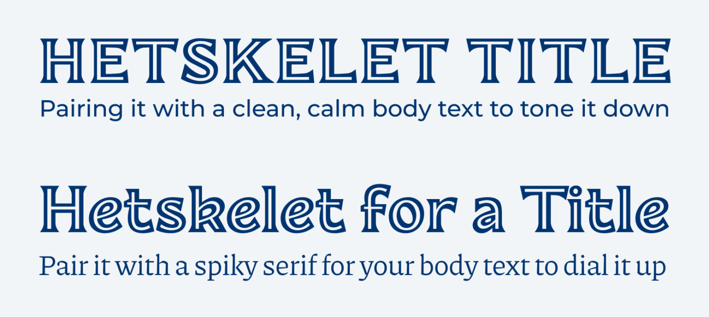
At times, the typeface almost feels a bit spooky to me, maybe because of the spiky, flared serifs. They can add an aggressive note to Hetskelet, but the playful inner shapes balance it out. To truly highlight Hetskelet’s unique features, you should primarily use it for large titles or headlines. This means it’s necessary to pair it with other typefaces.
Keep in mind that Hetskelet is still a work in progress and currently offers only a basic character set. But I’m excited to see how this typeface evolves!
Font Pairings with Hetskelet
Hetskelet is a quite dynamic, contrasting serif typeface. Here are some font pairing suggestions for smaller body text and functional text.

- Headings


Learn more about pairing typefaces using the Font Matrix.
What do you think of this concept? Is it somehting you want to give a try, or too wild for you? Let me know in the comments!
Oliver, that’s utterly ugly! 😣 Gothic-y
Anyway, while you’re in England, would you be so kind as to take a few photos of the streets of London, focusing on inspiring typefaces in displays and window dressings?
Haha, definitely not everyone’s cup of tea 😉. And yeah, I found some pretty lovely signs!
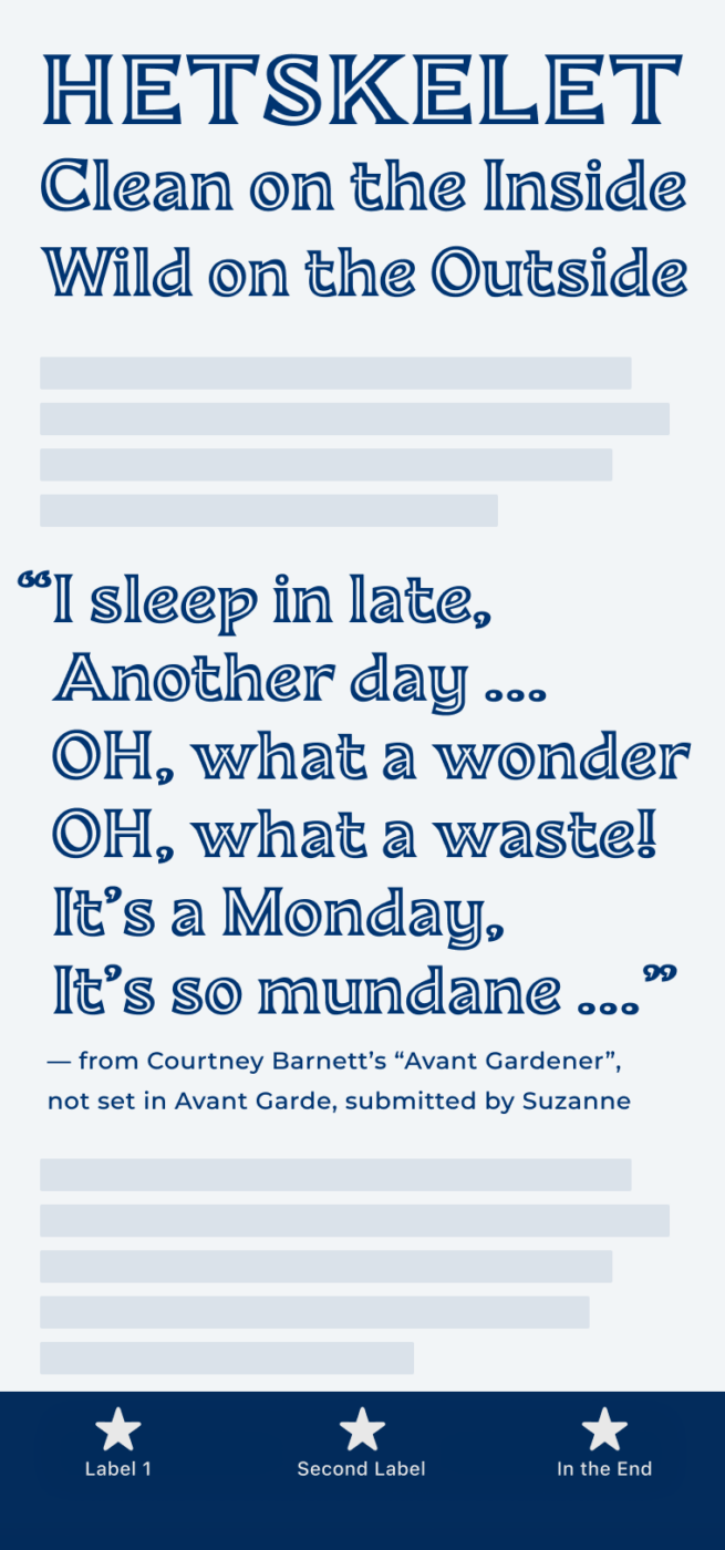
Yay! Courtney Barnett!
Absolutely 😉