My thoughts on Familjen Grotesk
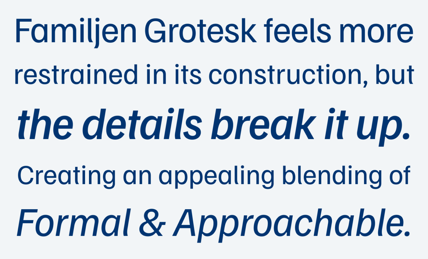
Familjen Grotesk was designed by the Swedish design Studio Familjen, is available for free, and also on Google Fonts. This variable font is a very cool blend of styles. From its construction, it is based on sans-serif Grotesk typefaces, like Helvetica. They seem very neutral, strict, restrained due to their vertical stress, and closed apertures (see the e). Familjen Grotesk breaks with that by adding some peculiarities to its design.

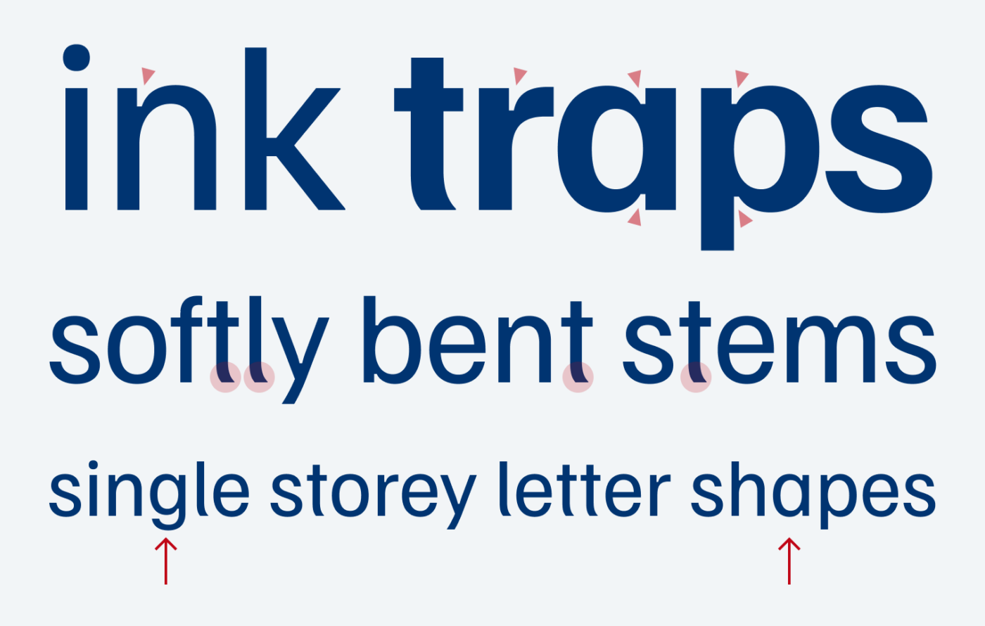
It is playing with opposites. The most obvious feature are the softly bent stems. Just before becoming too organic, they are cut off straight at the baseline. I love that! The roundness and simplicity of the single-storey a and g adds to the approachability, the subtle ink traps and the very wide and square w makes it more mechanic, again.

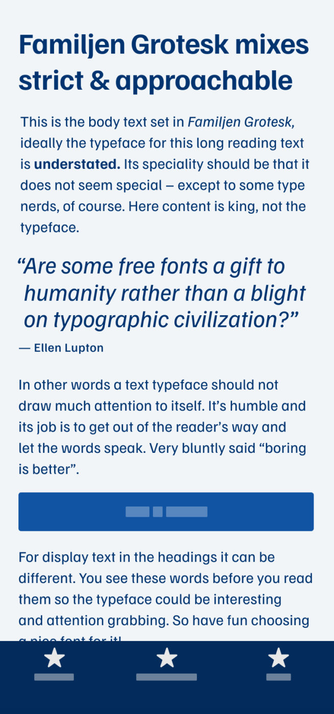
The typeface has little contrast, a large x-height and is rather narrow. This is helpful for headings and display text. Also used in a bit of body text, Familjen Grotesk performs well. But I’d rather not use it for long format reading, since some letter shapes grab too much attention. Overall, a great free font, and in some cases a welcome alternative to very dry Roboto or Helvetica.
What do you think? Is Familjen Grotesk something for an upcoming project? Tell me in the comments below!


Besides its restrained lines, Familjen Grotesk is still very leisurely mood.
I don’t like its roundness and large x-height. But that’s what makes it applicable to Roboto-Helvetica-like uses.
Good for headlines in creative publishing!