
My Easy Grotesk Font Review
One letter was all it took to win my heart. It’s the … well let me tell you later. First, you need to be introduced to Easy Grotesk. This wonky, weird, sans-serif typeface balances overall confidence with quirky details. Versatile, but certainly not for everyone.
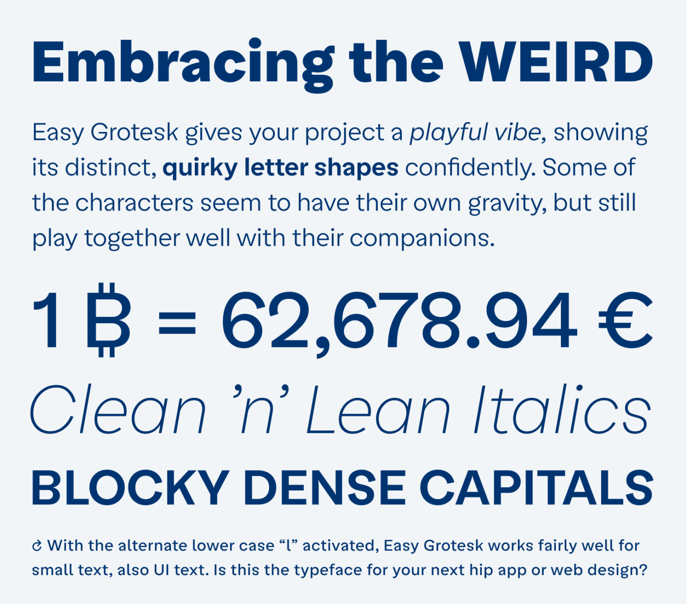
The typeface seems to be inspired by grotesque typefaces – like Helvetica or Roboto – but it shows this in a joyful, almost comic way. Easy Grotesk is unusually top-heavy. You can observe this by examining the extended terminals of the “S” and the lower case “a” – my favorite character. It is so charmingly clumsy and almost seems to fall over. Luckily, the other characters balance it out.

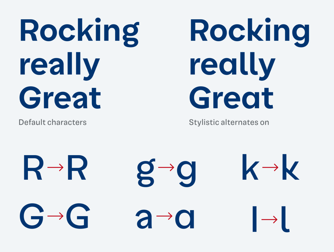
There are several ways to change the voice of Easy Grotesk, by activating certain stylistic alternates. Tone it down a bit by activating the simpler uppercase “R” and lower-case “a” and “g”. Or go even krazier with that unusual “k”.
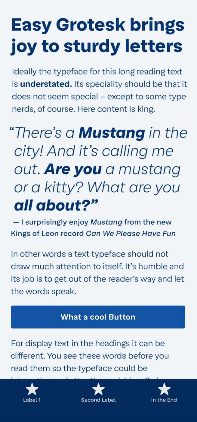
To me, the Regular weight of the body text seems a bit too light. You can see it in my phone example at the top of the page. So if you are using Easy Grotesk for a fair amount of copy or UI text, make sure to increase the weight. How it looks in comparison to its closest Google Font, supporters on Patreon can find out.
Font Pairings with Easy Grotesk
Easy Grotesk is a linear, quite rational sans-serif typeface. It also shows geometric influences. If you want something stricter, for UI text, pair it with narrow Action Text.

- Headings
- Copy
- UI Text


Learn more about pairing typefaces using the Font Matrix.
What do you think? Is easy Easy Grotesk something for your next project? Tell me in the comments!
Very unexpected character set, Oliver.One of the most interesting fonts on Font Friday!
This can be the – star of the show – make someone’s brand identity if applied well.
Easy Grotesk definitely can be the big star 🤩! Well said, Jana!