
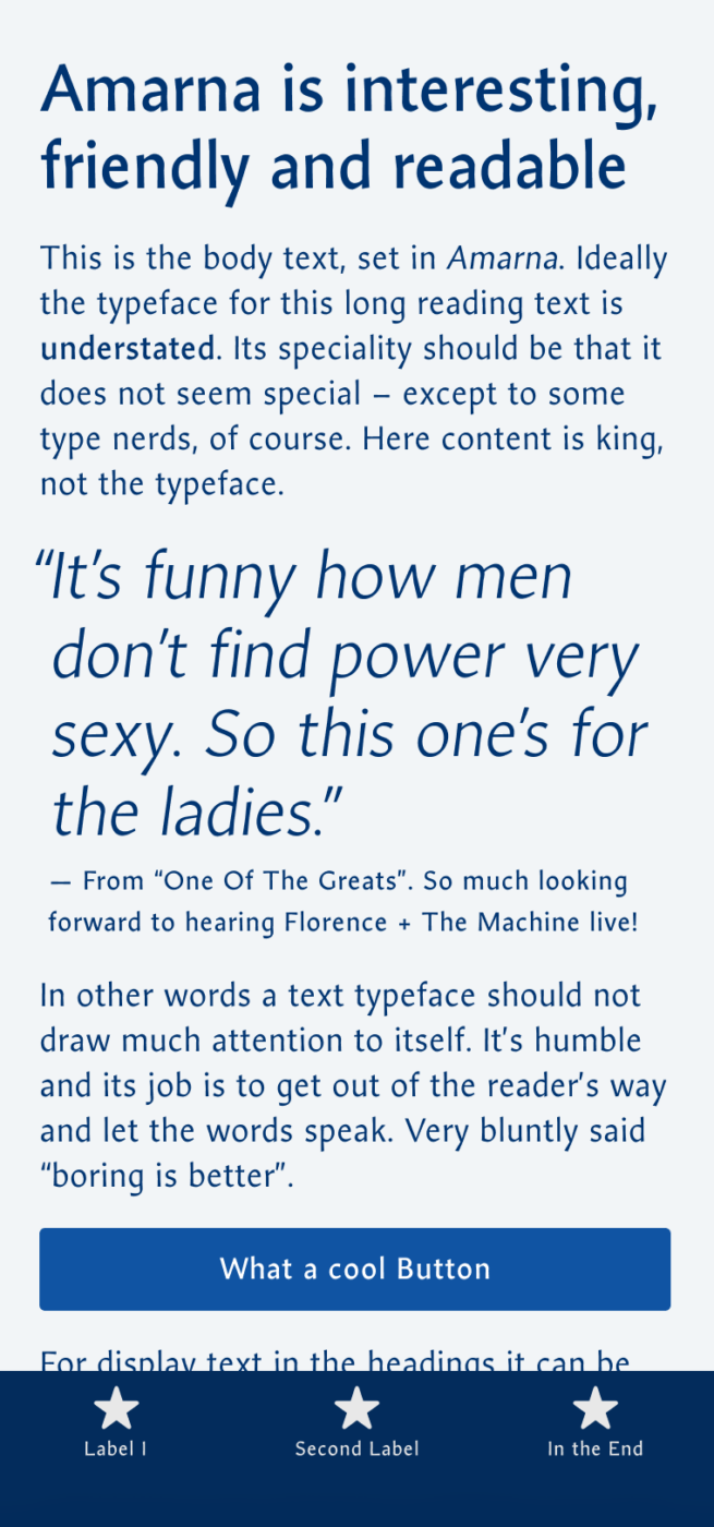
My Amarna Font Review
I discovered Amarna by Ishtar van Looy while browsing Google Fonts recently. It made me stop because I fell in love with its plasticity and vividness at larger sizes. It’s also remarkable how the delicate, light weights still manage to show a whiff of contrast.
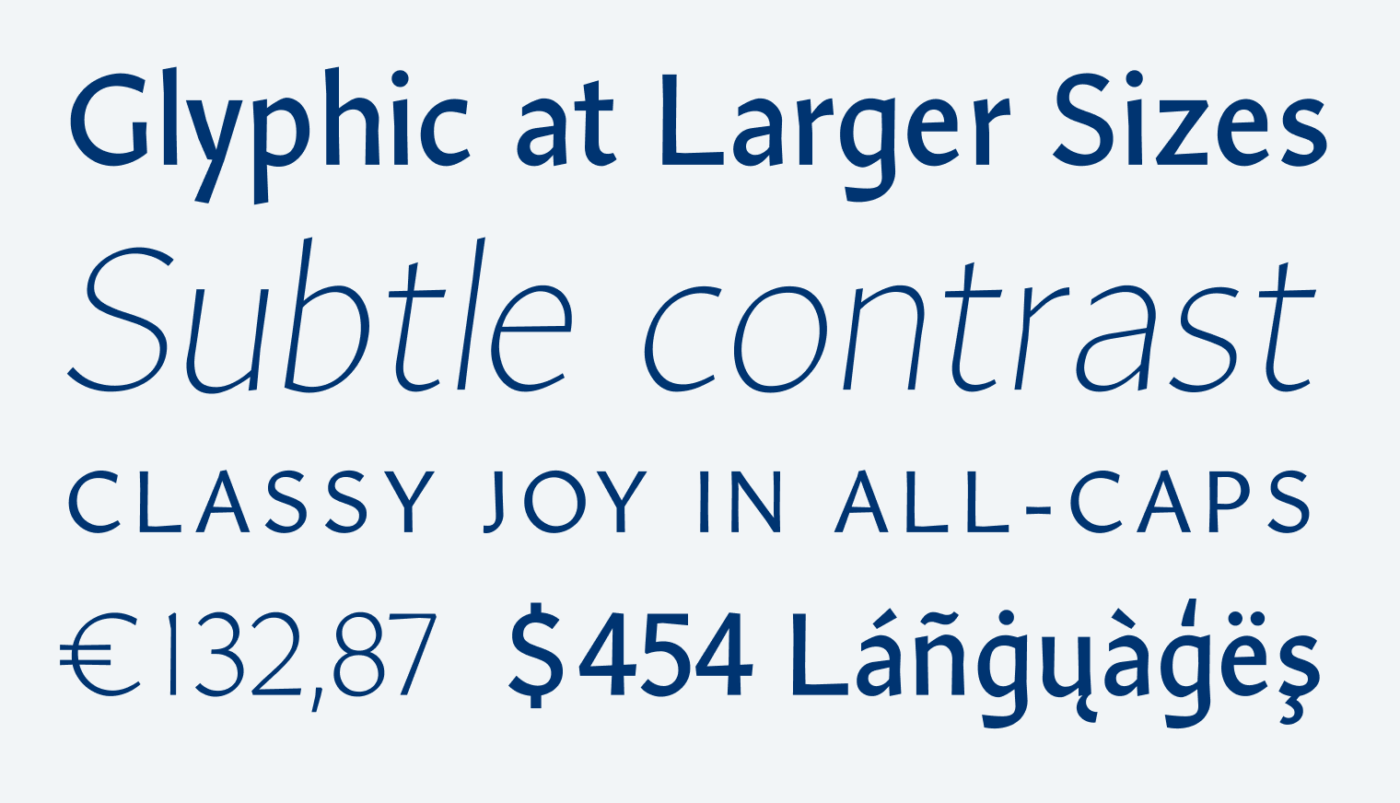
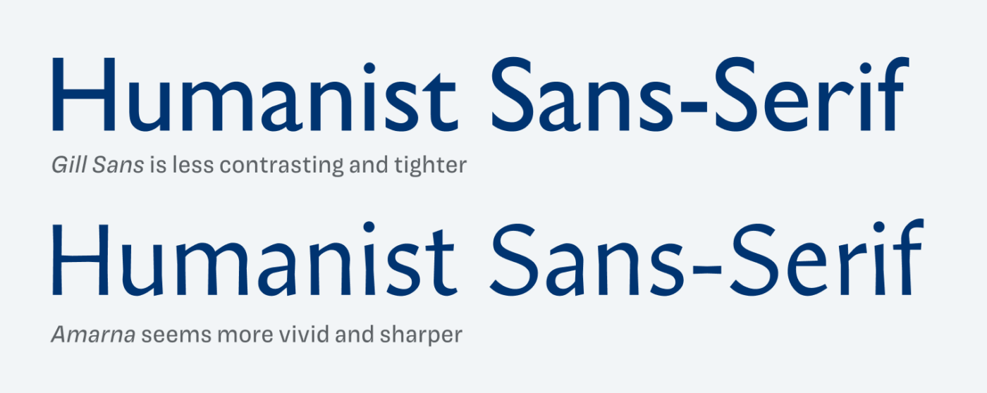
Inspired by early sans-serif typefaces like Gill Sans, Amarna feels narrower, more contrasting and more playful while still conveying classy vibes. Due to its contrast, it almost feels like a serif, which makes it quite special.
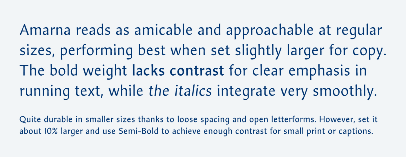
As mentioned, the lighter weights are Amarna’s strength, but the stronger weights are a bit too delicate still. Bold doesn’t achieve enough contrast next to the Regular in body text to really emphasize content. The italics, which are essentially more angled uprights, show a simplistic contemporary touch and blend in nicely. I like this design decision.
Pro tip: When choosing a typeface for body text, check how well the Bold stands out next to Regular. As people skim-read, you really want to be able to highlight parts of your text.
Overall, I’d recommend using Amarna for larger copy and display text. At 14 px, it becomes critical, so set it a bit larger. And for UI design, ideally pair it with a second typeface.
Font Pairings with Amarna
Amarna is a dynamic, slightly contrasting sans-serif typeface. Here are some font pairing suggestions for smaller body text and functional text.

- Headings
- Copy


Learn more about pairing typefaces using the Font Matrix.
What do think of Amarna? Write it in the comments!
Welcome back, Oliver! I’m so, so grateful you’re bringing Font Fridays back. 🙌🏼
Amarna is classy, my favorite detail is the numbers. There’s something effortless about their sleekness. But any financial app or bank should avoid it! Lol
Humanist fonts are generally my least favorite. 🙄
Jana! Grateful to having you back in the comment section 😊! Happy that you still found something to enjoy even though humanist sans serifs aren’t your cup of tea 😉.