
Ever since going to design school I’ve been addicted to handwriting, lettering, calligraphy – basically everything type. I frequently write and draw, but I never did it on a big board or anywhere similar. Luckily the opportunity came up to rewrite the menu at Cinema Paradiso Baden, my beloved local cinema. What a great chance to try out my lettering on a new medium – a 2 by 2 meters big chalkboard.
In this article, I want to share you my experiences with doing lettering on a chalkboard for the first time. I’ll tell you about the tools I used, how I sketched things out, my way of doing the lettering, what I learned from it and what I would do differently next time.
Things you’ll need for chalkboard lettering
You might be surprised to see how basic this list of tools is, but there is nothing you’ll miss. You only need:
- Simple chalk – I got it from the office supplies store near me
- A sharpener for the chalk
- A sponge and a cloth for correcting and fine-tuning things
- A mason’s level for sketching out the grid
Of course, you should have a clean and dry surface to write on – remember the times you were at school and had to reluctantly wipe the blackboard and do it more careful this time.
Sketching things out
Before you draw on your chalkboard you need some kind of plan or sketch how it should look like. If you don’t have a lot of experience (and even then) it’s a bad idea to start on the board directly and improvise, especially if you get lost in details easily and forget about the overall design (like I do). Although you can always erase stuff, it still takes a lot of time and effort to fix the overall layout later.
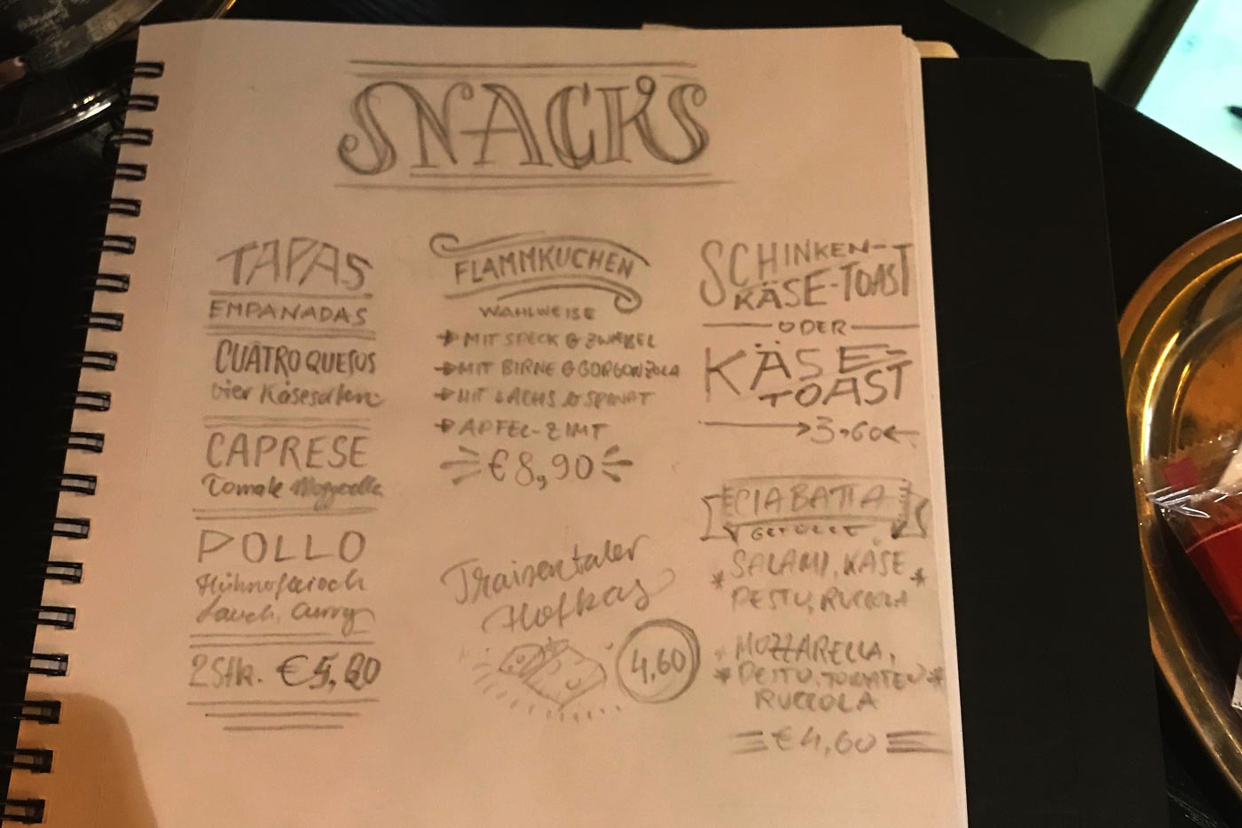
In my case, I was satisfied with a rough draft of the layout in my sketchbook. What I focused on were the composition, proper hierarchies and what styles of lettering there should be. I didn’t dig much into the details, because I wanted to fine-tune my lettering on the board and not on paper. If you are new to lettering or don’t have a lot of experience yet, I suggest you make precise sketches on paper. This might take some time but it will definitely improve the end result.
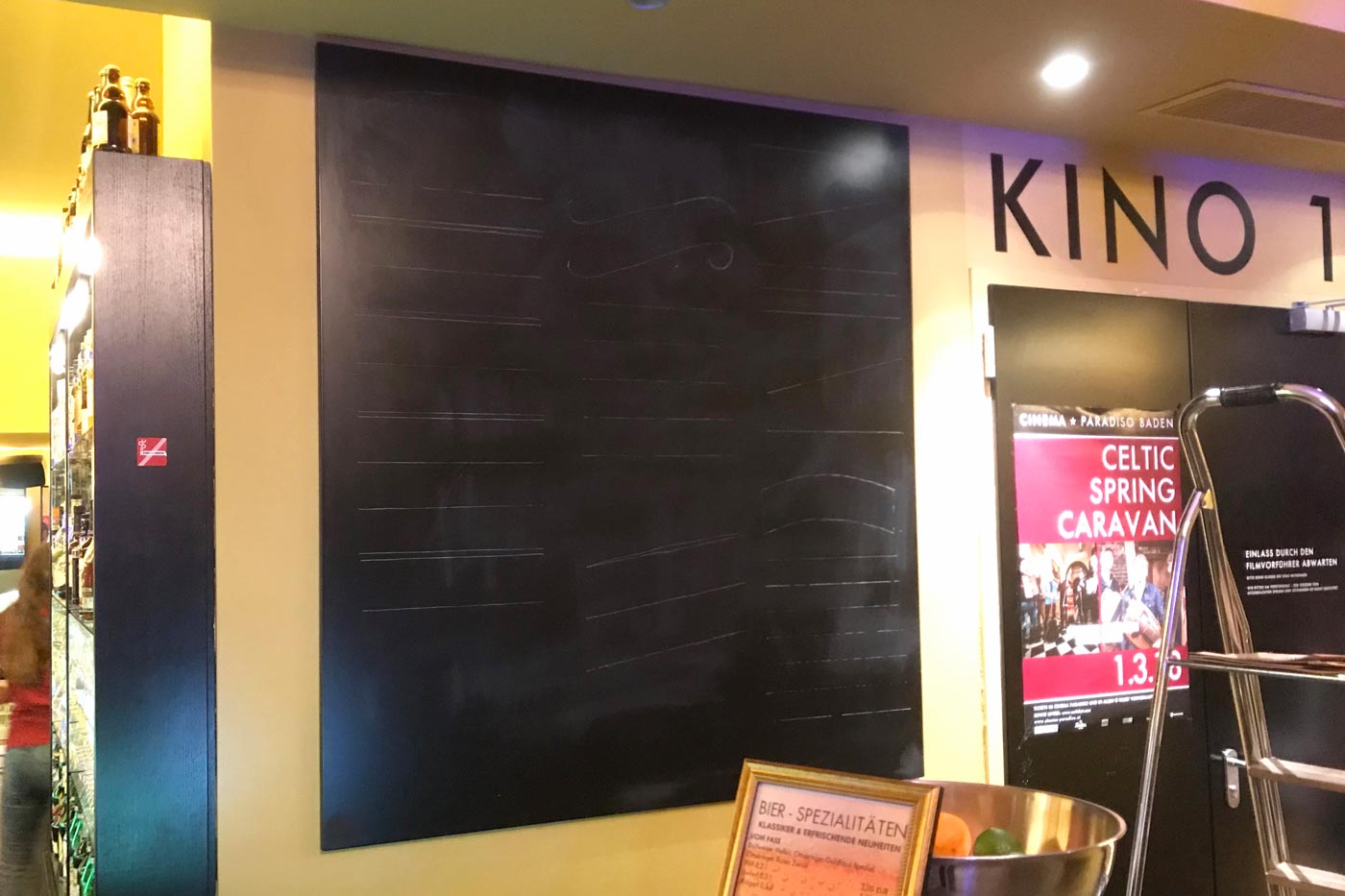
After that, I took a mason’s level to draw the grid of my layout. This is a very important part because it is the scaffolding of everything you letter, so give it some time. I sketched out three columns and every baseline, measuring things by visual judgment, but you can, of course, use a tape rule. This took pretty long for my 2 × 2 meters sized board (around two hours) and I did a lot of corrections before I was satisfied. My tip for you:
Add a little more space than you think you need. Things won’t be that exact on the board in comparison to paper and it’s always easier with more leeway.
Doing the lettering
Start in a direction where you won’t smudge anything already on the board (if you’re right-handed it will be from left to right). I sharpened my chalks to easily draw details. Unfortunately, it always broke at a certain size and I had to take a new one. Before writing one “perfect” letter I drew the skeleton of every word very lightly to make sure it fits within the given space. After that, I added more weight and fine-tuned each letter and in the end the whole word. After that, I moved on to the next part.
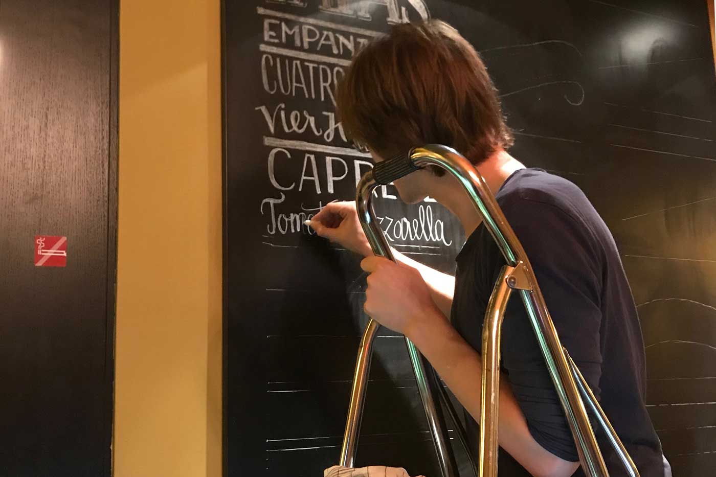
Working with chalk is pretty easy because it never evenly covers the blackboard’s surface. This creates a nice texture and is very forgiving if your lines are not that perfect. I did not use a ruler or anything to draw the individual letters, I more or less carved out the letterforms, being able to add and remove weight and tweak them until I was satisfied. Using a sharpened chalk, a sponge and a wet cloth gave me the possibility to do this in a very precise manner as you can see in these examples:


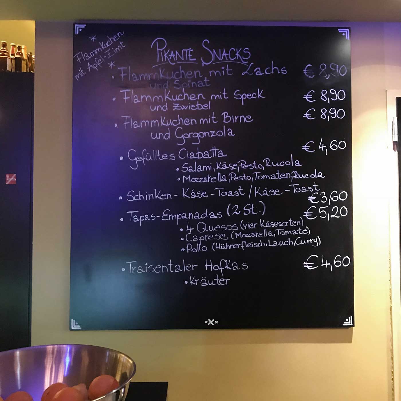
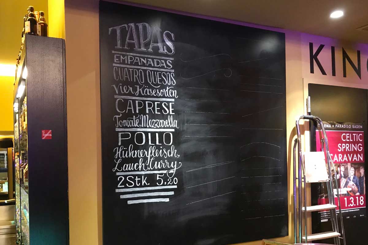
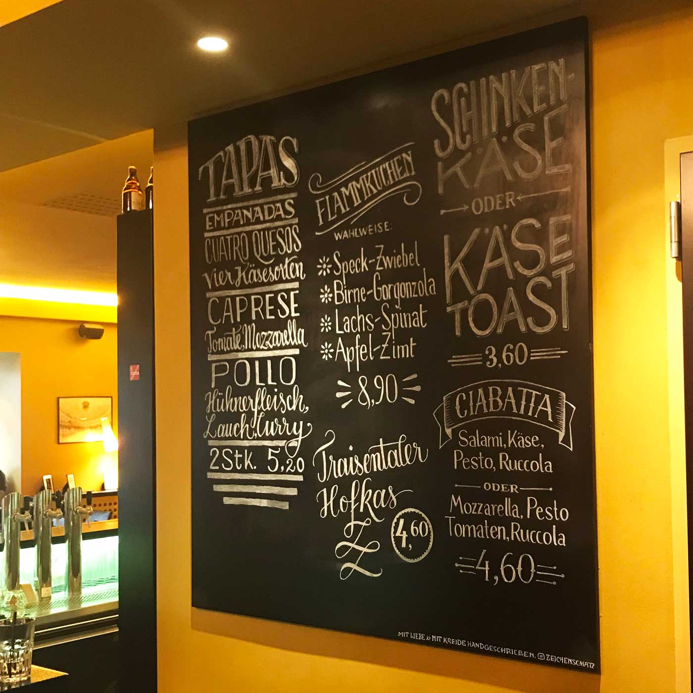
After several days of lettering, this was my final result:
What I learned from it
It took much longer than I expected. I thought one evening, maybe five hours would be enough. In the end, it was something around 15 hours for drawing on the chalkboard alone. Since this was my first big chalkboard lettering it might have taken me longer, but even with more practice I guess it won’t take less than ten hours. And you can’t do this at once – after three hours I got tired and a decrease in quality became visible. So I split the work up over several evenings. Thankfully Cinema Paradiso Baden fueled me with enough espresso and Czech beer during that week.
People don’t believe that it’s handwritten with chalk. Many touched the artwork and smudged it, to see if it’s real. If a waiter saw that they told them to stop, but I guess that there’s nothing you can do about it, except fixing those parts at times. Eventually, it’s an ephemeral art.
There is always one mistake. You spell “Ruccola” with one c only – now I know that. Luckily it wasn’t that hard to correct, taking stuff out is always easier than adding missing letters.
Consider if the board is in a very exposed place. In my case it is. The board is situated right behind the bar’s counter with waiters constantly passing by and accidentally touching it. After some days I had to write some text with chalk pens, that can’t be smeared after they dried. But there I also found out this:
It’s easier and more charming to work with chalk than with chalk pens. The liquid chalk inside the pens is tempting, but it is also very exact. It creates an even color but shaky lines will be more obvious which makes it harder to use. Erasing is also not that easy and leaves you with more chalk to wipe away. After it dries it takes more effort to remove it and some shadow might remain.
I will never be satisfied with everything and that’s okay. Looking at the end result the left column is too dense. Considering that it took three hours writing it I won’t redo it, I’ll just do it better next time.
I certainly want to do this again. It was great fun, I enjoyed hanging out even more at my local art-house cinema, spending time with the board, some chalk, and beautiful letters. As always, I’m curious about your experiences with chalkboard lettering. Leave a comment and share them with me!
Hello, I really love the job you have done (for a fist try, amazing).
Could you tell how much you charged for this please?
Thanks
Thank you, Anne! That’s very kind of you! To be frank, I did this on base of a personal commitment, since I know the people from the cinema so long and wanted to contribute something there. But they compensated me anyway with vouchers and a membership card that was approximately worth ~ € 300.
Hi, I really love the final result! What tips can you share on practicing lettering for blackboard? Finding 2-3 types of alphabets and practicing them until you master each letter? Which are your favourite fonts to use for blackboards?
That sounds like a good approach, Daria. I don’t really picked a specific alphabet, but as a resource Martina Flor is a great inspiration with her books.