Pope Francis is dead and it’s almost killing me! Not because he’s gone … but because of the typography on his tombstone. In this article (and the emotional video that goes along with it), we’ll look at what went wrong, how it should have been spaced, and what this unholy design disaster can teach us about typography in web and app design.
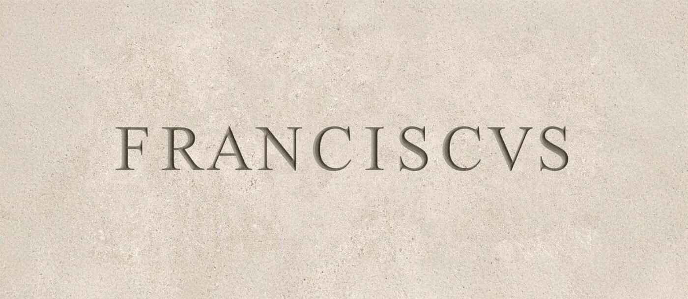
FR–A–NCISCVS? Seriously?
Just look at that letterspacing: FR–A–NCISCVS. That’s not a name, that’s a cry for help! It’s so bad, it actually made headlines in mainstream media. And when even the New York Times starts reporting on kerning – that’s not just poor design. That’s when typography stops being a nerdy detail and starts mattering to everyone.
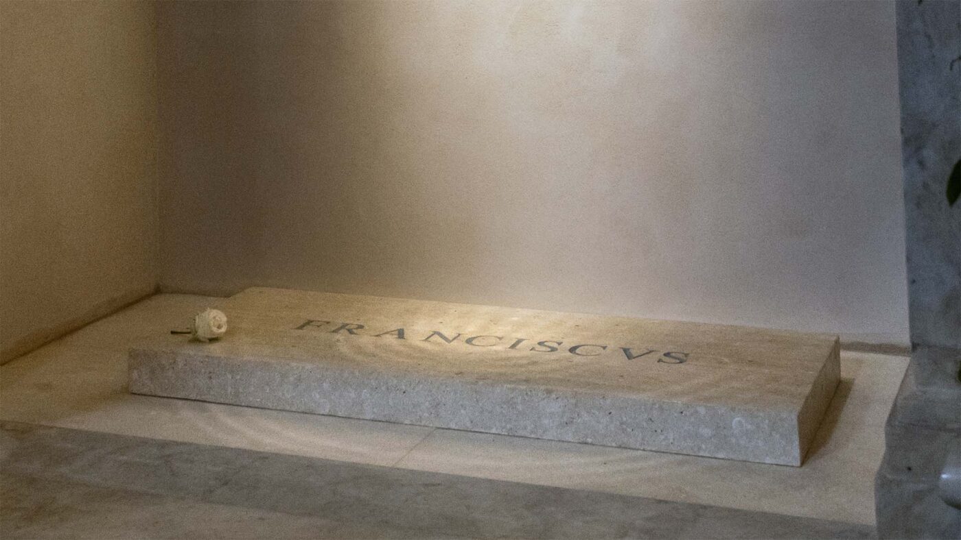
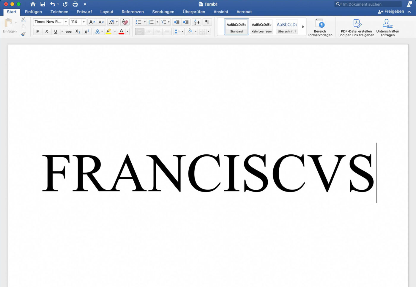
And it makes me feel sorry about the people visiting the pope’s last resting place at Santa Maria Maggiore in Rome. Lining up for hours, expecting solemn glory, divine elegance … and instead, they get a “Times New Roman on a tombstone” situation. And this is no joke! It’s literally carved in Times New Roman!
But maybe that’s the whole point, since Pope Francis was a very humble man. And what could be more humble than using Microsoft Word’s long-time default font? But even if the mason really just opened MS Word and gone for it, it would have looked better.
So what’s the real issue?
The issue here is that the type is spaced so poorly – clearly without any typographic understanding. And the real tragedy? Trajan’s Column – the holy grail of Roman type – is just a 20-minute walk away! So it’s not like good examples of sublime typesetting are hard to find in Rome – they’re literally carved into the city itself. Even on the facade of the basilica itself where the pope is buried in.
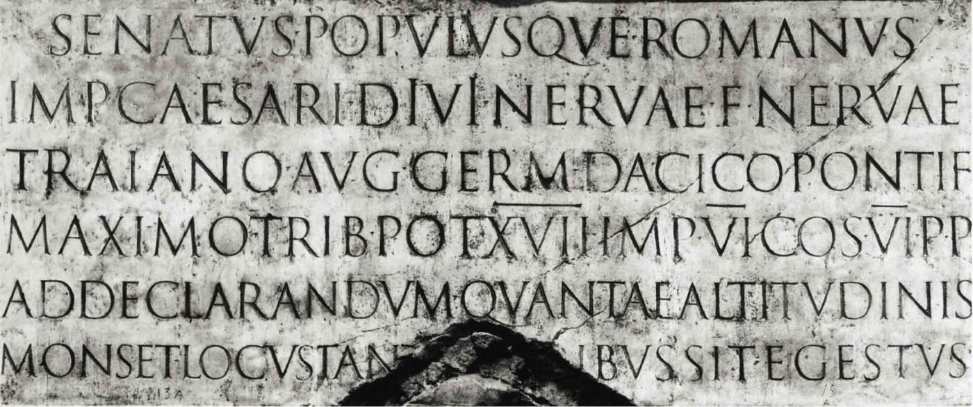
Because the Romans perfected capital letter spacing, and this isn’t some recent breakthrough – they were doing it while Jesus was still alive!
How to do it right
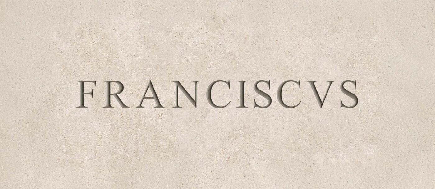
The principle is simple: balance the space inside each letterform with the space between the letters themselves. I’ve written about capital spacing before on a much more profane subject – but here’s a quick recap using this very sacred example.
Start by spotting the biggest visual gaps – like the canyon between the R and A. Then adjust the rest to match, aiming for a rhythm that looks even to the eye. And this isn’t about math – it’s about feel.
What probably happened on the Pontiff’s tomb? Equal spacing between every letter. Classic rookie mistake. When done right, it could’ve looked beautiful. Even in Times New Roman.
How this matter for type in UI design
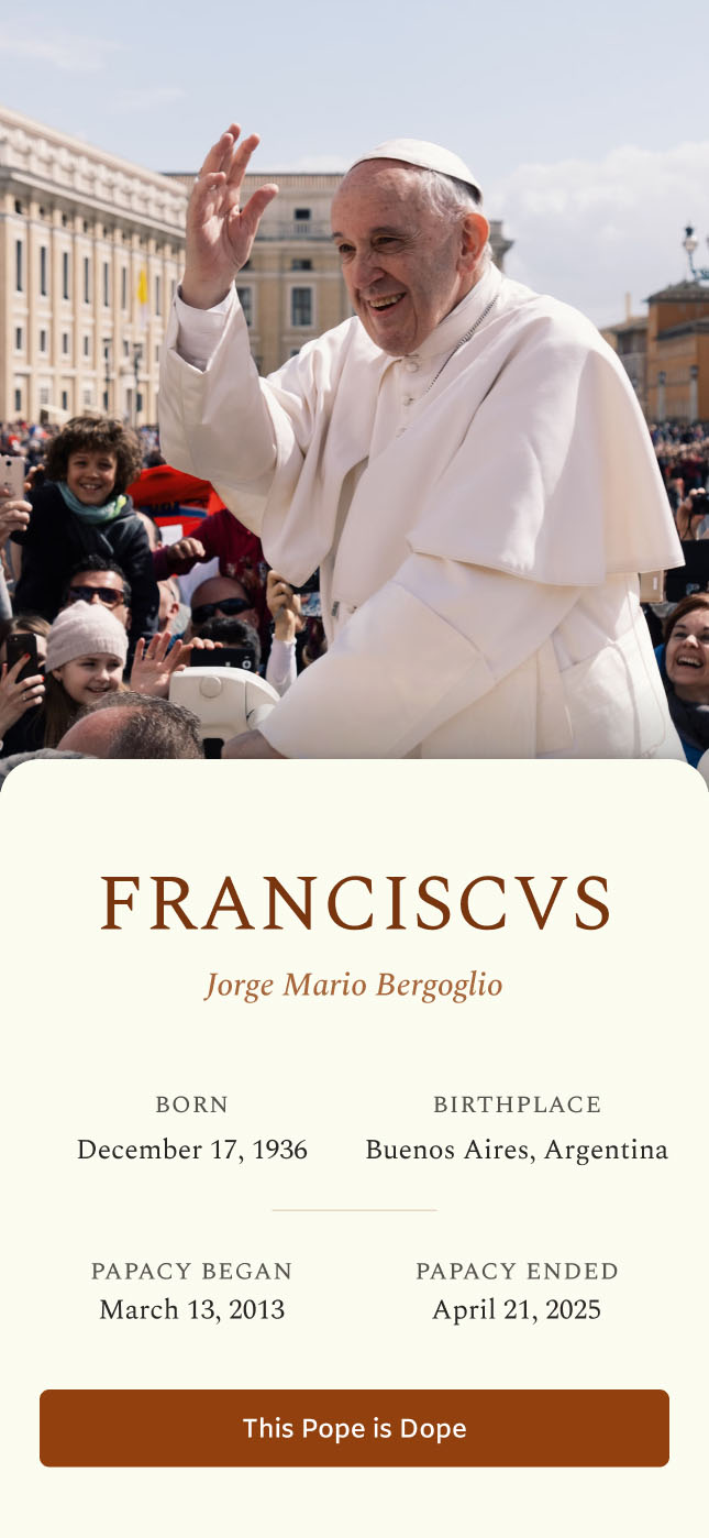
In digital interfaces, content is dynamic, and we obviously can’t tweak every letter pair. That’s why the system itself needs to be solid. Here’s a quick guide how to approach it – using my fictional “This Pope is Dope” app 😉 as an example.

We’re seeing the same flaws here as on the tombstone. The gaps – especially between the letters ‘R’ and ‘A’ – create that same clunky, uneven feel. So let’s explore how to fix this without having to manually adjust every single letter pair.
1. Use a proper font
One that comes with built-in kerning tables. Most fonts do, but if you’re not sure, just type the letters VA next to each other and see if the diagonals are close to each other or if there’s a gap. I’ll use the wonderful, classy serif font Spectral from Production Type.
2. Make sure kerning is actually turned on
Yes, this sounds obvious, but you’d be surprised. Again, use letter pairs like VA to check it.
3. Add a bit of extra letter-spacing
Adding a little extra letter-spacing will loosen things up and make problematic combinations like ‘LA’ less striking. Of course, this won’t be as perfect as manual adjustments, but it works well for most cases. And some fonts, like Spectral, even offer special capital spacing features you can activate.
Yes, these are very nuanced adjustments, but they go a long way. Especially when this has to work for various lengths and names.
Let’s see it in action
When applying it to our “This Pope is Dope” app you see that it still works for a set of very diverse names. Also, the labels of the biographical details – set in small caps – remain elegant. This is what good typography looks like: clean, intentional, reverent. I think I’ll need to put this app out there 😉 for real.
A final UX lesson from the Pope
So next time someone says, “What’s the worst that could happen with bad typography?” Just tell them: even the Pope couldn’t escape it. And it shows that typography doesn’t just matter to designers – it shapes how everyone experience meaning. Now if you’re wondering whether your design is committing the same sins – if your app or website is spiritually blocked by bad spacing – book a free type check with me. I’m happy to help you out elevating your typography.
How does the Pope’s tomb make you feel? Let me know in the comments! Also what you think about my app design.
Great article, Oliver! Well written, fun and educational. Thanks a lot. Using “VA” to check for kerning tables was new to me, I’ll be using that trick during my next font search. 🙂
Thanks, Ntimi! Happy you enjoyed it, and that I could also tell you something new. Also, combinations like “Ta” or “Te” sometimes show it, but not always, and not that obvious.
And we can’t even shame the Vatican enough for them to correct their error. Note to Vatican: it’s typography, not doctrine!
Amen 😅!
Wow, what an easily preventable mistake.
Excited to deep dive into “kerning tables” after this!
Happy I could set you up for that deep dive, Luke 😉.
Hi, thanks for the read up. Not a typography expert here, but to be honest, I still find something odd even in the “fixed” picture, the one captioned with “Fixed 😇 This is how the Pope’s tomb stone could have looked with proper letter spacing”.
If I look at it, I read that as:
F – RANCISCVS
Is it only me? Or is it intended?
Cheers
I agree. I guess it’s important to get different opinions because obviously Oliver sees it differently to us. In fact, only the VS looks the same spacing as RAN to me. FR is the widest but NCISCV all a bit wider, particularly CV which has the same canyon as RA, so the nearest serifs should be at the same distance as in RA.
Incidentally Oliver, there’s something about your images “The original letterspacing”, “Now optically balanced” and the Spectral ones. They don’t display for me on Android. I’ve tried two browsers, and also seen this on some other articles.
Well that’s interesting. The missing images are now there after I posted the comment.
Happy you enjoyed it. And That’s fair to say. Now after seeing it some months later … maybe the F could be a bit closer 😅. It’s not an exact science. I made the gap fairly large so that the distance between RA does not stand out that much (because it can’t be closer there).