My AR One Sans Font Review
In augmented and virtual reality design, text readability faces challenges like low resolution and varied backgrounds. To compensate for that, the free font AR One Sans was made. Let’s discover how it performs and how it can be useful even in scenarios not aimed at AR or VR.
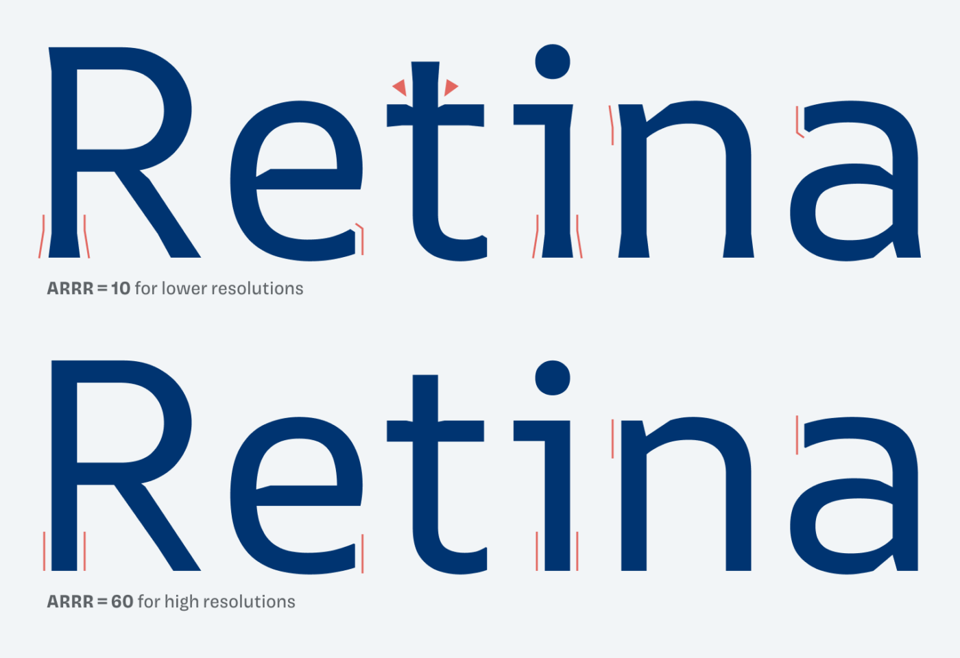
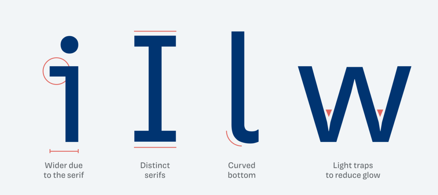
The typeface uses wider spacing and distinct, legible character forms that make it stand out even in busy, low-resolution environments. Thanks to this, AR One Sans outperforms Roboto in my little simulation here. One of the most unique features of AR One Sans is its flared terminals, designed to counteract halation and pixel loss on low-res devices.

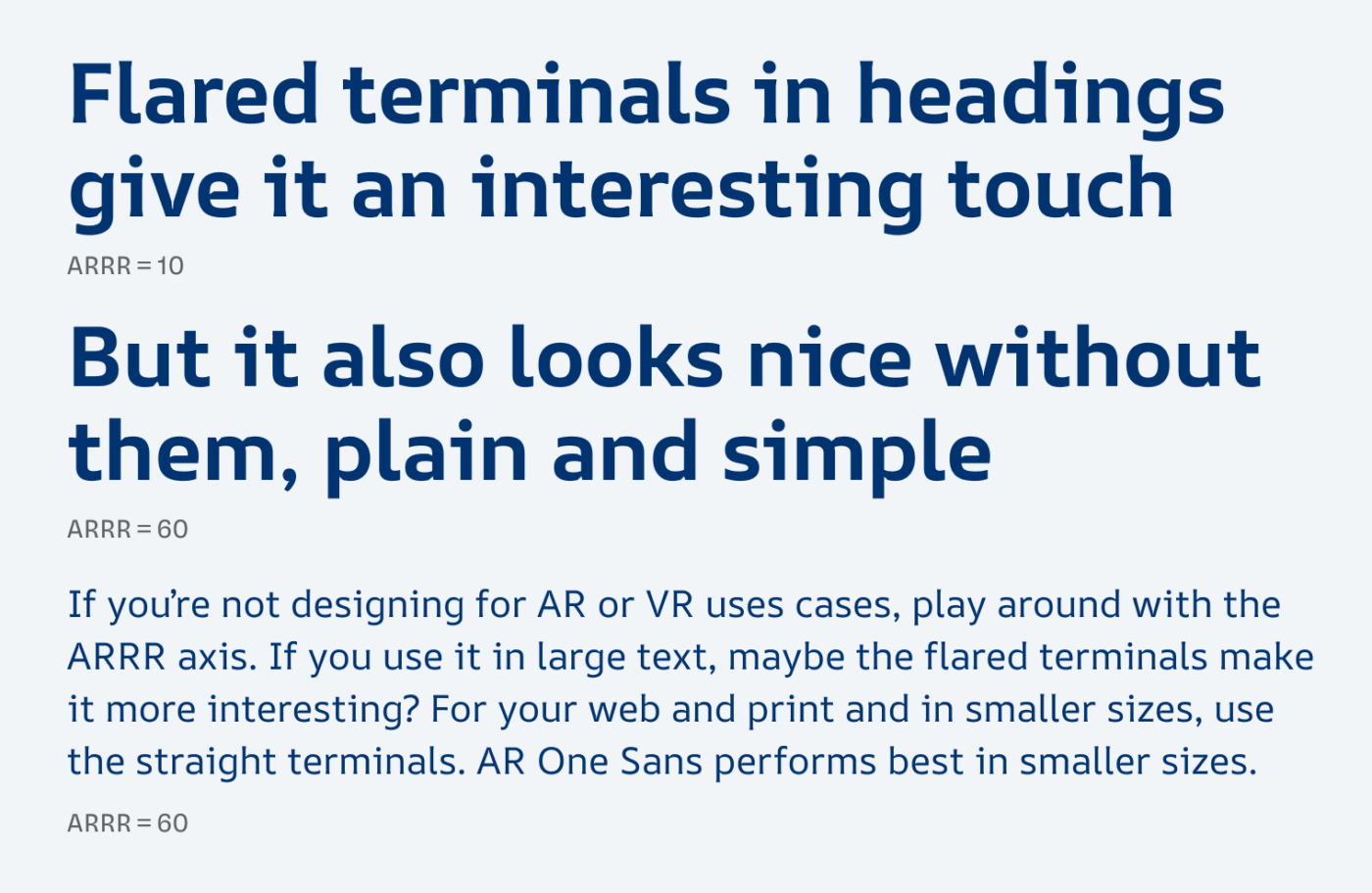
Even when you’re not designing for AR applications, you could still use the low resolution style with the flared terminals in larger text. This makes it much more interesting, so try it out and see how it works for you.

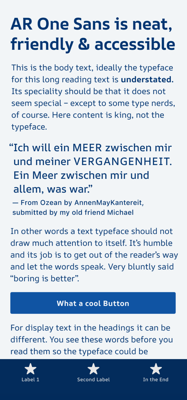
Besides this, I also appreciate the very legible characters. They make AR One Sans very accessible, durable and ensure that it also performs well in small sizes, like in UI designs. I only wish there also were italics.

Overall, AR One Sans is a reliable typeface, making it a versatile choice beyond AR and AR environments. Give it a try, experiment with its unique ARRR axis, and see how this font can enhance your designs across various applications.
Font Pairings with AR One Sans
AR One Sans is a dynamic, linear sans-serif typeface, performing best in UI design. For body text or striking headings, combine it with one of my suggestions.
- Headings
- Copy
- UI Text
Learn more about pairing typefaces using the Font Matrix.
What do you think of it? Tell me in the comments, also which font I should review next.


Now all we need are matching italics and a condensed version.
Absolutely!
Thanks for reviewing the typeface, Oliver 🙂
I appreciate how you’ve focused on its nuances and specifically covered the use cases and features it was designed for.
Of course, Niteesh, happy you enjoyed it!