Hannes sent in the beautiful web design of the Belgian fashion label Wolvis. A great font choice conveys the desired atmosphere of luxurious and durable, but there still is some room for some pimpin’ in terms of the spacing of the headings. I go into weird details about that.
TL;DW: I repeat reducing the letter-spacing and word-spacing across several gorgeously set large headings to make them appear more compact and united. This video will help you develop an eye for that while also tackling the line height of headings a bit at the end.
The design briefing
- The key audience is fashion interested
- Their top 3 values are honest, local, durable
- The atmosphere of the website should be luxurious and durable
Font choice
- Adobe Caslon Pro for the headings
- Aktiv Grotesk for the body text
- Caveat for special emphasis
Reduce letter- and word-spacing for large headings
Most fonts are designed for body text sizes (around 16 to 18 px). When shown in lager sizes, the sentences tend to fall apart. Reducing the word-spacing is beneficial to gain a more compact appearance, which makes it easier to grasp at one sight.

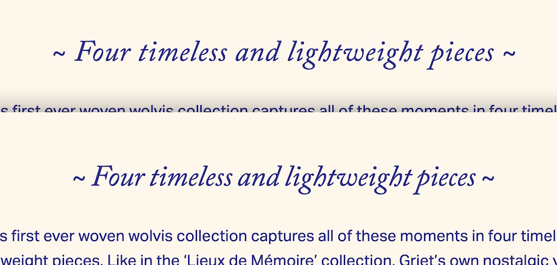
On the top the h3 is set at 43 px with no adjustments. On the bottom it’s more of a unit with letter-spacing: -0.008em and word-spacing: -0.05em.
Decrease the line-height for headings
It could almost go as close as 1.1. Especially when you reduce the letter spacing and the word spacing, this is necessary, because the vertical space gets emphasized when the horizontal space is more closed.

On the left side the h2 is set to 60 px, and the line-height to 1.3 it has no adaptions, the letter spacing, word spacing, and line height are quite loose and “designer“ is too far away from the first line. On the right side its more united with letter-spacing: -0.008em, word-spacing: -0.05em, and line-height: 1.1.
I think the pimped version gives it a more compact look. Happy to hear your thoughts in the comments blow! Here you can submit your design for a free Type Check.
