Sans-serif superfamily

from Darden Studio
designed by Viktoriya Grabowska

Variable Font

2 axes: Weight, Width

108 Styles

9 Weights: Thin to Black
6 Widths: Narrow to Wide
with matching italics

Best for

  • Headings (display text)
  • Long reading text (body text)
  • User Interfaces (functional text)

License starting

around $50 (one style)
around $2000 (bundle)

Specialty

A versatile geometric sans-serif superfamily that doesn’t take itself too seriously, balancing playful quirks with practical design.

Win Gamay

Join Pimp my Type on Patreon until September 30th and you might win the entire superfamily of 108 fonts, for desktop. Many thanks to Darden Studio for the generous support!

My Gamay Font Review

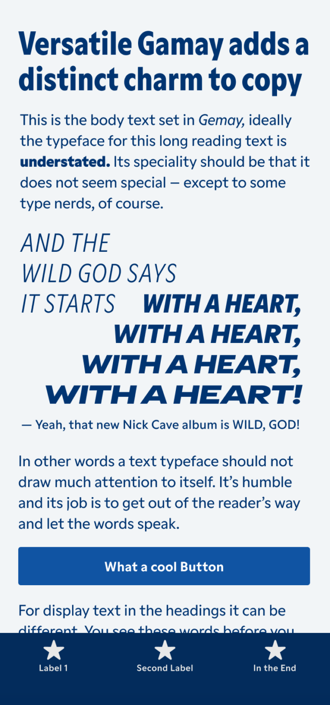
Here’s the thing with superfamilies: They are often very dry or very eccentric. But this is not the case with this week’s recommendation, because Gamay kinda hits a sweet spot for me. This sans-serif typeface is interesting enough for large headings or titles, but still calm enough for copy and even small UI text. But what gives Gamay its special charm? Let’s find out!

6 Widths 9 Weights 108 Styles Gamay is a friendly and versatile sans-serif typeface. Being interesting enough for display text, while not too distracting for copy, it’s suitable for most applications. ☞JUMPING FOR JOY!☜ Gamay is quite sturdy and works well in small sizes too. Don’t forget to increase the letter spacing here to make it readable, because the typeface is spaced quite tightly.
With so many styles, you won’t run out of options. And I really like how that cartoony manicule gives Gamay an extra playful touch!

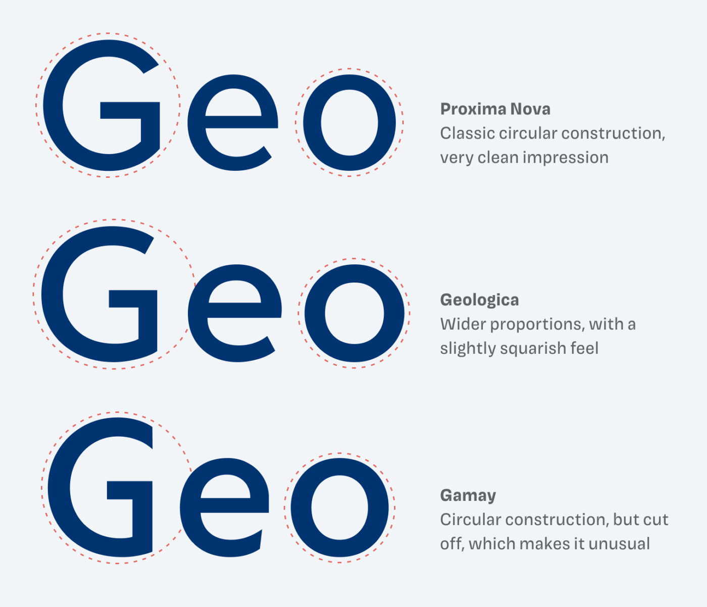
I am a detailed oriented person, so I love to discover how tiny design decisions affect the impression of a whole typeface. Gamay is based on a geometric construction. You can see this when drawing a circle around the lower-case “e”. But it breaks with conventions by adding unexpected touches to it. Like the unusual cut-offs, or the sharp, beveled terminals.

Showing details of the these characters. The upper-case “G” has narrow proportions and is cut off to the right side. The lower case “e” is based o a circular construction, which is also slightly cut off on the right side. The lower-case “t” shows sharp, beveled terminals, and the lower-case “k” a pointy connection of the diagonals to the vertical.
Geometric, but not sober. Gamay has quite some surprises in store.

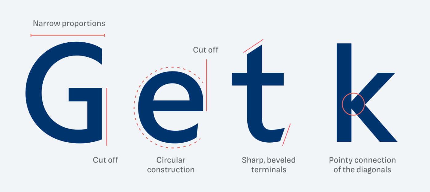
You can see that these design features are something special when comparing them to other geometric sans-serif typefaces. They look sober and clean, while Gamay shows its quirky character and does not take itself too seriously. And the seemingly tiny terminals and cut-offs contribute a lot to that.

Proxima Nova: Classic circular construction, very clean impression. Geologica
: Wider proportions, with a
slightly squarish feel. Gamay: Circular construction but cut off, which makes it unusual.
Compared to other geometric sans-serif typefaces, Gamay shows a certain playfulness and uniqueness.

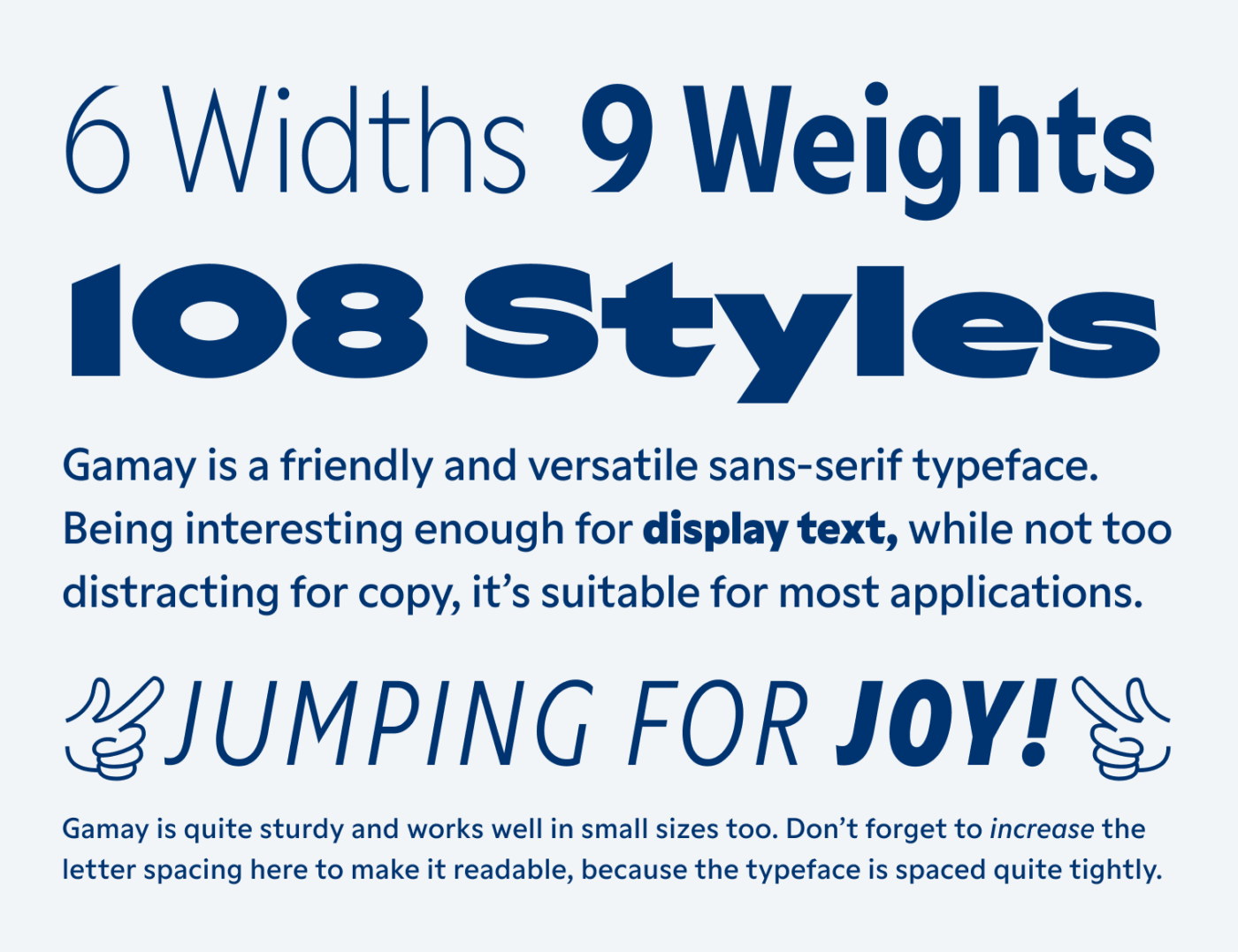
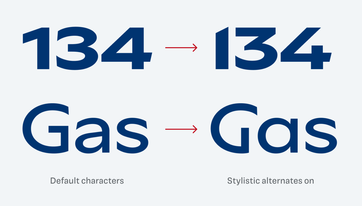
What I also appreciate are the numerous stylistic alternates, like a single-story “a” or an even wilder version of that upper-case “G”, named “Desperate G” 😅. I also love the sharp numbers, especially that elegant 1.

These stylistic alterantes make Gamay more elegant or wilder.

Overall, Gamay is a great typeface for posters, packaging, editorial design and also web or app design. Here the various widths can be very helpful to save space while giving your content a more personal touch.

Font Pairings with Gamay

Gamay is a geometric, linear, sans-serif typeface. If you look for something more striking in headings, pair it with or one of my other suggestions.

Gamay
Gamay
  • Headings
  • Copy
  • UI Text

Learn more about pairing typefaces using the Font Matrix.


Is this typeface pushing it to the limit? Tell me in the comments what you think of Push and if you would use it in an upcoming project!

Typographic power to your inbox

  • Font Friday: I recommend one typeface per week, free fonts included.
  • Type Tuesdays: articles & videos that up your design game.
  • Join 2700+ typography enthusiasts, unsubscribe anytime.
Edition #171, published

Leave a Reply

Your email address will not be published. Required fields are marked *