Something pretty exciting just happened in the world of typography: Adobe Fonts and Monotype are now collaborating. And that means nearly 800 Monotype fonts just landed in the Adobe Fonts library – available to all Creative Cloud subscribers.
Yes, Helvetica is included. No, that’s not what this blog post is about 😉. Let’s dig into a few standouts I think are absolutely worth your attention.
Gotham: The Confident Classic
Once famous for its use in the Obama campaign, Gotham is now available in all 64 styles through Adobe Fonts. It’s a geometric workhorse – clean, modern, and versatile. I love it in all caps headlines. Gotham is just timeless, and its confidence shines through.
ITC Benguiat: Wild 80s Retro
Designed by the legendary Ed Benguiat, this spiky serif made a pop culture comeback thanks to Stranger Things. But beyond the nostalgia, it’s just fun. ITC Benguiat’s bold weights especially bring out its quirky, 70s-80s editorial charm. Use the condensed version for poster designs.
Nexa: Geometric with Personality
Created by Svet Simov from Font Fabric, Nexa is another Monotype gem. It’s geometric, but not cold – there’s a subtle warmth and quirk to it, like in its beautiful double-story ‘g’. With 36 styles, it’s flexible enough for branding, headlines, and even small bursts of text.
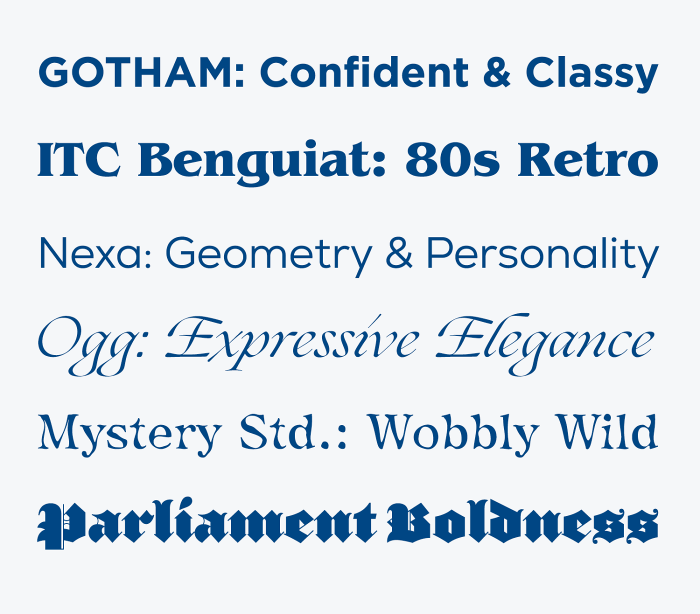
Ogg: Expressive Elegance
This one truly captured my heart. Ogg Display is calligraphic and full of contrast. It balances geometric structure with old-school flair, and its italics? Gorgeous! Perfect for big editorial or pairing with its more restrained sibling, Ogg Text for body copy.
Mystery Std.: Weird in the Best Way
I don’t even know how to describe Mystery Std. – it’s only one style, but wild! Almost like a sauce spill turned into letterforms. I believe it was designed for Japanese usage, but the Latin characters are so expressive, fluid, and strange in a way that really sparks curiosity.
Parliament: Blackletter Boldness
Designed by Jonathan Hoefler, Parliament is a modern blackletter that feels both traditional and rebellious. It’s spiky, confident, and full of visual tension. Definitely an eye-catcher if you have the right project for it.
I’d love to hear your thoughts: What font from the new Monotype drop are you most excited about? Tell me in the comments!