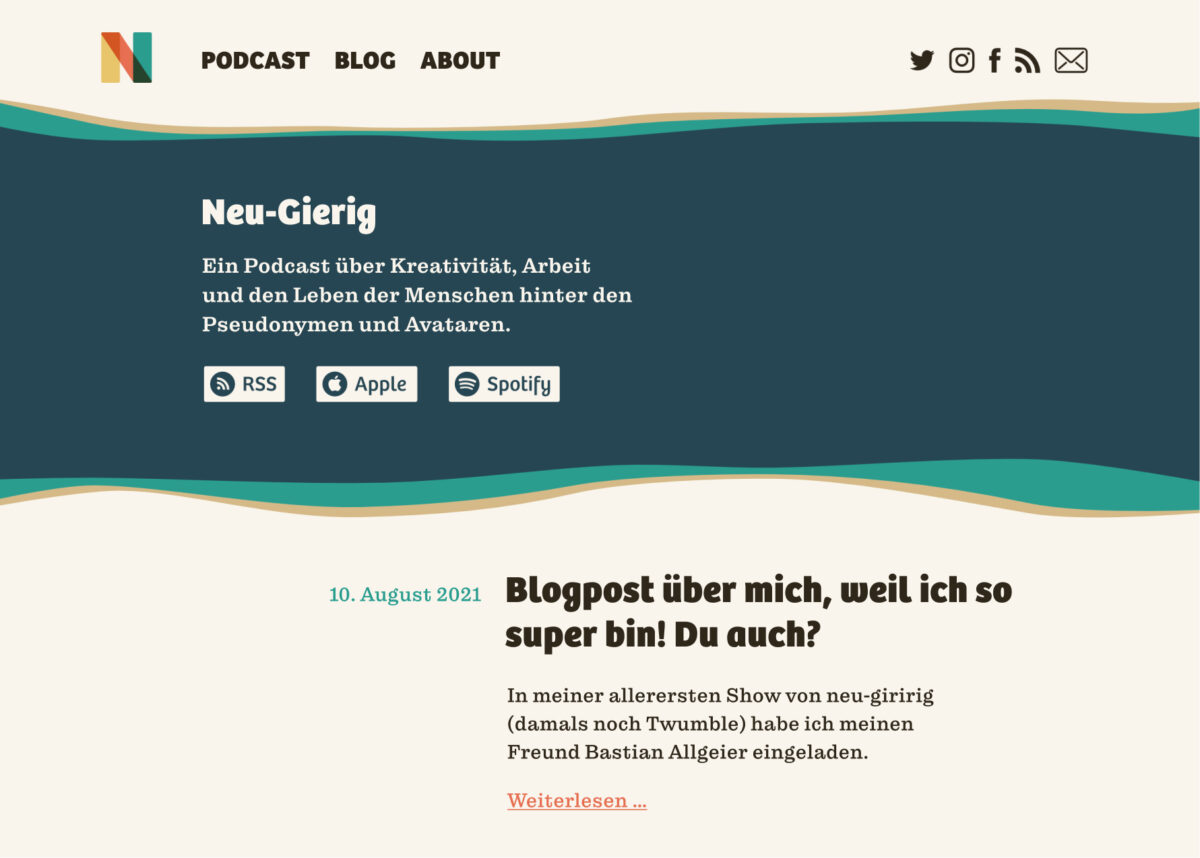
Marc sent me the redesign of the blog for his German podcast Neu-gierig and wanted to know my opinion on his font selection. In the video analyze it and give some suggestions for improvement.
TL;DW: I change the font for body text, activate stylistic alternates for the headings and tweak the navigation a bit to achieve a more harmonic end appearance.
The Design Briefing
- The key audience are web designers and designers.
- Their top 3 values are creativity, open-minded, curiosity.
- The atmosphere of the blog should be friendly and welcoming.
The current Design

The design is colorful and contrasting. The typefaces are Bree and Pulpo. Bree is a soft, friendly typeface with a handwritten touch that fits nicely to Mark’s briefing. Choosing a slab-serif typeface for the body text is a good idea as well, since it might be a bit traditional, human. But the particular choice of Pulpo in combination with Bree does not work that well. Why? Read on!
Pimpin’ it
Change the typeface
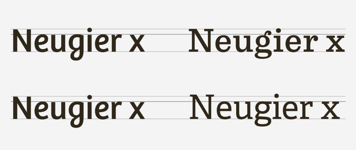
Bree has a large x-height and a narrower, Pulpo has a low x-height and seems wider. Bree also has an even stroke and simpler construction, Pulpo has some contrast going on (the horizontal lines are lighter than the vertical). This all results in a not so ideal combination. I’d go with Bree as the primary typeface, since it fits the desired atmosphere best and look for another typeface for the body text. Adelle is by the same foundry as Bree and has closer metrics and also a simpler, cleaner touch to it, even though it’s a slab-serif. This makes it a better combination.

Activate stylistic alternates
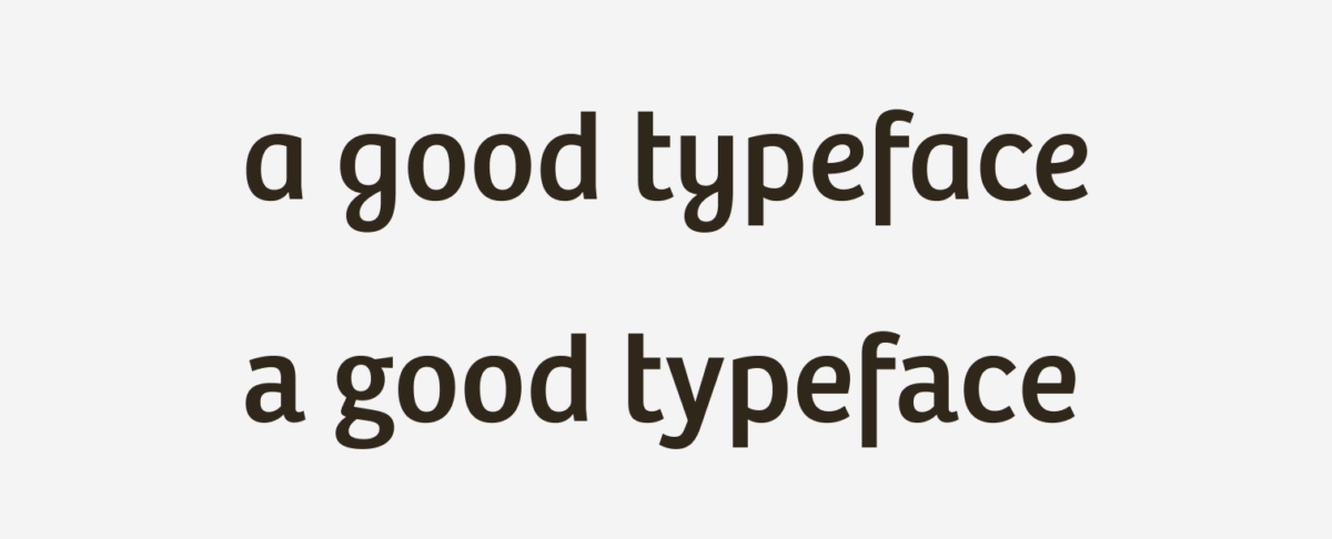
Bree is great, but it is very often seen and wide-spread. To make it a bit more unique, we could activate the stylistic alternates in the open type features. This way the very characteristic loop of the y and g get replaced among other characters. It basically becomes a little straighter.

Adapt the navigation
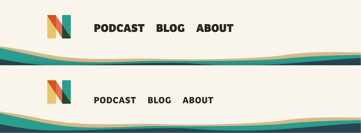
The navigation is really big and not aligned to the bottom of the logo. Making it smaller will emphasize the logo more. Aligning it to the bottom of the logo is also better since it is the same baseline.
Extra-Bold is very strong for this smaller font-size now, it’s too dark. Bold will be sufficient. When something is set in all caps it’s beneficial to increase tracking (the space between letters), so they don’t sickt together that tight.

The result

What do you think of the redesign? Leave it in the comments below! If you would like to receive some tips for improvement on your design, submit it here.

Thank you for your teachings on typography. This one wa sparticularly good and helpful. Keep your good work.
Thank you, Joaquin! 🙂
It’s really super interesting. A huge thank you for these explanations.
On the improved version, is it me or is the menu a bit too low compared to the logo?
You’re very welcome, Elle! And you’re totally right – the navigation was too low! Kind of missed that 😉 . Fixed it now.