Apple recently announced iOS 26 with its “biggest visual update in over a decade”, introducing a shiny new UI design called Liquid Glass. It feels sleek, modern, impressive – at first sight. Because the moment you try to read anything, this mirror-like interface cracks usability and breaks my typographer’s heart!
So in this article and opinionated video I don’t only want to share with you the biggest three typographic problems with iOS 26, but mostly what we can learn from it for your own UI design with some practical examples.
While we’re still in early beta territory and things will evolve until its final release in September, design trends have a way of sticking around, and I don’t want people to take an example from that. Because what looks like innovation is actually a masterclass in how not to handle text contrast in user interface design.
1. Lack of color contrast
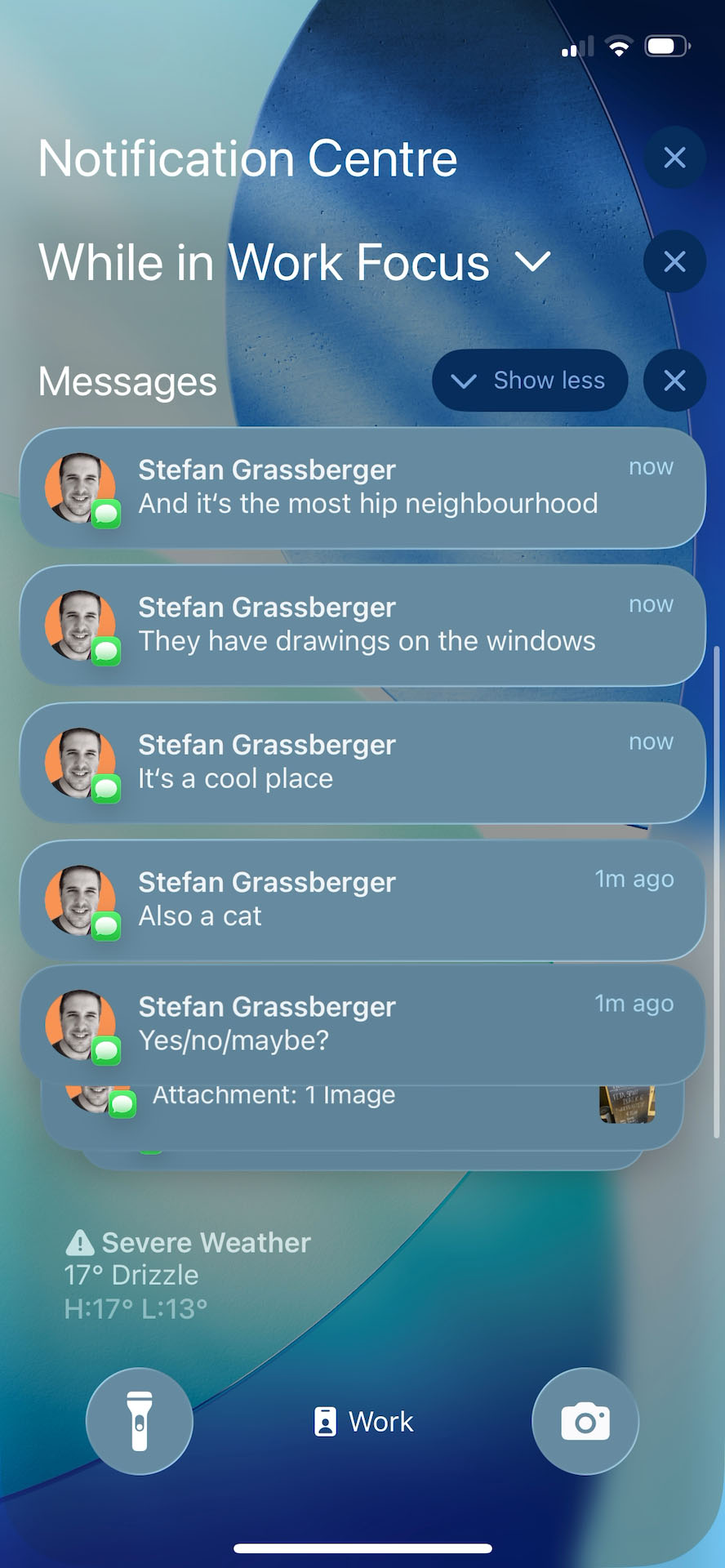
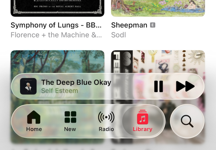
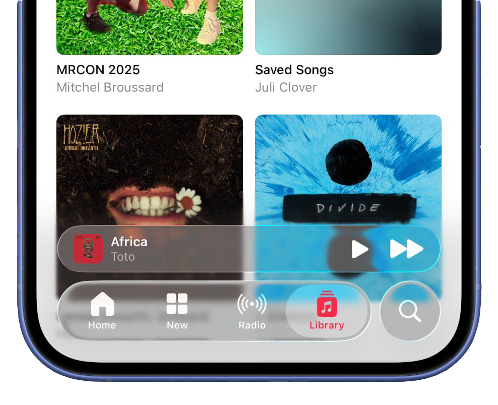
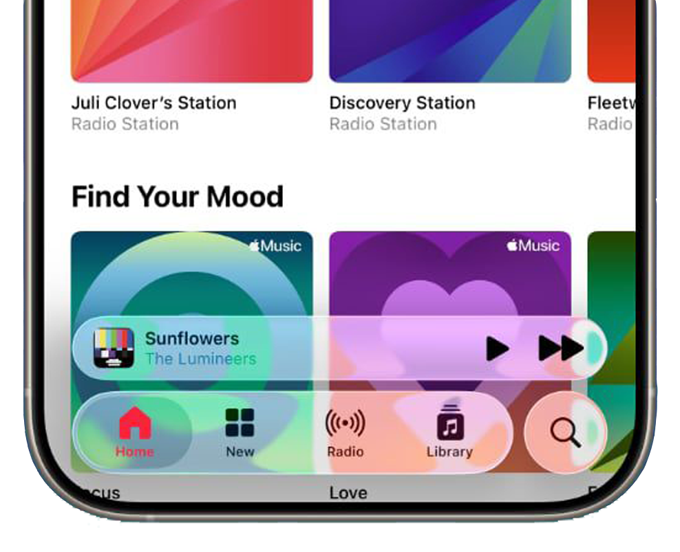
One of the most fundamental rules of readable design is clear text contrast. And yet, with Liquid Glass, the floating tab bar menus often fade into their background, making the active tab disappear like shy party guests.

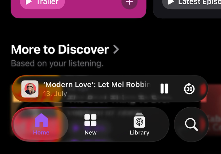
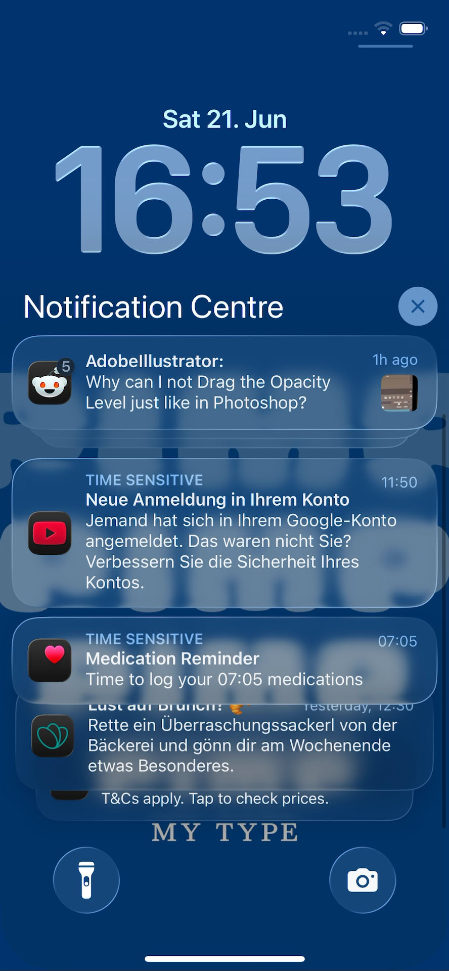
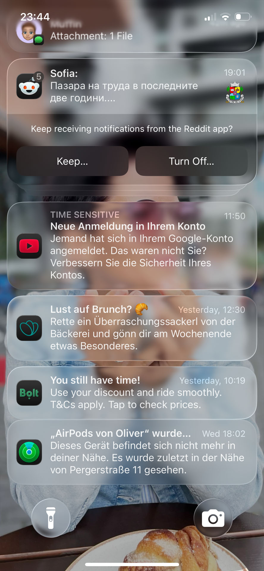
Sure, transparency and blurred layers look slick – but not on your lock screen, once you throw a busy wallpaper behind them. Suddenly, you’re squinting, second-guessing messages, and replying “Love you too” to your delivery driver.
Seeing that makes me absolutely remember that contrast is our friend. The coolest font in the world won’t help if it’s floating in visual chaos. So add a background layer with sufficient contrast, as I will show you a bit later.
2. It easily breaks
Apple lets users customize their Home Screen style. Pick your poison and switch to Clear or Tinted icons. The Clear style looks sleek but turns the UI into a blur of indistinguishable icons, and suddenly you’re spending more time hunting for apps than actually using them – which could be an advantage considering social media 😜.
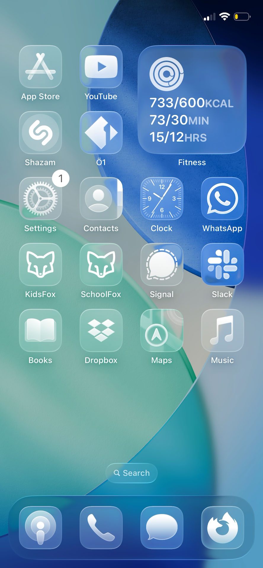

But even worse is the Tinted style. Express your personality with color – well, really? A sophisticated user might finesse it into something stylish – but most won’t. It takes five minutes to make it look good. It takes five seconds to turn it into visual chaos.
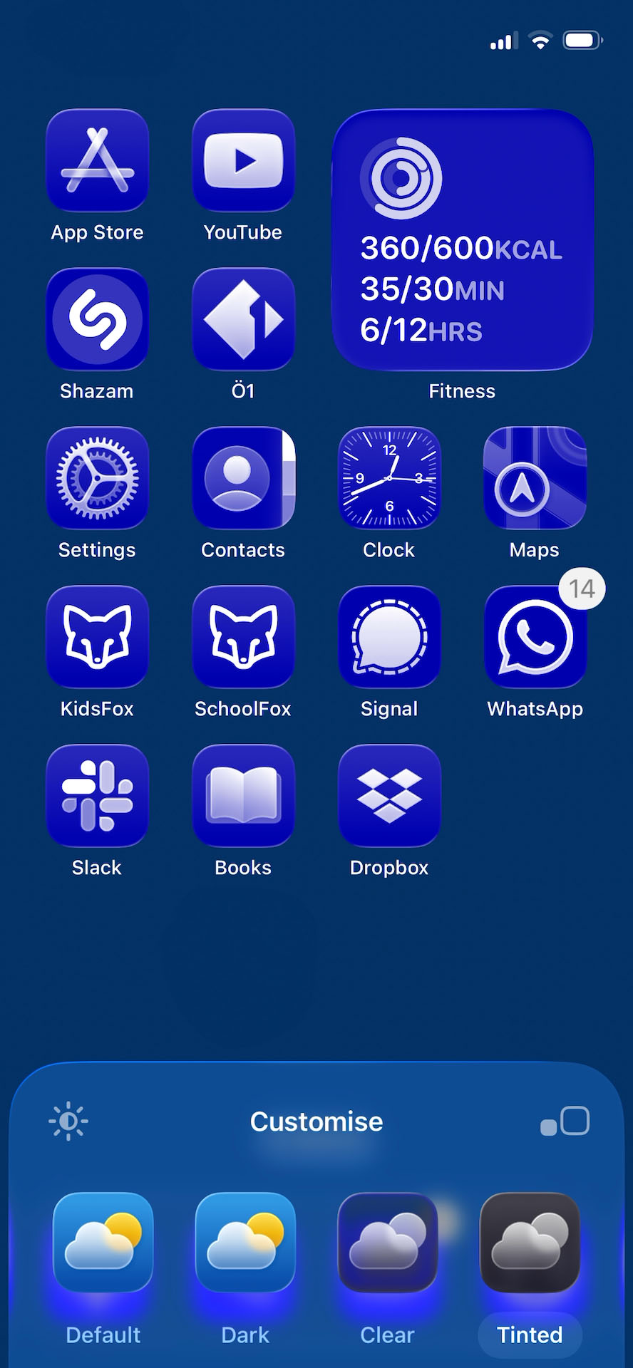

Of course, you could blame users for their choices, but I’d rather blame the system for making poor choices possible in the first place. So in your UI design you should always plan for edge cases, limit fragile options, and prioritise resilience.
3. Accessibility became a hidden feature
Apple does provide an option to “Reduce Transparency” in accessibility settings – and suddenly, the UI becomes more usable. Not just if you have low vision – but if you’re tired, on a shaky bus, or outside with 3% battery in bright sunlight.
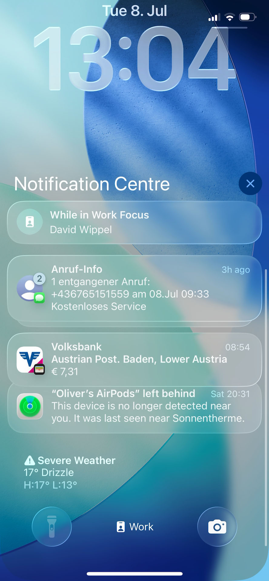
But that shouldn’t be a hidden extra. Readability is not an add-on, and after all the attention to accessible design in recent years, I find it very disturbing that they make it harder for more people by default.
When considering accessibility, aim for a single, robust design with accessibility built in, not on top.
Not everything’s bad
To be fair, as a designer I find it great to have a new visual direction after the slightly evolved flat design of iOS 7 from 2013. I really enjoy how Apple embraces the fluidity of variable fonts with the clock on the Lock Screen, also the contextual menus are bigger and more contrasting now.
Many other things work well in iOS 26, but these three problematic areas cast a long shadow, and I’m afraid that they might encourage more designers to sacrifice readability for style. So let’s break this down into a more practical and realistic example, and how to evolve it.
How you can improve your UI Design
Now since not everyone is designing the next iOS – I guess 😉 – I want to distill some key takeaways from Apple’s contrast crimes into a relatable example, using a fictional app design here.
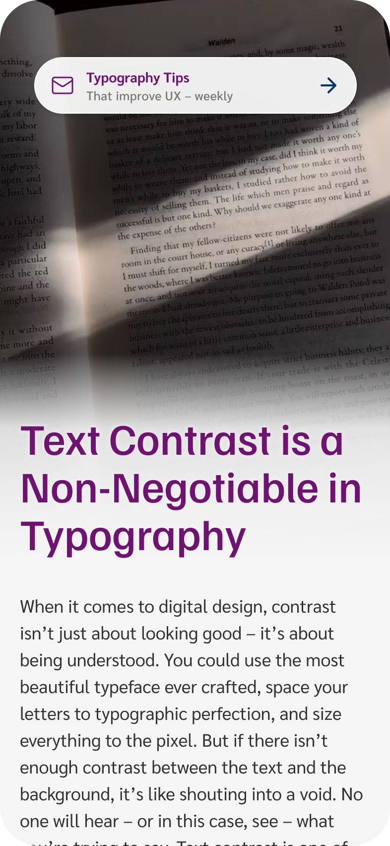
1. Make robust choices for your background
Picture this: in a web design you decide to overlay text directly on a striking background image. Looks polished, feels modern – but is it readable? Not if one image swap can turn it into a readability minefield.
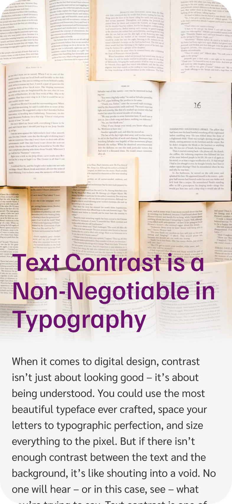
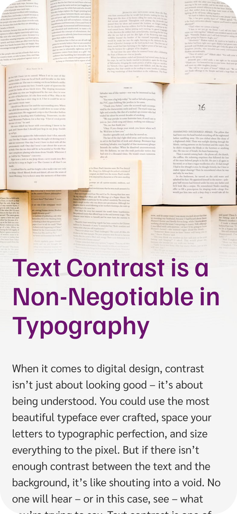
Fixing it
- Add a background. This can be an elegant gradient, so the text still connects with the image underneath.
- Turn up the opacity of your text containers to create better separation.
- Add a subtle text shadow in a color similar to the page background to make text more resilient.
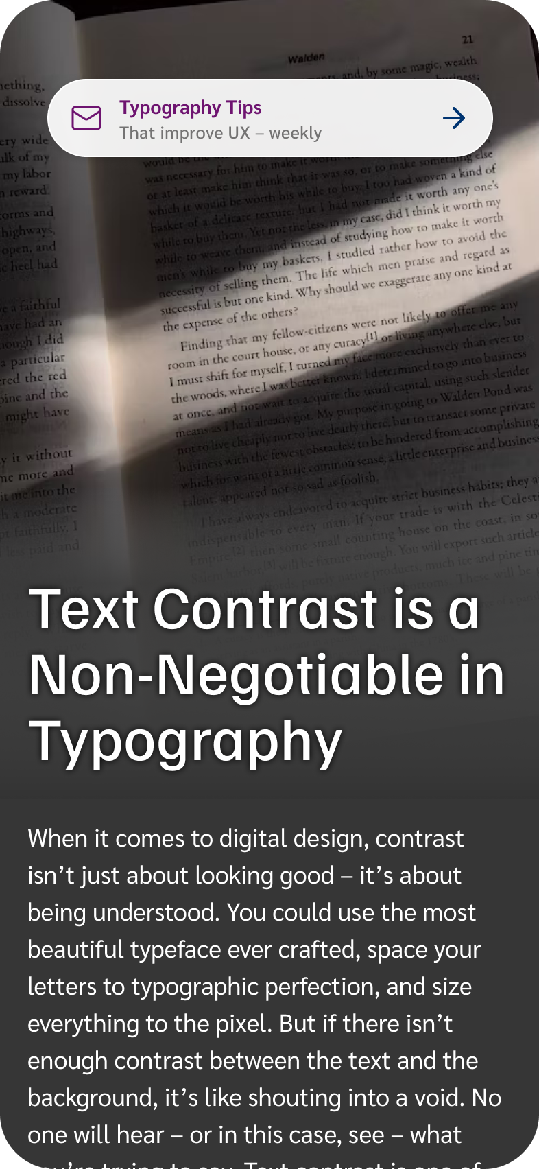
2. Build robust systems
Let’s add a newsletter sign-up bubble on top of our image – by the way, you should definitely sign up for that newsletter 😉. Looks glassy and nice, but again, it’s horrible to read.
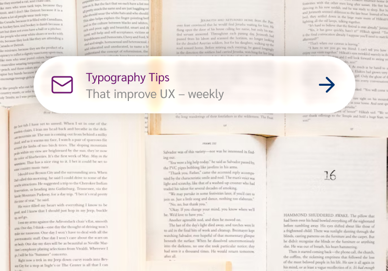

Fixing it
- Drop the opacity of transparent elements to make backgrounds more solid and text easier to read.
- Aim for sufficient color contrast of at least 4.5:1 for normal text.
- Bump up text size when working with challenging backgrounds.
- Increase font weights: From Regular to Bold for the title and for small text to Medium.
- Add a pinch of letter spacing to open up the letters just enough to breathe.
This creates a system that works across various backgrounds, light and dark.
3. Design for when things go wrong
Consider less-than-ideal use-cases. What happens when the text gets longer? What happens if users upload a totally different background image?
Fixing it
- Either limit options, so users can’t break the experience. This would mean not overlaying image and text in the first place.
- Or offer dedicated modes that handle edge cases gracefully.
Design for accessibility by default
Imagine if our designs had a switch from “Poor contrast” to “Sufficient contrast”. Legally, this would pass accessibility guidelines. But would everyone find it? Would you want to maintain two designs? Or would you rather build one resilient system that works for the most people?
Fixing it
- Don’t treat accessibility as something extra to hide behind a toggle.
- Make it the foundation of your design, right from the beginning.
Apple already circles back
While I was writing this, Apple is already tweaking the interface – dialing back some of the glassiness (then bumping it up again), but overall aiming to improve background colors for better contrast. That shows we’re heading in the right direction. I’m curious how it will turn out, once the final version is released.
But what I’m most afraid of is that making things look shiny and glossy might stir designers into thinking: “You know what’s cool? Making text look like it’s been laminated, dipped in glass cleaner, and hidden behind a glare.” And we are already seeing some tendencies out there. Which makes it even more important to remember how crucial good text contrast is.
Your takeaways
In a nutshell, these small changes make huge differences.
- If your UI has text, it needs to be readable. If the text isn’t essential, delete it. If it is essential, respect it.
- Add subtle backgrounds, adjust text size or weight. Blur and transparency can look slick – but only when implemented thoughtfully.
- Check your color contrast. Learn more about it in this article.
Design systems should protect users from making poor choices – not enable them. The goal isn’t to look cool – it’s to be understood. Even if that means breaking some glass.
Raluca Budiu’s article on the Nielsen Norman Group Blog also shares great examples of how Usability Suffers in iOS 26.
Is your typography hitting the right mark?
Are you uncertain about text contrast in your own design system? Book a free type check with me, and I’ll give you my honest, practical feedback to help you spot where legibility goes wrong.
What do you think? Did Apple go too far? Am I too strict? Tell me in the comments below!