When it comes to typography, AI image generation tools still miss the mark. Take David’s Modern Software Makers podcast cover: a good concept, but the text doesn’t quite capture the energy it should. So in this video and article, I’ll show you step by step how to pimp its typography – 80s style 😎 – to make the cover more impactful.
The original cover
My good friend David showed me the cover for his podcast: Modern Software Makers. The concept is promising with its cool title and trendy AI-generated graphics. But as with most AI designs, the typography is far from decent. And that’s a shame, because more than the imagery, it’s the text that will capture attention when you’re browsing through podcasts. So let’s pimp the type for this podcast cover – 80ies style.
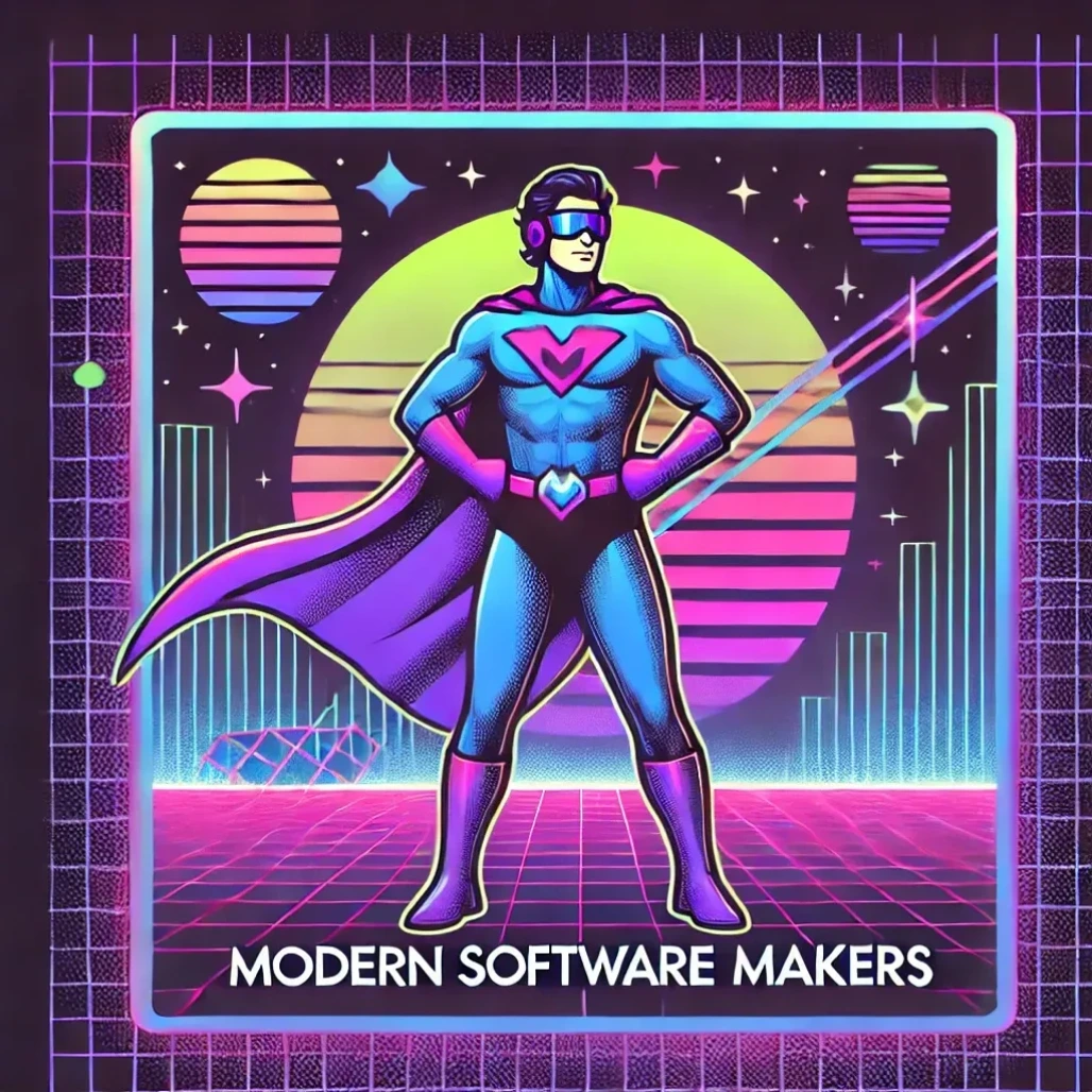
Typography is challenging for AI
We’re accustomed to sharp, precise text. This makes us far less forgiving of flaws in AI-generated type compared to small imperfections in images or illustrations. While some tools perform better than others, the results are often inconsistent. Here I tried it with the prompt: Create an image of a podcast cover only using the text "Modern Software Makers", 80ies style.
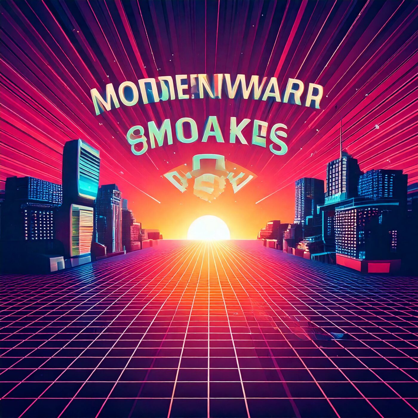
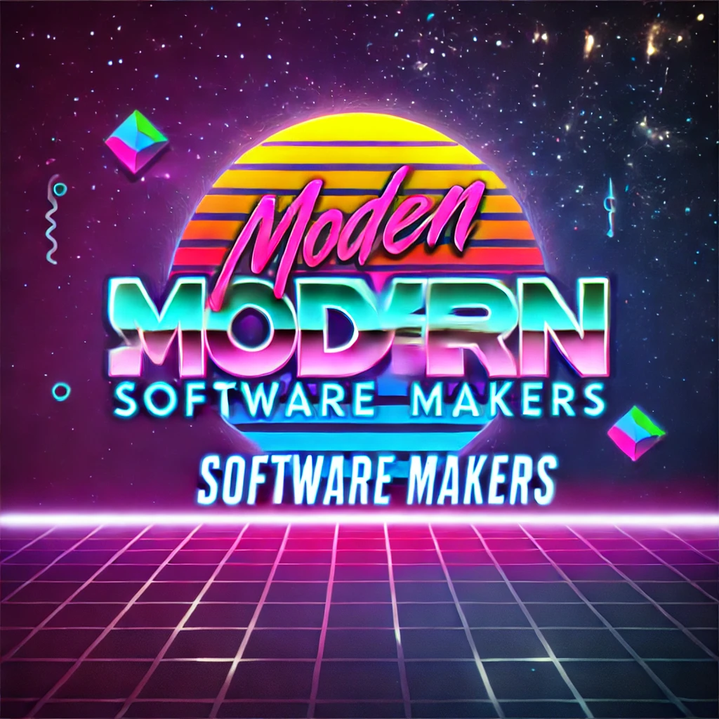
Adobe Firefly struggles to generate any usable text, while DALL·E does a better job – though the text still has flaws, including blurriness and wobbly outlines. This was just the first attempt, and with different prompts, things might improve, but it’s clear that creating quality type remains a challenge for image-generating tools.

The biggest limitation, however, is that no AI image generator truly understands how to capture the vibe or emphasize the right elements in typography. This still requires a designer’s intuition and skill. So, while the imagery is worth keeping, the text in David’s cover needs a complete overhaul.
Step 1: Choosing the right typeface
The 1980ies remind me of wide, blocky text. Bold, all caps! And Push from Fontwerk is an ideal choice for that. This vast type family covers eight weights in seven width, adding up to 56 styles! And the best of it – you can seamlessly adjust it using the power of variable fonts, which will be very useful for us.

Step 2. Setting the foundation
I begin by setting the podcast title in all caps, using the Wide Extra Bold style. To ensure the text feels cohesive, I activate capital spacing, a feature some fonts include to make all-caps text more balanced. A slight increase in letter spacing enhances readability, especially at smaller sizes.
Step 3. Emphasizing the right words
At first glance, “Software” dominates the title due to its length. But for a name like Modern Software Makers, the emphasis belongs on “Modern Makers.” Adjusting the font’s weight or size alone doesn’t solve the issue – it still feels off.
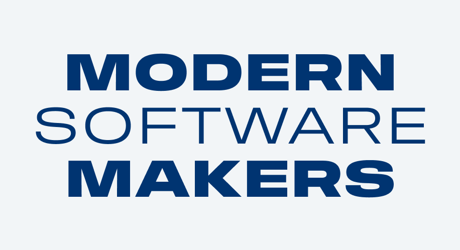
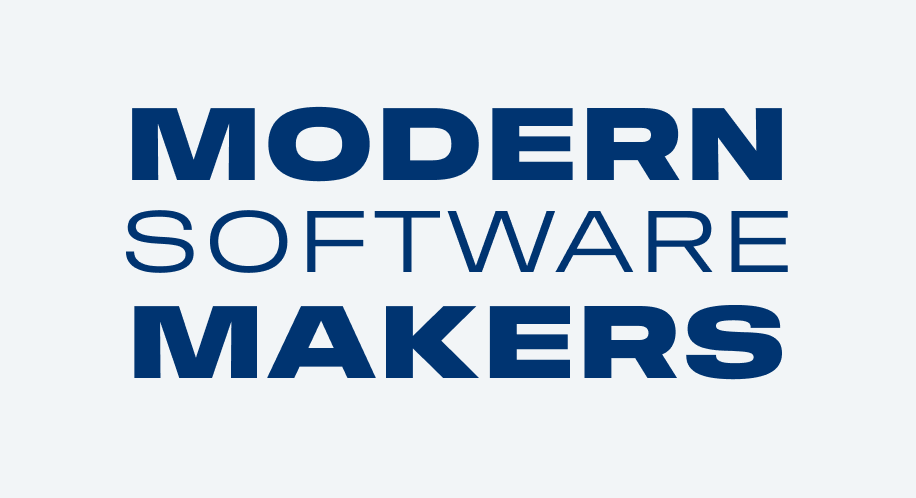
The solution comes when I use Push’s variable width feature. By making “Software” slightly narrower, I can balance it without changing the font size. This seamless adjustment lets the entire title shine.

Step 4. Putting it into place
With the typography aligned, let’s focus on integrating it with the cover design:
- Texture: A noise filter adds a retro touch, blending the text seamlessly into the cover’s aesthetic.
- Colors: I match the typography with the illustration’s color palette for a unified look.
- Scaling: To ensure visibility in podcast platforms, I scale the text up significantly.
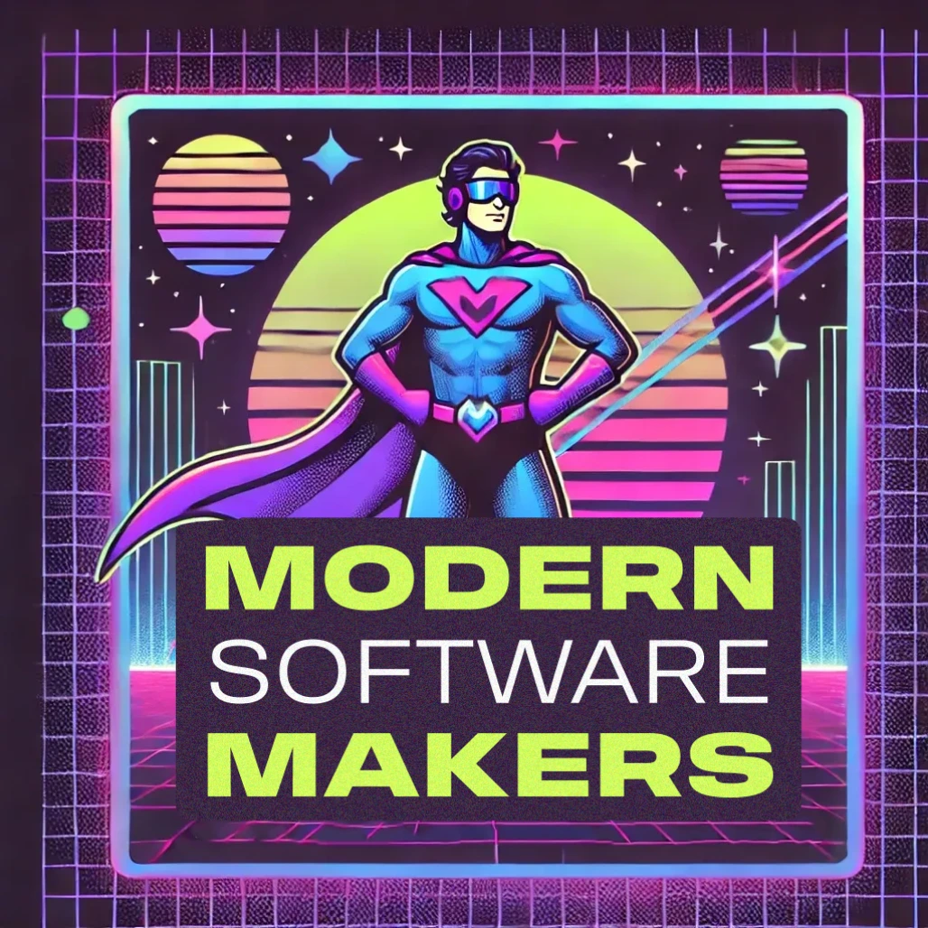
Trying an alternative: Shader
For variety, let’s experiment with Shader from Dalton Maag, a retro video game-inspired typeface that I also reviewed here. While Shader lacks Push’s variable width feature, we can find a workaround by setting “Software” in mixed case. Surprisingly, this tweak balances the text visually, aligning “Software” with the all-caps words in terms of size and weight.

After applying the same color and texture adjustments, Shader delivers a striking alternative.
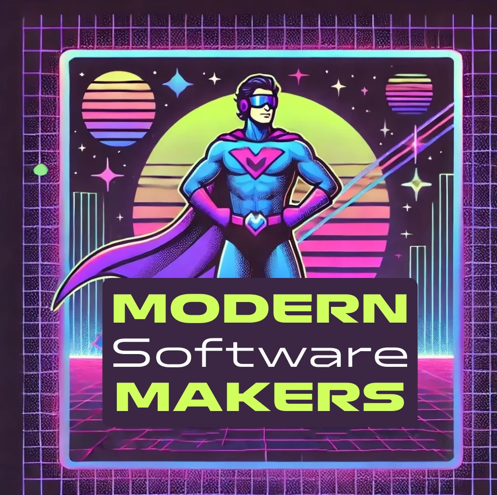
Which one works better?
Looking at the original cover alongside the redesigned versions, the updated typography stands out clearly. The bold, large, retro-inspired type brings the title to life while capturing the podcast’s essence.


Now I ask you: Which design do you prefer – Push or Shader? Share your thoughts in the comments!
Looking forward to better AI tools
In the future, we can hope for AI-generated images to offer editable text, using real fonts instead of a random collage of fragments. But even with those improvements, the thought process behind good typography will remain an essential. I believe that understanding your message and crafting the right atmosphere will always be setting great designs apart from merely functional ones. When done right, it won’t matter which tool created the design – it’s the intention and execution that make it truly stand out.
David’s podcast now has launched on Spotify and Apple Podcasts. It’s in German, and in a few weeks, you can hear me as a guest discussing the importance of UI design. If you don’t wanna miss it, subscribe 😉.
